This work follows on from our design to help users understand how diverse their candidates are.
The user need this work aims to address is:
The aim of this iteration was to simplify the diversity information we show to providers. This will make it easier for them to spot any bias in their processes.
What we changed
We made changes to the:
- column headings and data in each table
- section about how to understand the report
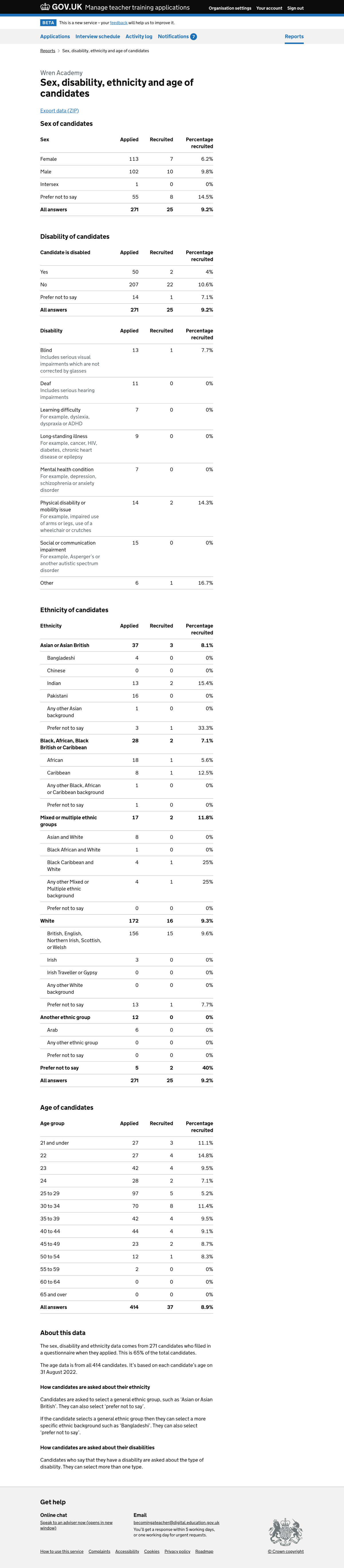
Column headings and data
Previously the tables showed data for the number of:
- candidates recruited, out of those who gave the answer
- candidates recruited who gave the answer, out of the total recruited
This meant that the column headings were quite hard to understand, since each referred to a different total.
The first column helped to show bias in recruitment. The second column indicated the composition of the group of recruited candidates. We decided that we should focus on the first of these to meet the user need.
Removing the second column allowed us to split the data so that we only have one number in each cell. We now have columns for:
- applied
- recruited
- percentage recruited
We changed the titles of the tables to include the word ‘candidates’ so that we do not need to say this in the column headings. This helps to make the ‘percentage recruited’ column clearer, since a reference to ‘candidates’ might be understood to mean all candidates recruited.
We also added a row to each table except the disability type to show data for ‘all answers’. This will help users to:
- compare the number of candidates who applied in a group to the total number who applied
- compare the number of candidates recruited in a group to the total number recruited
- understand whether the proportion of candidates in a group who are recruited are higher or lower than the provider’s average
We did not add this row to the disability type column since candidates can select more than one type.
We updated the data exports to match the changes we made to the tables within the service.
Section about understanding the report
We added content to the explanation at the end of the page, to say that candidates:
- are asked to enter a broad ethnic group
- can enter ‘prefer not to say’ for the broad ethnic group, in which case they will not enter a more specific one
- can enter ‘prefer not to say’ for the more specific ethnic group
- can enter more than one type of disability if they say that they are disabled
We renamed the section to ‘About this data’, reflecting the broader range of the section’s content.
We added a text file to the data export to contain the information in ‘About this data’.
Further considerations
Report showing the diversity of the group of recruited candidates
We could create a report containing the data which was previously in the second column of this report. It would show the characteristics of the recruited group, without indicating potential bias.
We decided to focus on the data showing bias, which better meets the user need we’ve identified.
Adding withdrawn and declined columns to the tables
In research, some participants have said they would be interested to know the characteristics of candidates who withdrew their application or declined an offer.
We decided not to add these columns because candidates withdrawing and declining could only indirectly indicate bias. Recruitment and rejection are more direct, since they’re actions taken by the provider.
We also think that mixing positive and negative outcomes may make the tables harder to read.
Showing charts
We are not going to add charts at this point. We want to make the tables easier to understand rather than relying on charts to make up for badly designed tables.
We may consider charts later as an enhancement of the report.
Including raw data in the downloads
We could provide the data for specific candidates which we use to calculate the totals in the tables.
We won’t provide this as part of the current work. There’s ongoing work to consider what personally identifiable information should be shown to providers at different stages in the application process.
Hiding the report while users could be identified
When a provider has only received a small number of applications, it’s possible that a candidate could be identified using the information in this report.
We are going to find out whether this problem has been considered by teams working on other DfE services or content.
Our decision about this will also be influenced by the work being done to consider what personally identifiable information can be shown to providers.
Showing reports for current and previous cycles
We do not have complete data for the previous cycle since many applications were made through UCAS. We therefore think it will not be useful to show the previous cycle’s data.
Sex, disability, ethnicity and age of candidates report#