We reviewed how we use and display boxes in the service. This was part of an audit which also included:
- page titles
- headings, caption text, success messages and timeline event titles
- button labels and warning text
- the use of red buttons
How it works
We made changes so that we’re consistent with:
- the thickness of the borders used for boxes
- when we show boxes around content
We also removed some boxes and their content as they were unnecessary.
Changing the thickness of the borders used for boxes
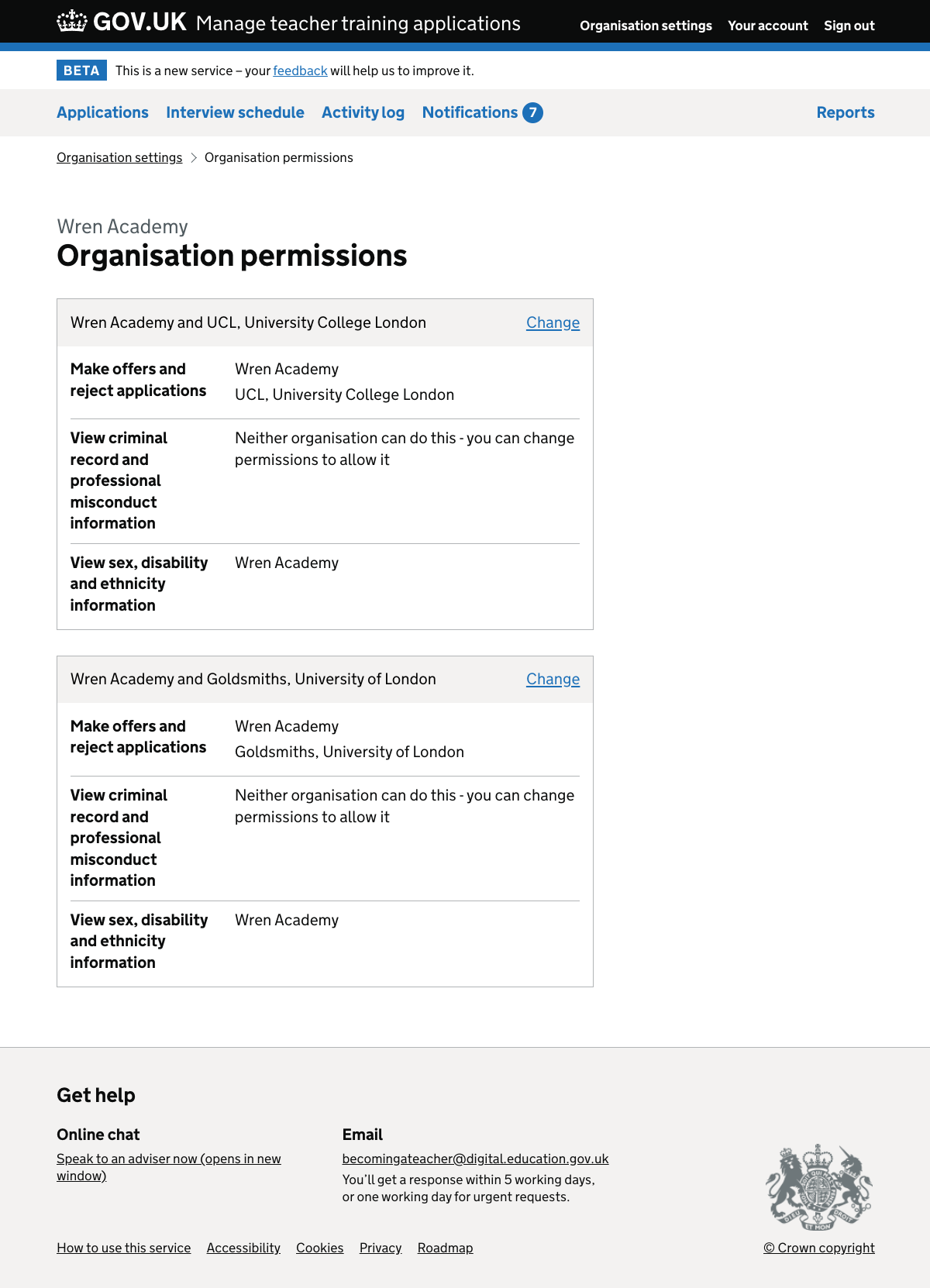
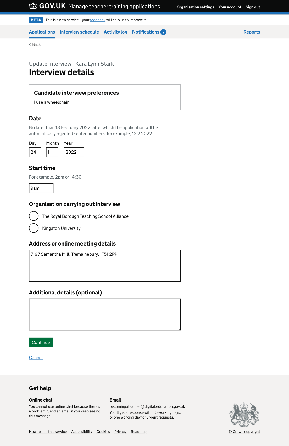
Previously some boxes used thick lines and some used thin lines. For example:
- each set of permissions on the organisation permissions page was surrounded by a thin line
- the candidate interview preferences on the interview details page were surrounded by a thick line
We do not think that this distinction conveys any difference in meaning, so we decided to use thin lines for all boxes.
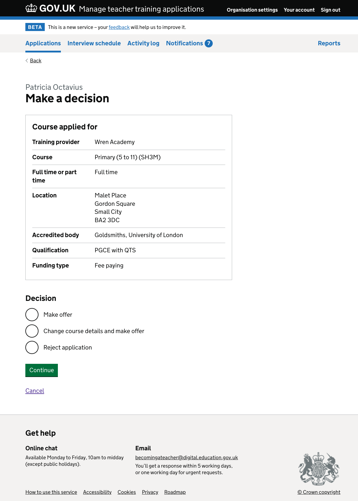
When we show boxes around content
We’ve decided to only show content in boxes when either:
- there are actions which users can take on a whole thing, for example to change or cancel an interview
- it’s helpful for users to see information from another part of the service, for example we replay course details at the start of the ‘make decision’ flow
As a result of this, we’ve removed the box around summary lists on the check answers pages.
Removing unnecessary boxes and their content
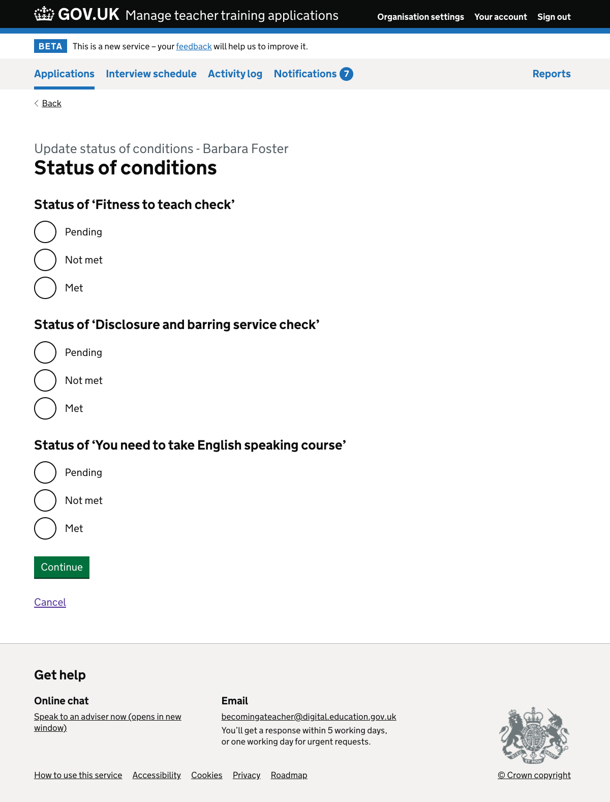
We removed the box showing the current status of conditions which was displayed above the radio buttons when:
- deferring an offer
- changing an offer
- updating the status of conditions
This is because the radio buttons indicate the current status of conditions, so it is not necessary to show the statuses separately.