We looked at the way we use red warning buttons. This was part of an audit which also included:
- headings, caption text, success messages and timeline event titles
- page titles
- button labels and warning text
- the use and appearance of boxes
The GOV.UK Design System contains the following guidance about red warning buttons:
Warning buttons are designed to make users think carefully before they use them. They only work if used very sparingly. Most services should not need one.
Only use warning buttons for actions with serious destructive consequences that cannot be easily undone by a user. For example, permanently deleting an account.
We’ve not been consistent in how we follow this guidance. For example:
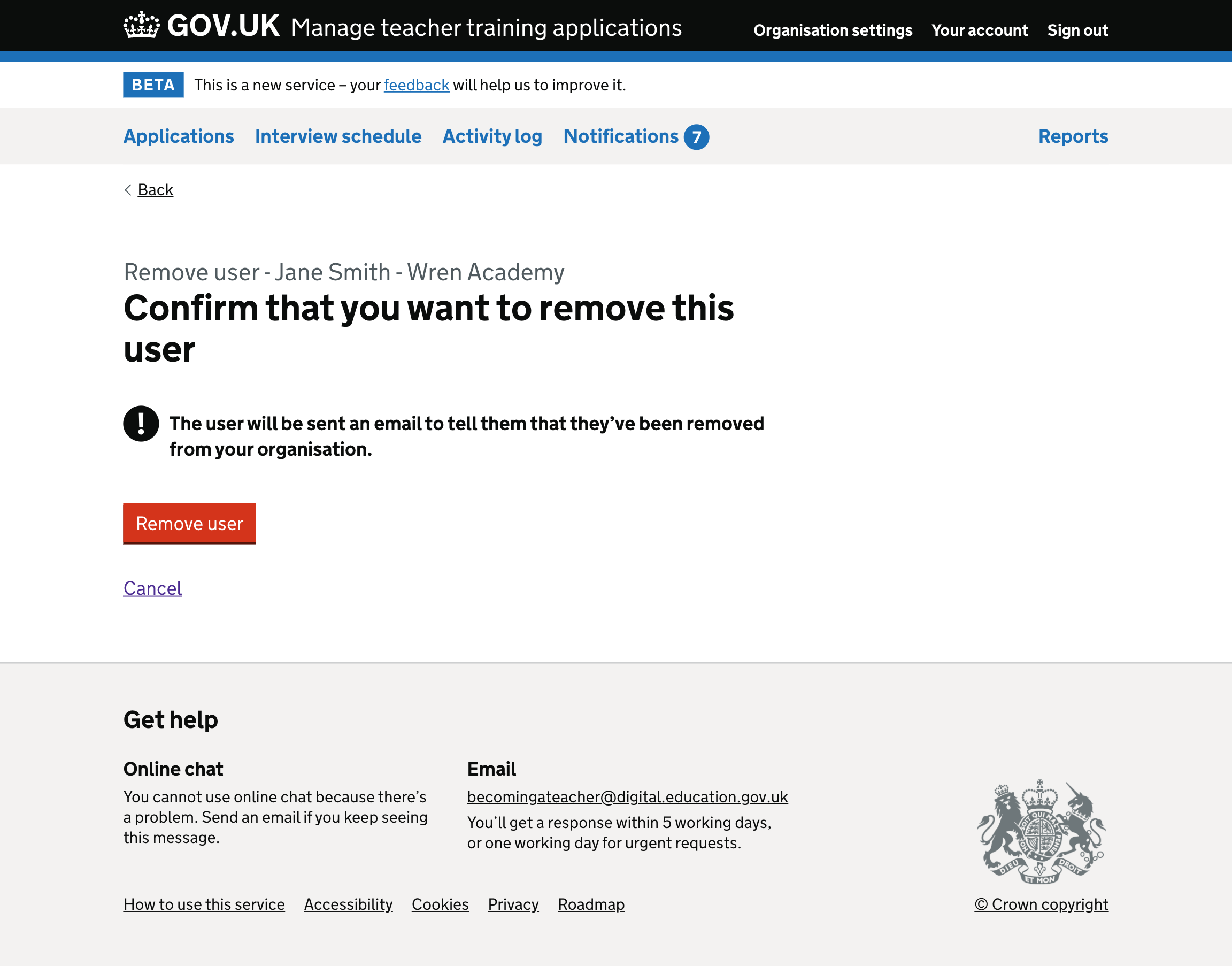
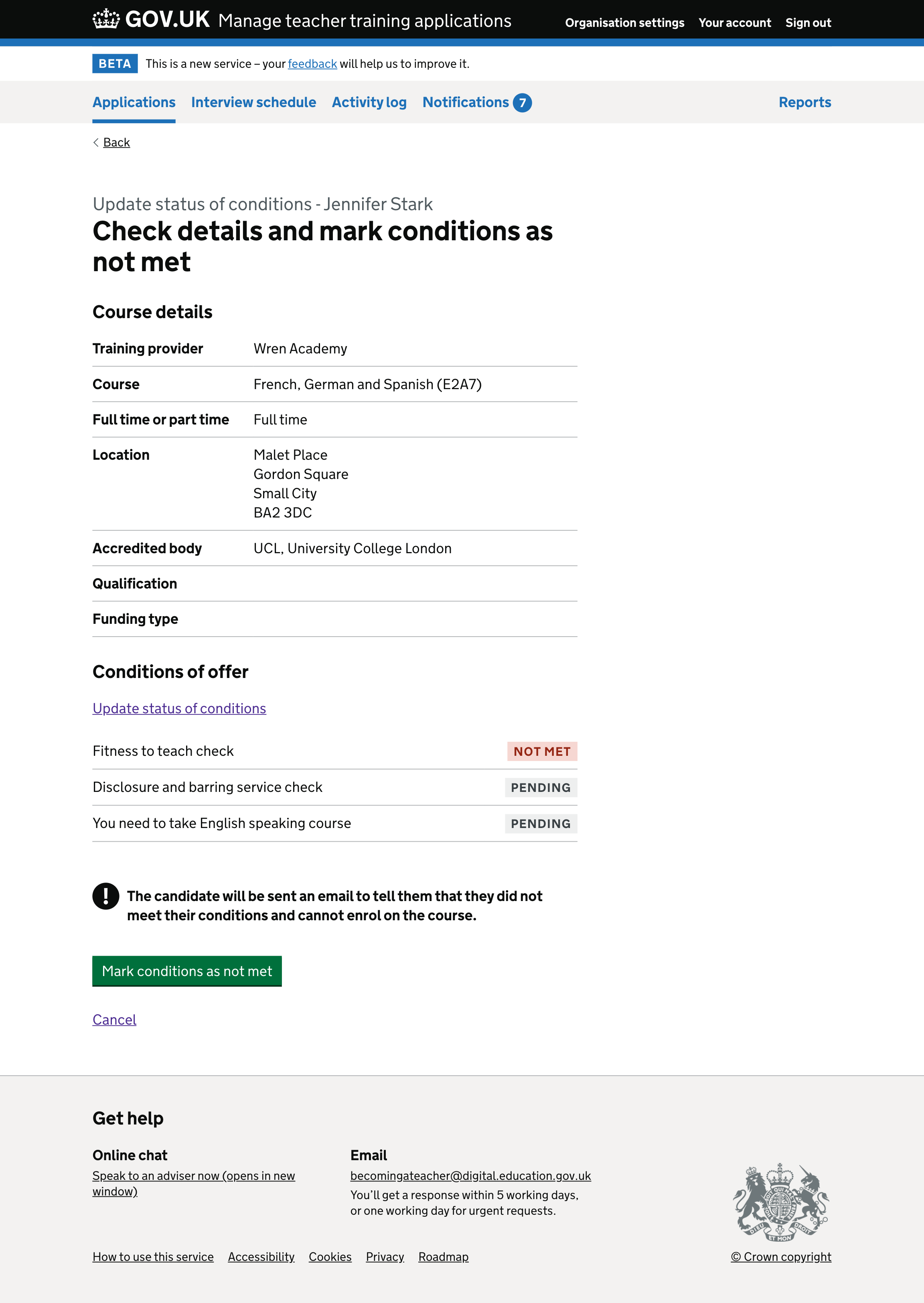
- we use a warning button when marking a condition as not met
- we do not use a warning button when rejecting an application
Although rejecting an application and marking a condition as not met are negative outcomes for an application, they’re actions that users are expected to perform regularly.
Using warning buttons for actions the user is expected to perform regularly may alarm users unnecessarily. This may mean they have less chance of making users pause before clicking.
We’ll only use warning buttons when removing a user. Although a user can be added back to an organisation, removing them will unassign them from any applications. This cannot be undone.
Marking a condition as not met#
Removing a user from an organisation#