We designed and implemented additional navigation links and call to actions (CTAs) between the 'Your details’ and ‘Your applications’ tabs in Apply for teacher training (Apply).
These changes aim to improve the user experience and help candidates seamlessly transition between managing their details, adding applications and viewing applications.
The issue
As part of our work to change the application process, we held 3 testing sessions with our wider division. These sessions aimed to find any technical or design issues we had missed. We called these sessions ‘bug parties’.
During these sessions a few people struggled to navigate between the ‘Your details’ and ‘Your applications’ tabs in the navigation. They commented that when you complete ‘Your details’ there is nothing to direct candidates to the ‘Your applications’ tab, like prompts or guidance to navigate between these two tabs.
What we did
Added a button on the ‘Your details’ tab after completing all sections of the task list
Once a candidate has completed all their details, we render a button in a container at the bottom of the page which takes the candidate directly to choosing a training provider and course for their first application. We then hide this button once the candidate has added 4 applications.
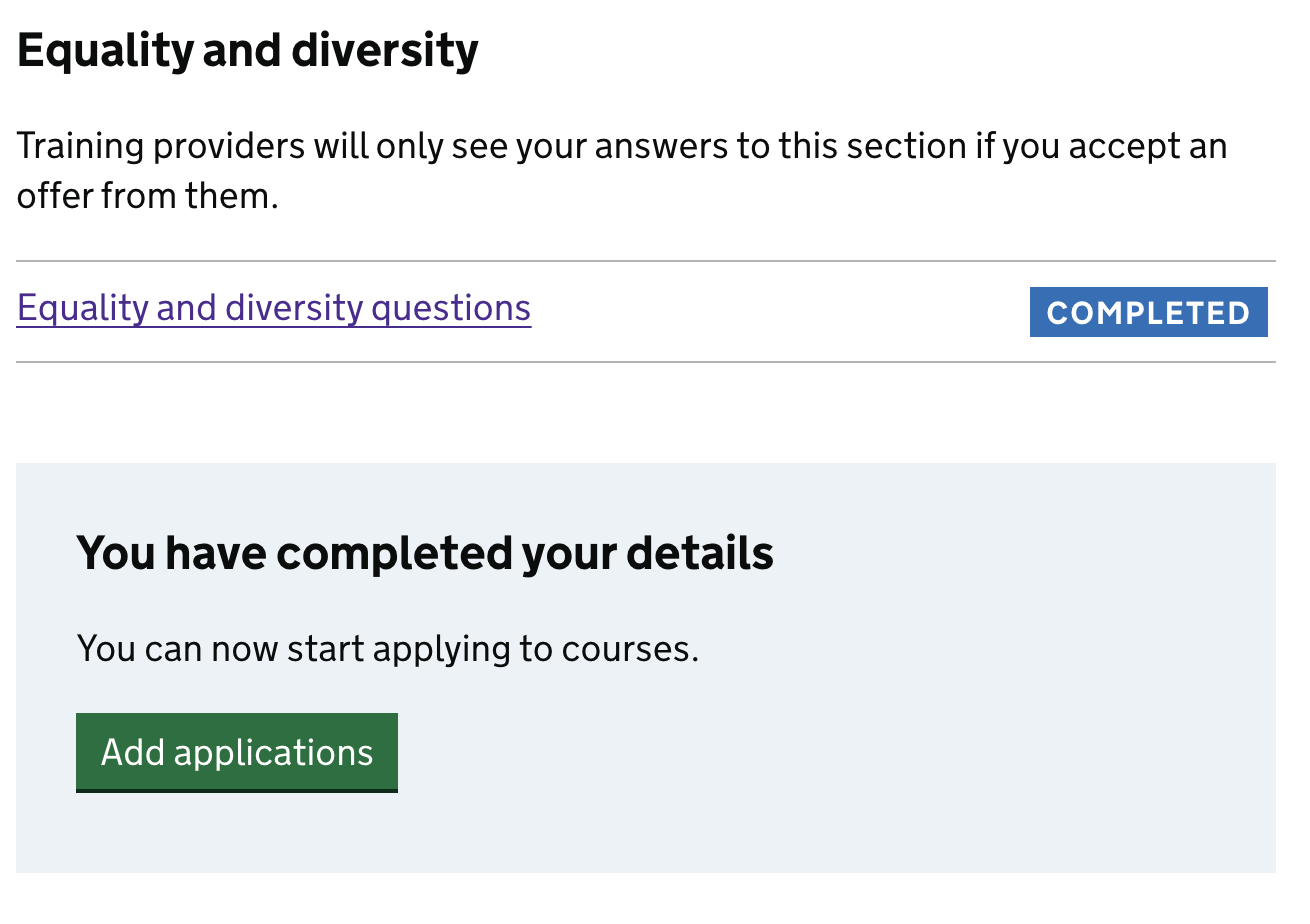
Link on the ‘Your details’ tab after completing all sections of the task list
Once a candidate has completed their details, we also render a link at the top of the page. This links them to the ‘Your applications’ tab. The link will disappear once the candidate has added 4 application choices.
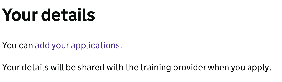
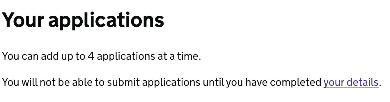
Link on the ‘Your applications’ tab when a candidate has not completed their details
We also render a link on the ‘Your applications’ tab which links them to their details. We hide this link once they have completed their details.
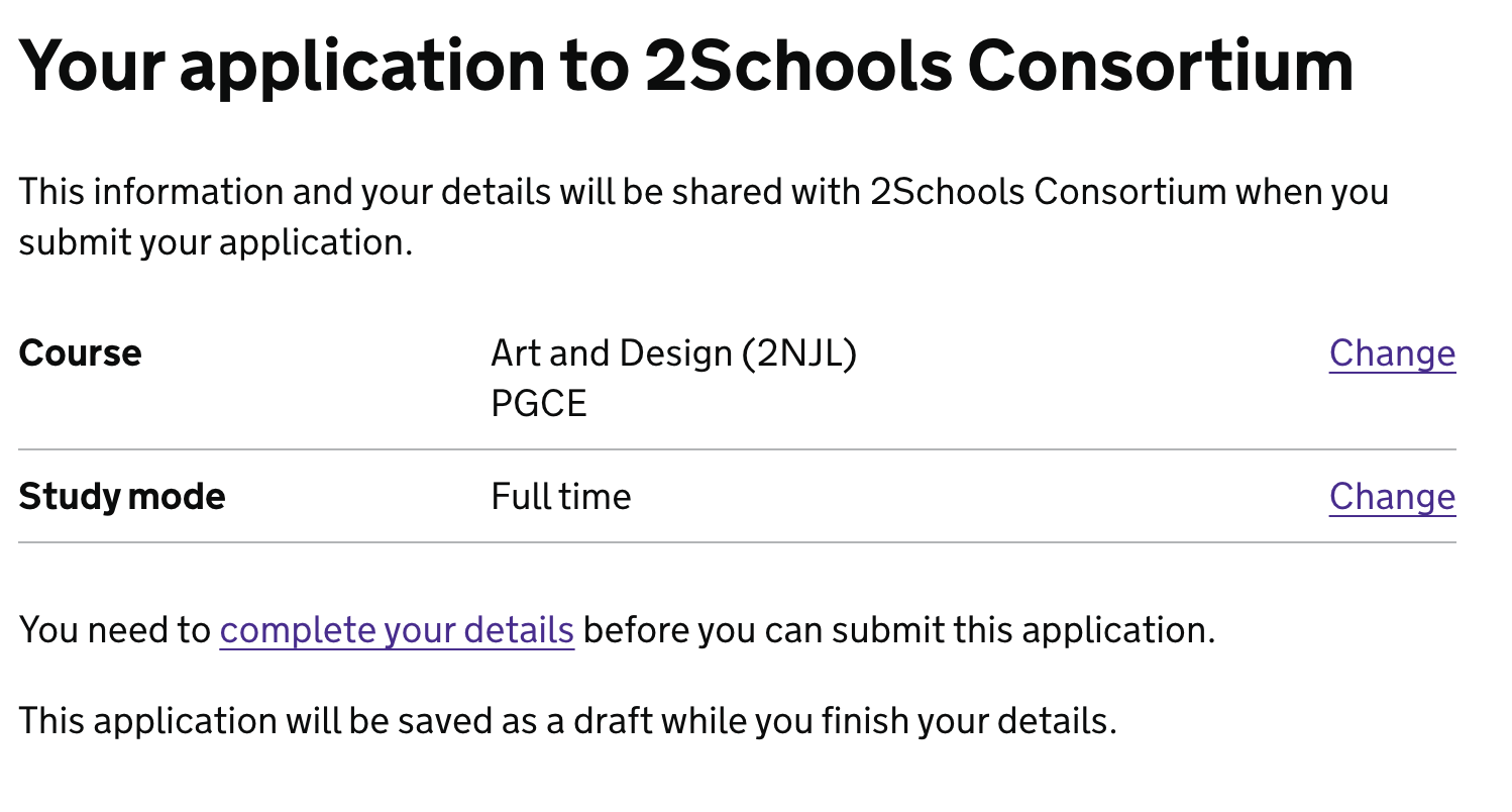
Link back to the ‘Your details’ tab when the candidate has not completed their details
If the candidate chooses their training provider and course but they have not completed their details, they cannot submit their application. We hide the submission button and instead, render content which links them to their details and confirms that their application will be saved as a draft.
User testing
We conducted user research sessions to test this new navigation that has been launched as part of the 2023 to 2024 recruitment cycle. We received some good feedback that allows us to understand the issue better.
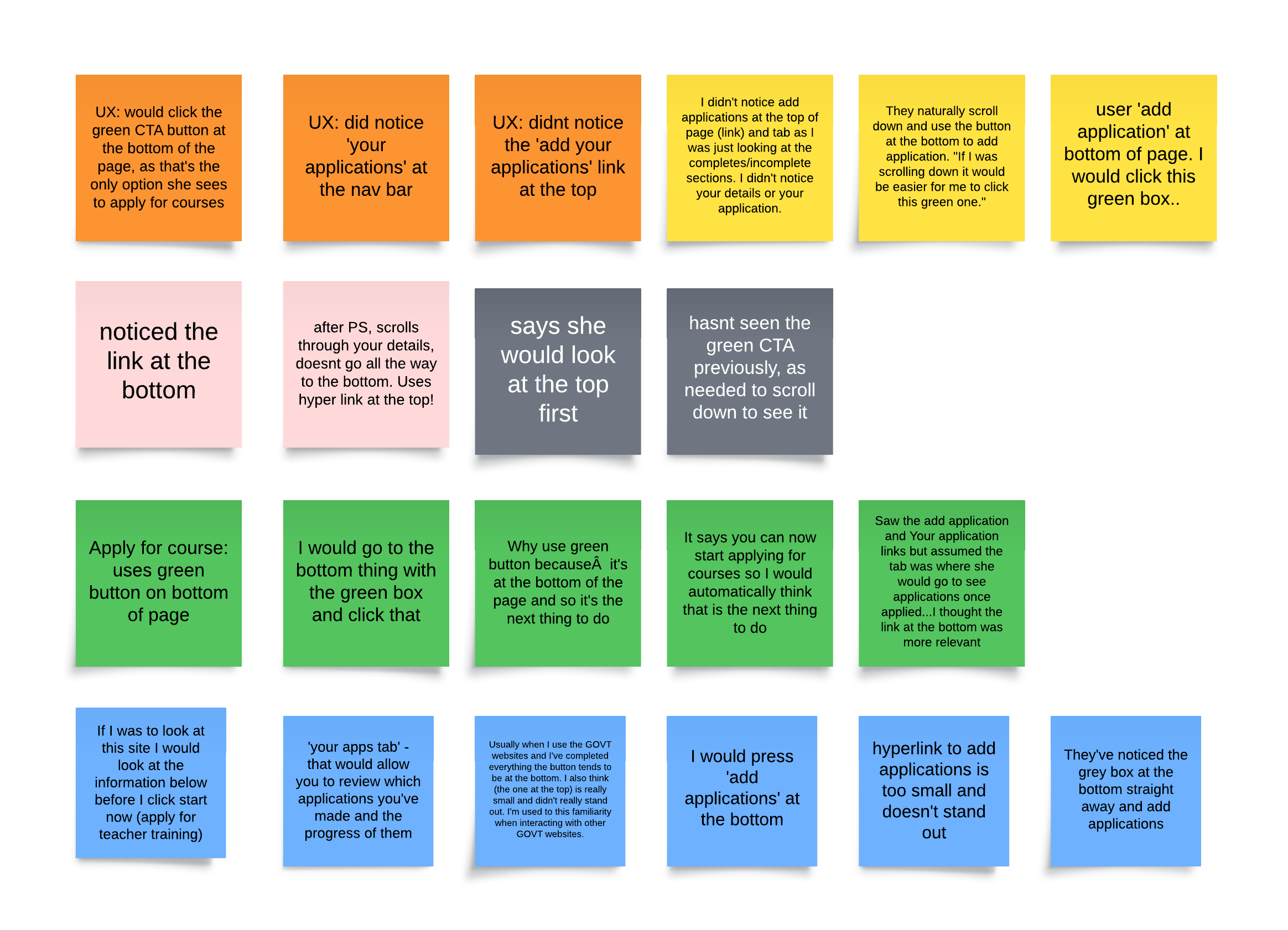
Most users said that they did not notice the ‘add application’ link at the top of the ‘Your details’ tab, as it is not very prominent and gets lost.
Some users did not notice the green CTA button at the bottom of the page as they have not scrolled down. When they did notice it they thought it’s very useful and it’s a ‘natural next step’ to adding an application.
Some users expected to see the green CTA at the bottom, as they have seen the same pattern on other government websites.
Further considerations
We will be iterating these designs further, things we want to consider are:
- moving the blue container and button to the top of the ‘Your details’ tab
- making the link to the ‘Your applications’ tab more prominent