We added a navigation bar to the candidate interface.
Currently, this only contains 2 items, but we added the navigation bar to enable us to add additional navigation items as we change the application process in future.
This change was made on 8 June 2023.
The issue
We started exploring how we might change the application process to allow candidate to send additional applications whilst waiting for existing applications to be responded to. We realised that this would require having access to both the pre-offer and post-offer interfaces simultaneously.
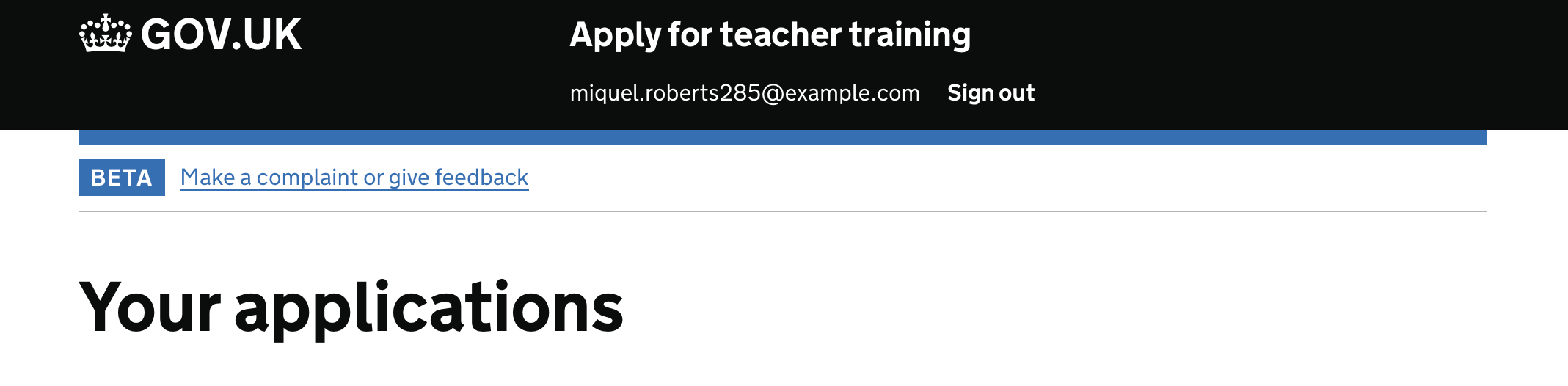
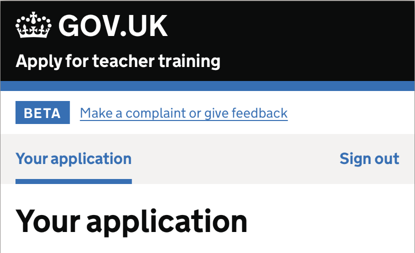
The previous design included the user’s email address and a ‘sign out’ link within the black GOVUK header bar. We could not find a strong user need for always displaying the user’s email address. Research from other teams has also shown in the past that users sometimes do not spot navigation links within the black header bar (although this may be less true for sign out links).
What we did
We re-used the same navigation bar design that was already used on the provider-facing Manage interface.
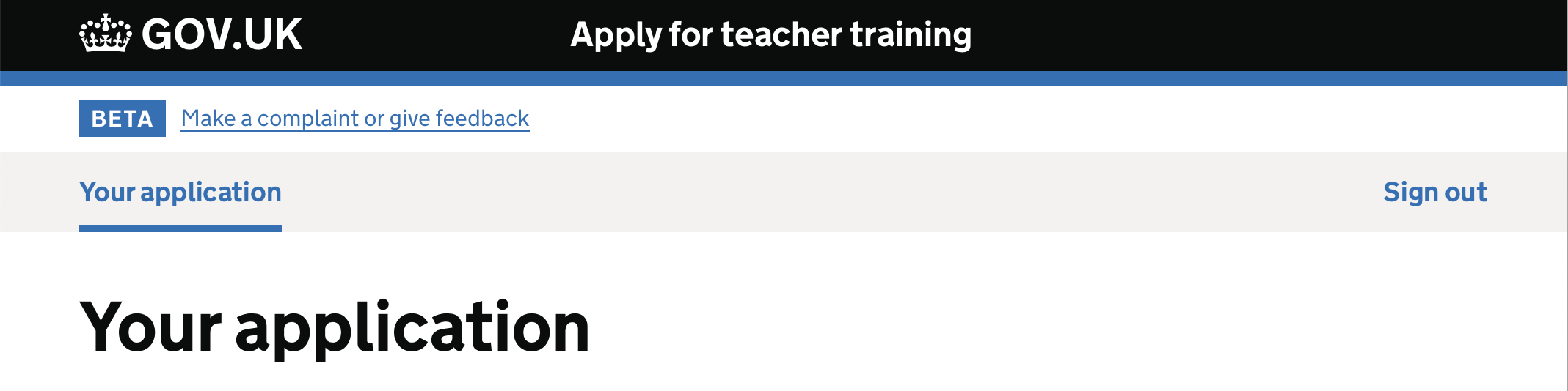
Initially, the navigation bar has a single item on the left labelled ’Your application’. This changes to ’Your offer’ if a candidate accepts an offer.
If the user has submitted their application and applied for more than one course, the label is pluralised to ‘Your applications’, matching the page title, as at this point we now treat each course as a separate application.
The ‘Sign out’ link is right-aligned on the right hand side of the navigation bar.
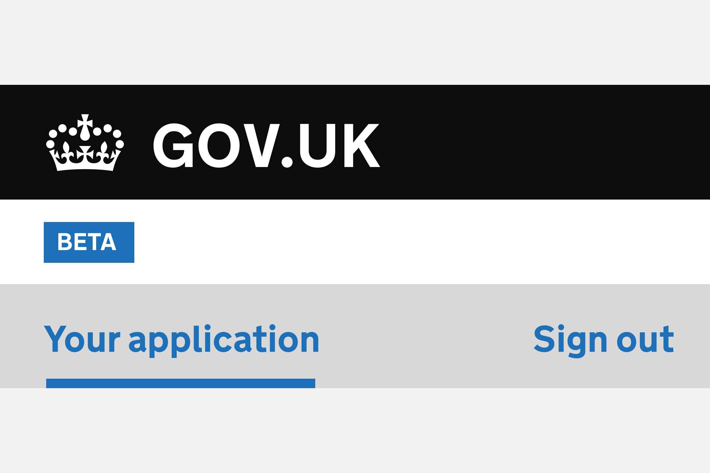
The black GOVUK header bar has been simplified to just show the crown, GOV.UK and the service name. This now takes up less vertical room.
The border under the beta banner was removed. This is no longer needed as separation from the rest of the page, as the navigation bar does this.
The blue GOVUK brand border beneath the black GOVUK header was made to stretch to the width of the screen, for visual consistency with the navigation bar.
Mobile view
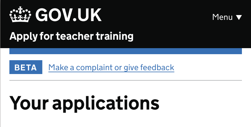
Previously, the email address and Sign out link used the standard Header with service name and navigation component from the GOV.UK Design System.
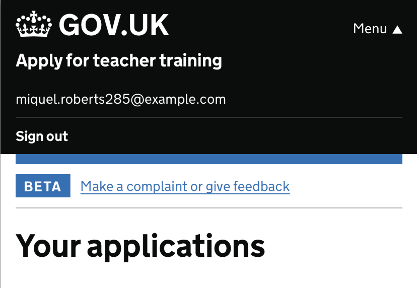
This meant that on mobile views, a ‘Menu’ button appears which toggles the display of the 2 items. Initially, the email address and sign out button is hidden:
Clicking the menu button revealed the email address and sign out link:
In the new design, there’s no need for any collapsing of items into a menu button toggle:
Further considerations
The pronoun ‘Your’ was included as ‘Application’ has multiple meanings and would be ambiguous if used on its own. In future it may be worth considering alternative words or phrases.
The GOV.UK One Login service team are currently exploring a new header design for government services. This could potentially be adopted in future.