We previously investigated free-text responses we may get from Apply. Where the free text response cannot be mapped and we (currently) require an answer from a fixed list, we will ask our provider users to correct the answer.
This is an interesting design challenge - we want to show the user the answer, but not imply that the candidate has done anything wrong.
For our first iteration, we’re going to show the candidate’s answer in the summary list as normal, but with extra styling to highlight the invalid data and that providers need to do something.
The styling has been a collaboration with other teams in DfE Becoming a teacher - where there are some common needs about showing missing, changed, or invalid answers.
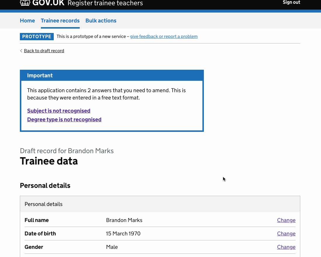
Showing invalid answers on summary pages
Summary pages get a notification banner if an answer is not recognised.
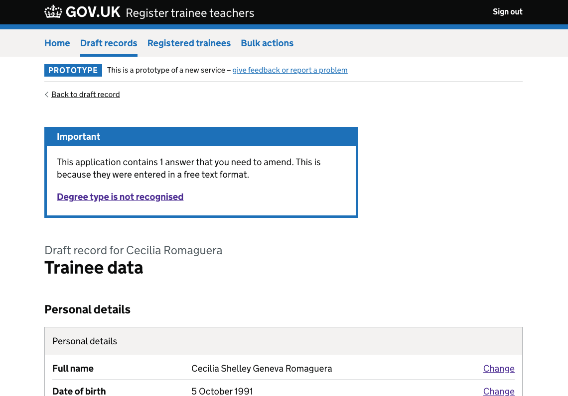
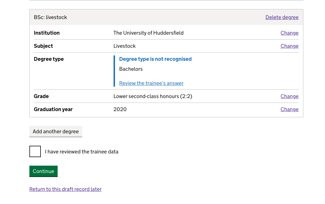
In the summary card, the candidate’s answer is shown inset with a message that the provider needs to review it.
When the provider continues through to review the answer, we show a similar banner and inset on the form field:
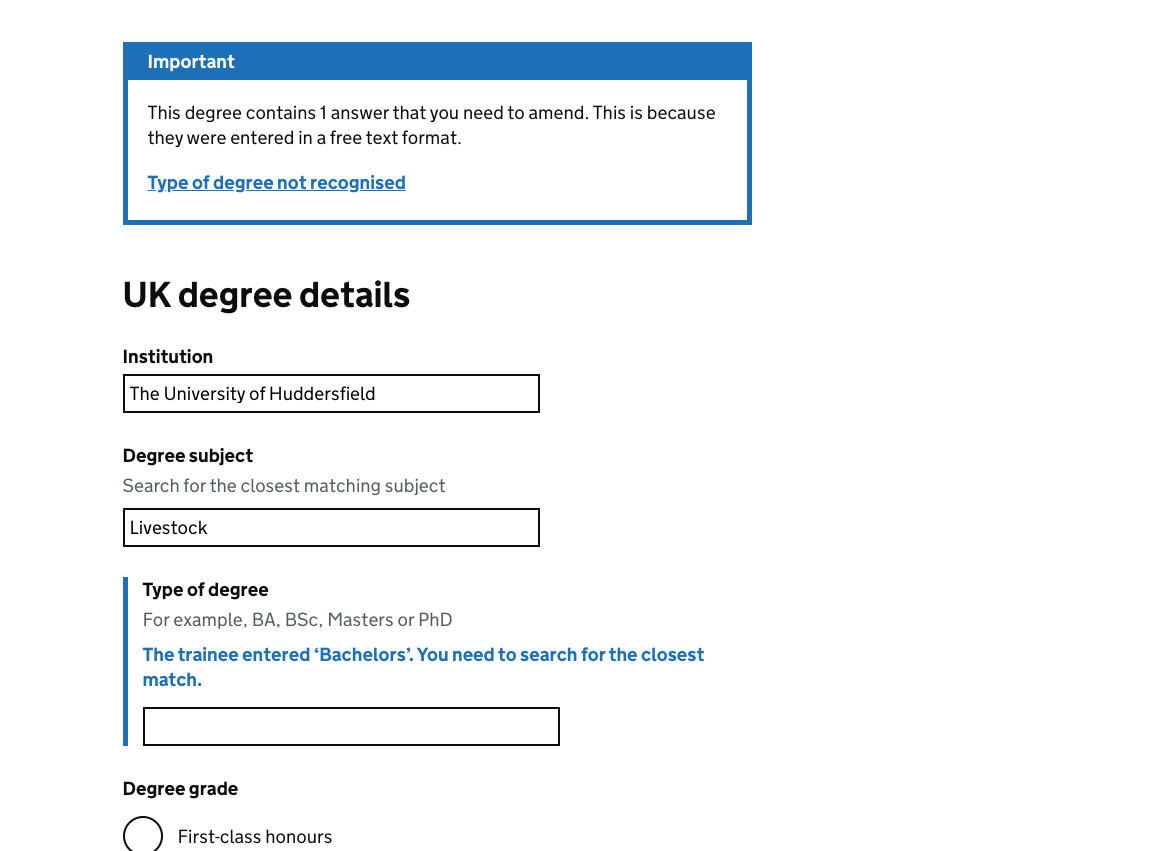
The styling of these inset messages is very similar to the error message style.
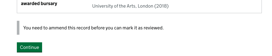
Validating invalid answers
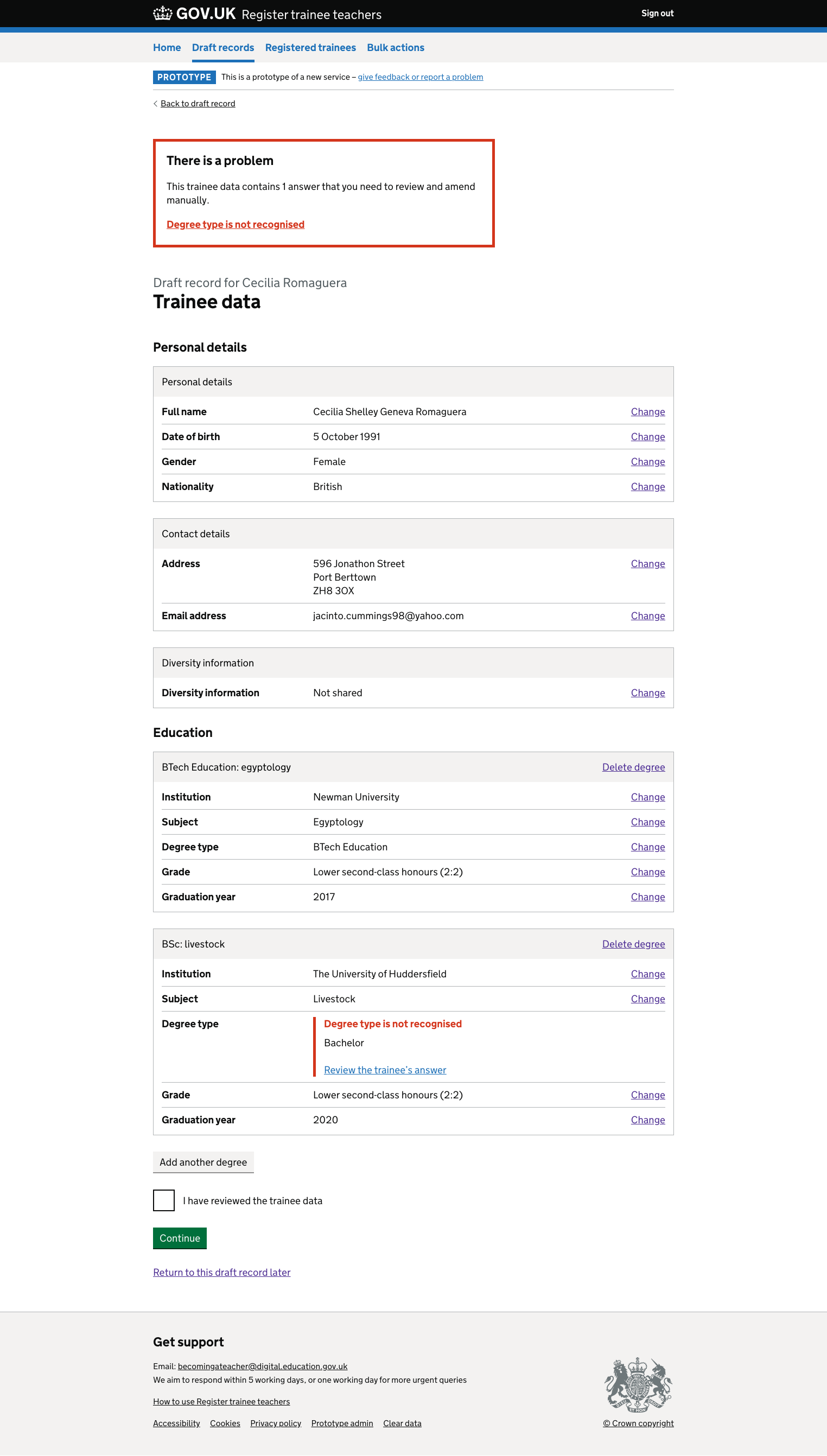
Providers must fix the invalid data in order to mark a section as complete. If they attempt to mark the section as complete without correcting the data, the notification banner and inset change to use error styling:
Video of invalid answers pattern
How this has tested
The pattern seems to be working well to help highlight answers the provider needs to review. Our users seem clear what’s being asked of them and understand that this is a computer translation issue rather than the candidate making a mistake or doing something wrong.
We’ve seen several users miss the banner on first pass - we think this is a case of banner blindness and are considering what, if anything, to do about it. As we have clear validation, we’ve not seen any cases where this has been a blocker to users. After they’ve seen this pattern in use once, we’re also confident they’ll be able to use it for future applications.
In an earlier iteration of this pattern, we tried hiding the checkbox until invalid answers had been fixed:
This tested really poorly - the participant missed the banner and clicked continue. This returned them to the task list where the section still had the status ‘review’ - but it was not clear what they needed to do next. They opened the section to try to review it, and then clicked continue again. Keeping the checkbox and showing clear validation messaging if users attempted to confirm without reviewing the invalid answers has tested much better.