In this iteration we:
- removed the horizontal navigation in favour of sections in the page
- took the course content status labels and reused them on course pages
- updated the ‘About your organisation’ page to be more like a course
- added details we received from UCAS to the ‘About your organisation’ page
Removing horizontal navigation
The switch from tabs to horizontal navigation did not have the desired effect. This bar now sits strangely on the page and we considered moving it to the top – but that would further deprioritise the ‘About your organisation’ journey.
Instead we chose to be explicit: Do this, then do this.
Status labels
The status labels in the course table tested well. They’re a good indicator of empty/draft/published.
For consistency this design adds them to ‘About your organisation’ and course pages. The draft status replaces the blue box (‘You have unpublished changes’).
The draft status was switched from blue to orange. This colour better communicates this intermediate state. “It’s in amber”
Making ‘About your organisation’ like a course
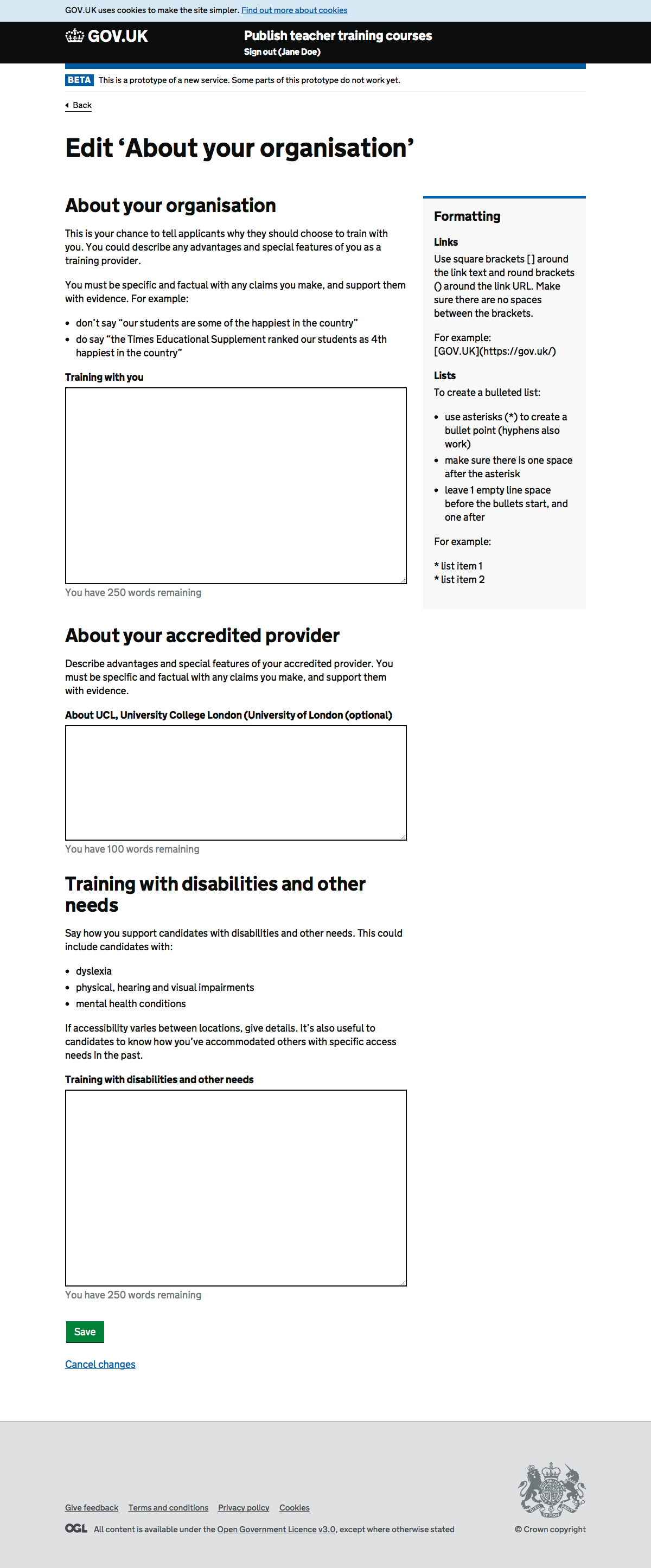
The previous design had two calls to action on one page. One for saving, another for publishing. With the publish button high up on the page there’s a risk users might use this rather than save, although we did not observe this in research.
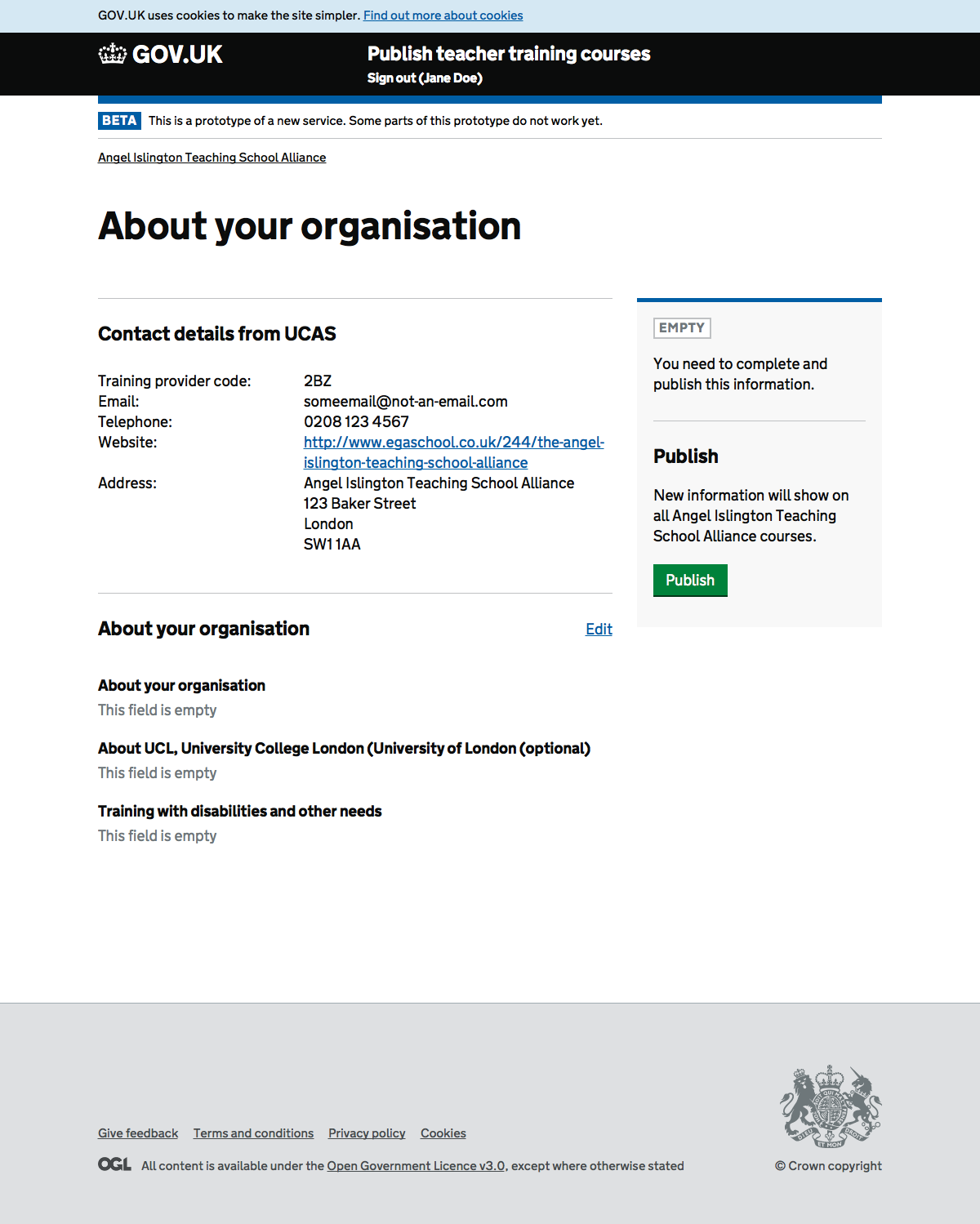
We also needed to show what information we’d imported from UCAS about this organisation (eg contact details). There was not an obvious place to put this.
The new design creates an overview page containing a summary and the publishing workflow. Editing is moved to a child page, separating the save and publish actions in the same way a course does. The design is now consistent with courses. On the overview there is space to put imported UCAS data, like on a course.
Screenshots#
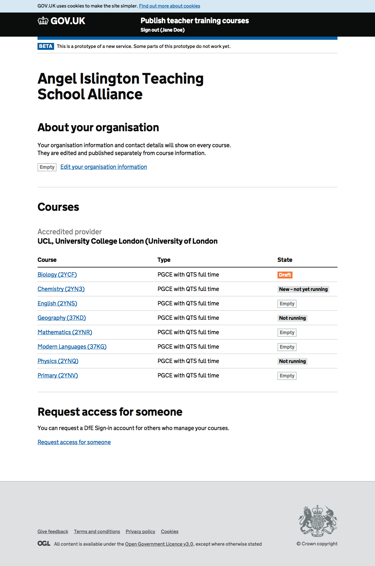
Organisation#
About your organisation#
Edit about your organisation#
Course#
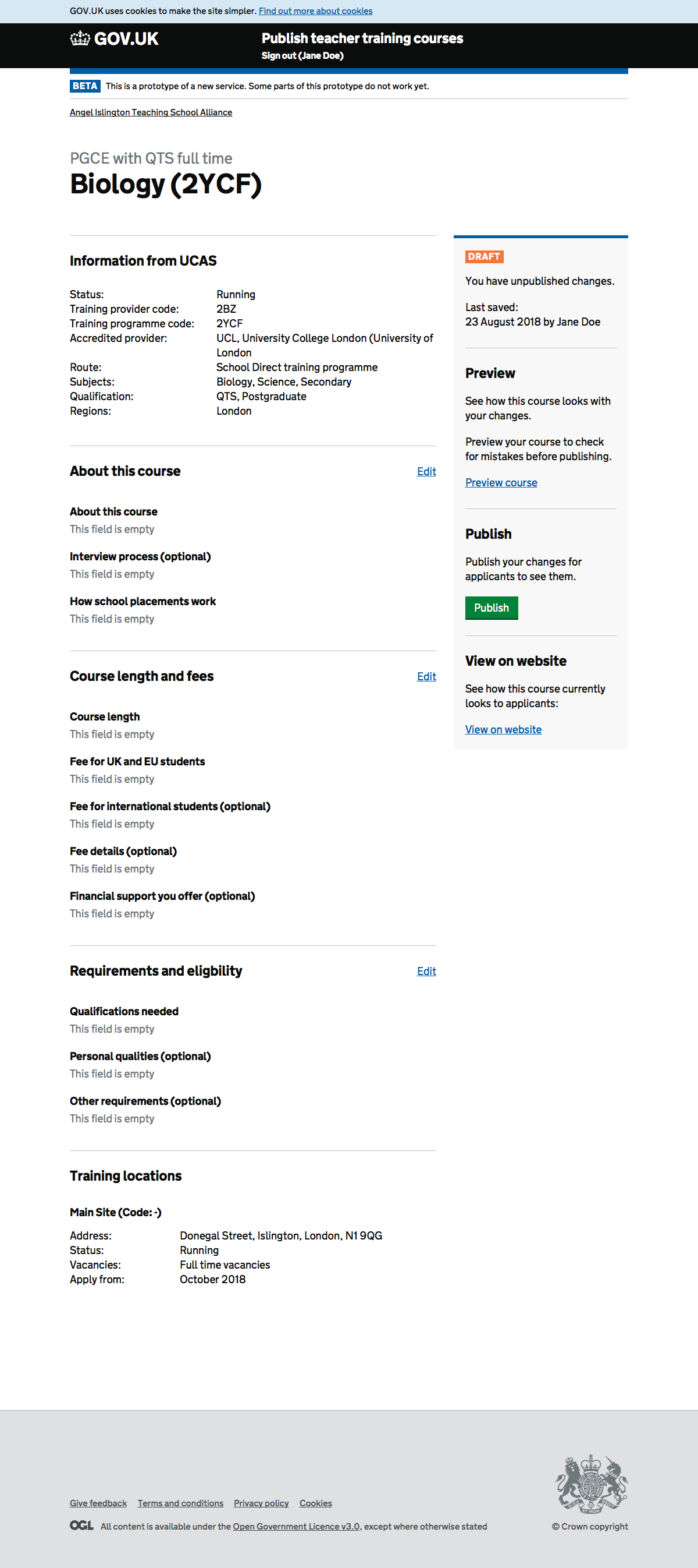
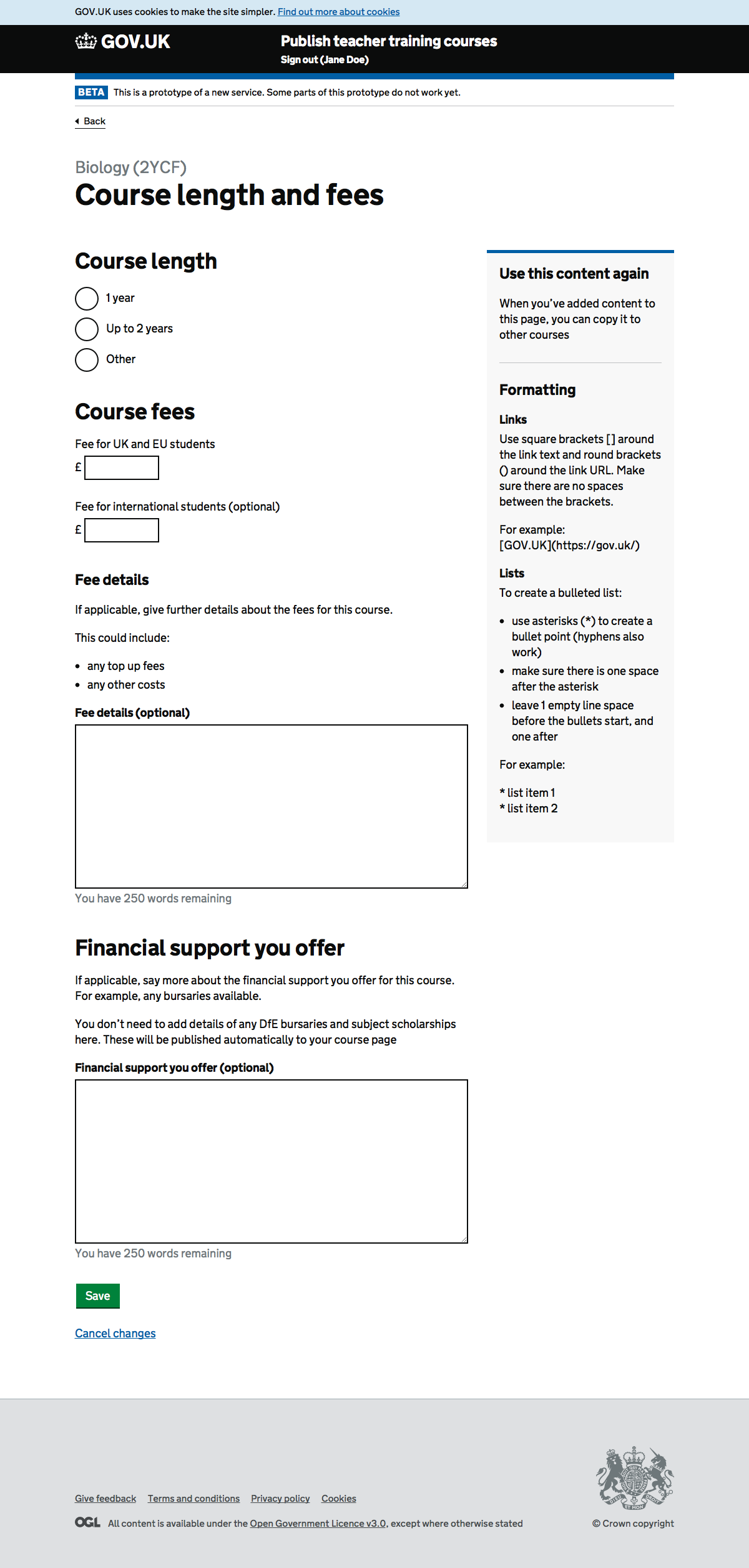
Note the similarity with ‘About your organisation’ and the orange draft status
Preview#
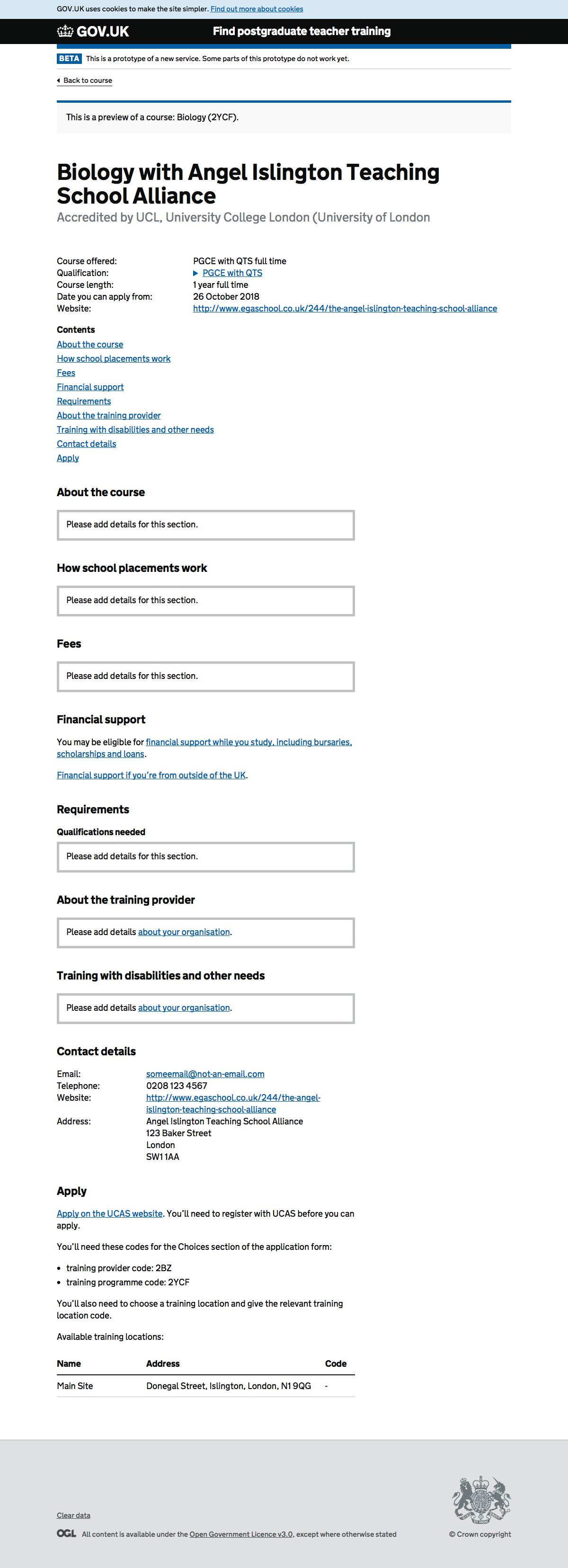
Course length and fees#