We have made several improvements to the design for organisational permissions and user management.
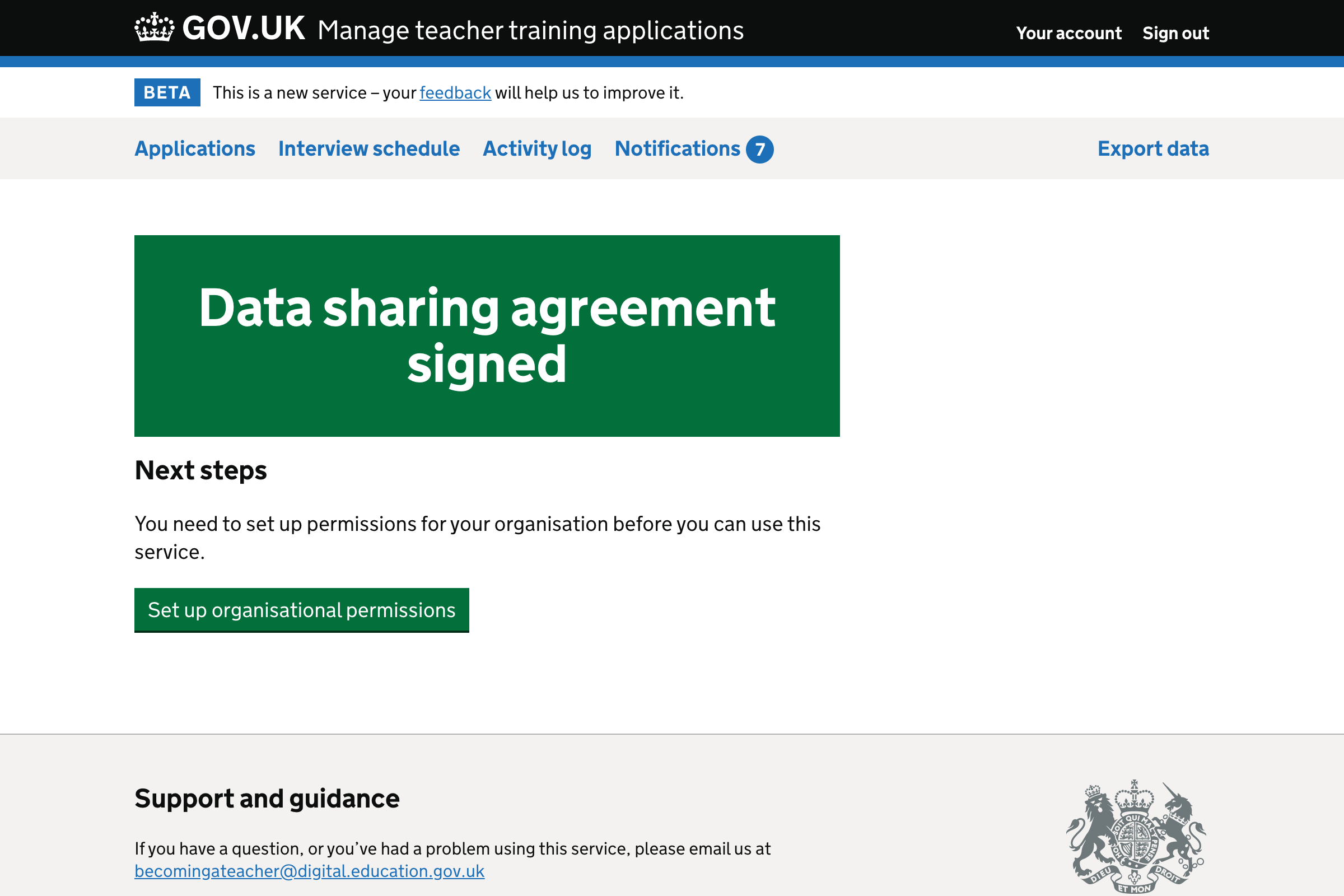
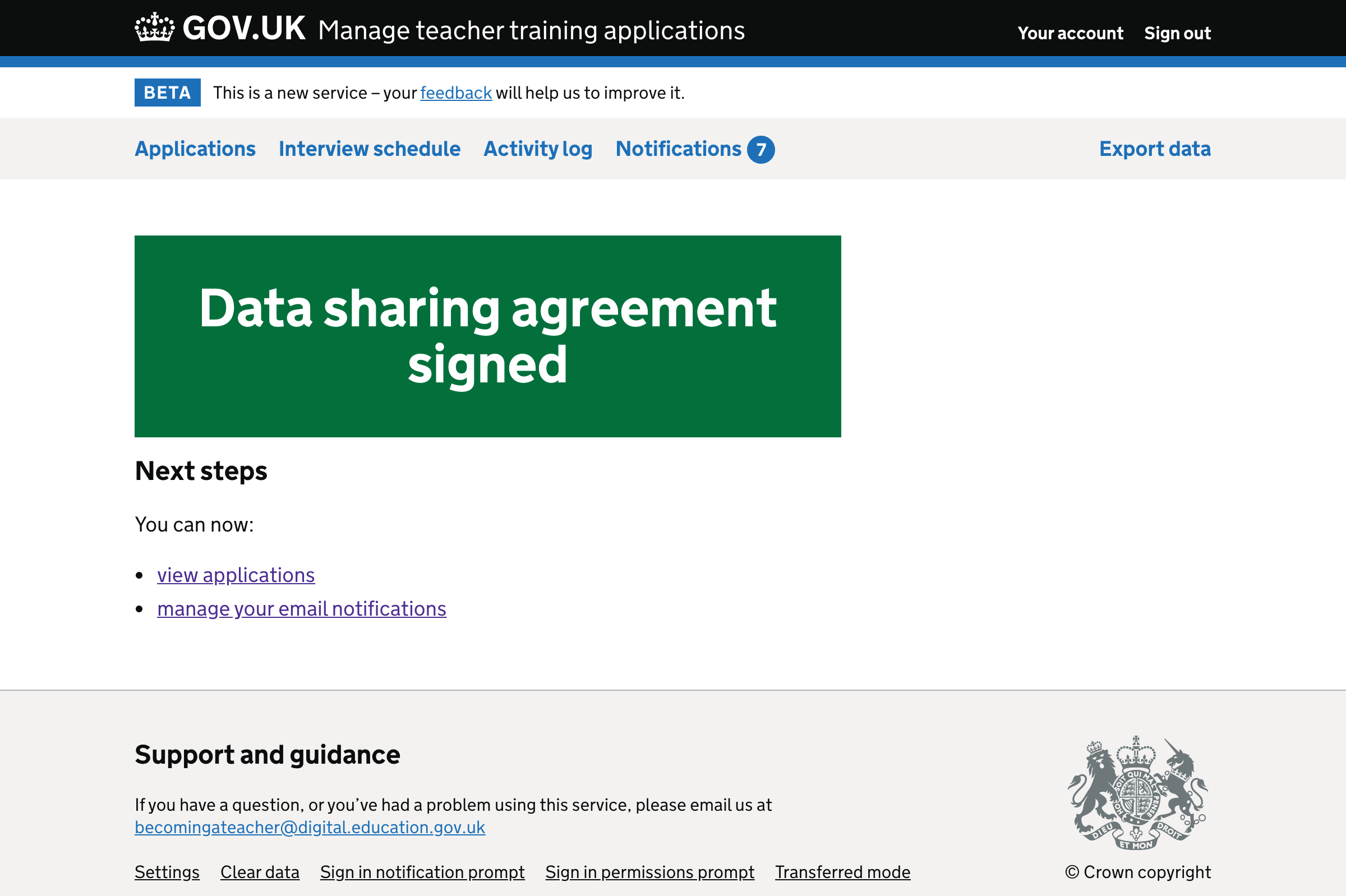
Data sharing agreement confirmation page
The content is now clearer and more concise. There’s no need to say that the user “successfully signed” when we can just say “signed”.
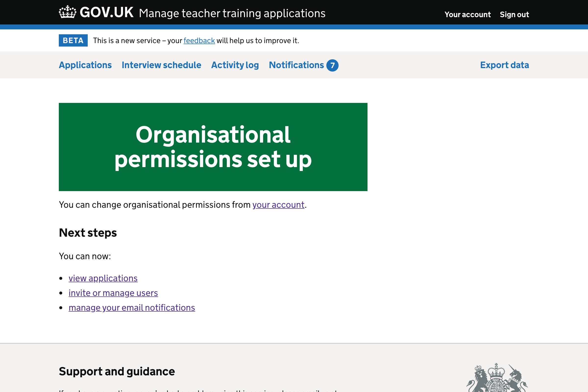
If the user can manage organisations and there are organisational permissions to be set up, the page will tell them that the organisational permissions are next.
We removed a sentence saying that “we’ll guide you through” setting up organisational permissions as it isn’t necessary.
If the user cannot manage organisations or there are no organisational permissions to set up, they instead get options for next steps. These are now given in bullet points.
We added a link to manage email notifications, as it’s something which users may want to do next.
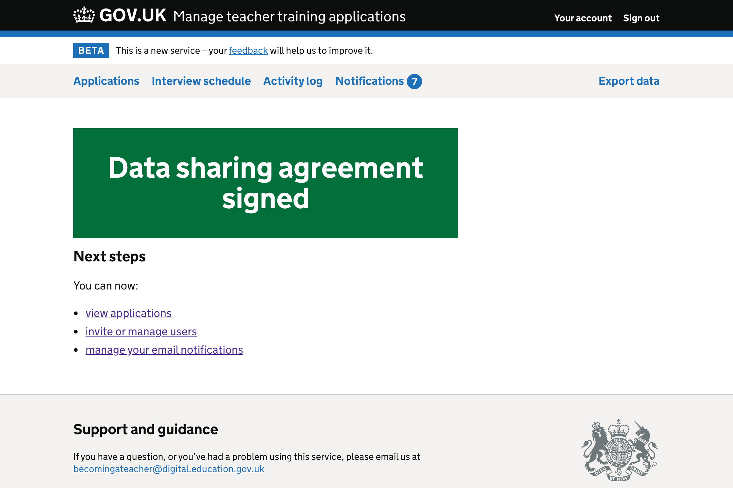
If the user cannot manage users, we only mention viewing applications and managing email notifications.
Setting up organisational permissions
Start page
We’ve made the content more concise. We no longer say what kinds of permissions will be set, as the user will see this on the next page.
We’ve also removed a paragraph about what will happen after permissions have been set. We think that’s too much information for users at this point.
It’s important to list the organisations the user belongs to, as well as their partners. This helps users understand what they’ll need to do next.
If the user belongs to multiple organisations, we now use subheadings to separate them.
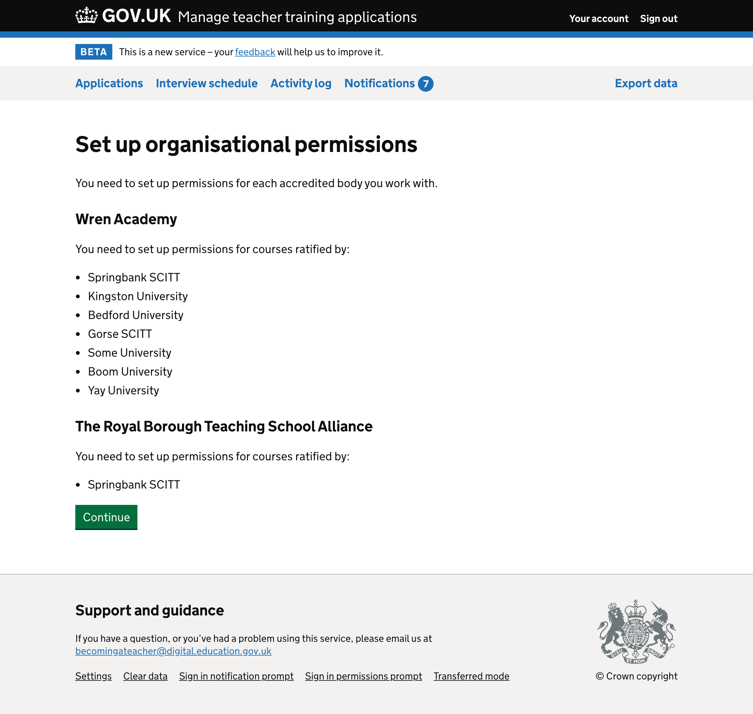
If the user belongs to only one organisation, we do not need to use the subheadings.
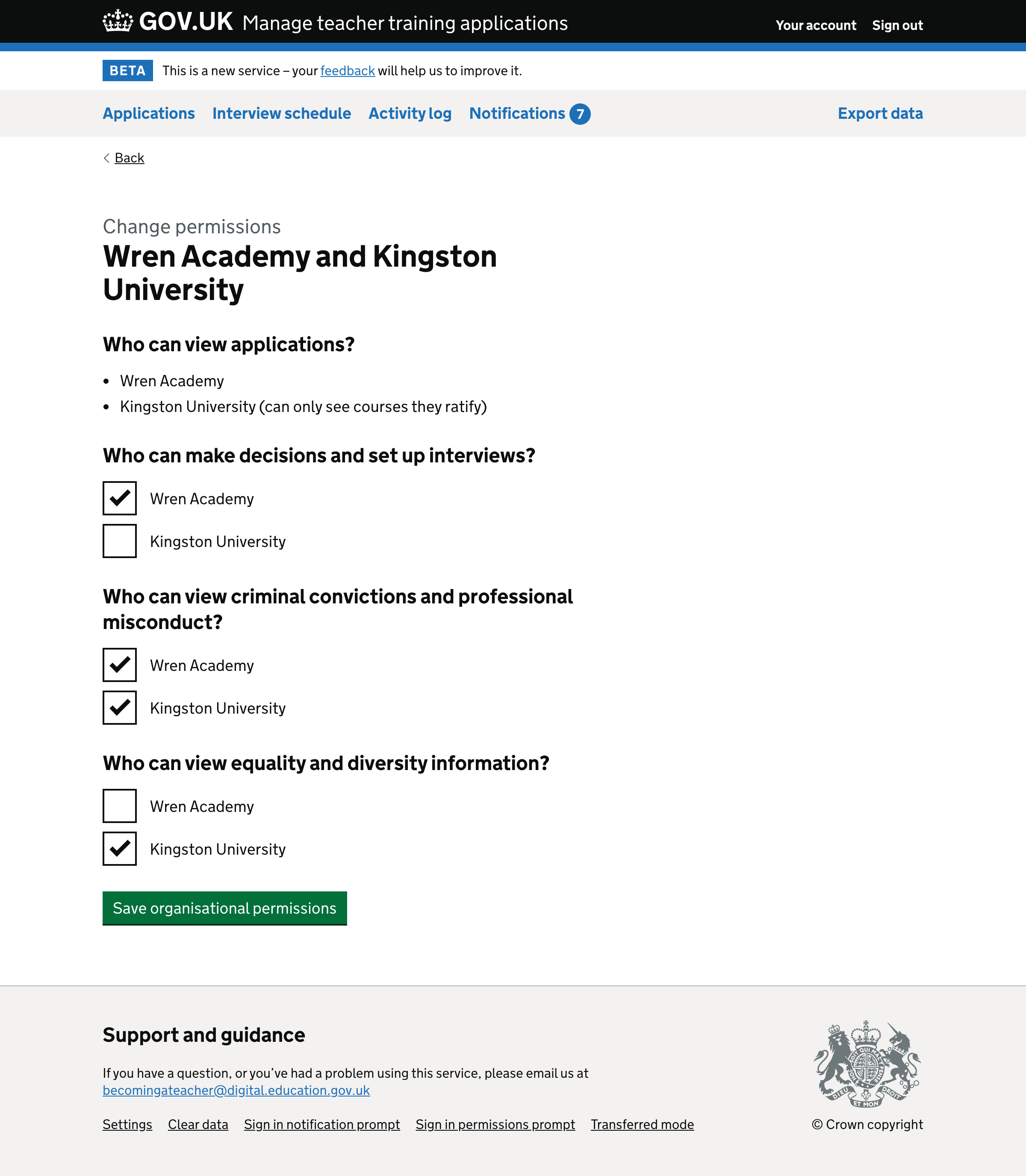
Organisational permissions form page
We’ve changed the caption so that we’re consistently using the term “organisational permissions”.
For the labels, we’ve changed:
- “safeguarding information” to “criminal convictions and professional misconduct”
- “diversity information” to “equality and diversity information”
We’ve also removed the hint text because the field legends can now stand alone.
We’ve replaced the tick icons with normal bullet points. This is because:
- on this page we only use tick icons, we aren’t contrasting them with crosses, so they have no more meaning than a bullet point
- the use of a tick may imply that they can be ‘unticked’ or replaced with crosses - it may not be clear to the user that the items cannot be changed
- the heading makes it clear that the list is things the user can do, so there’s no need to further emphasise that it’s a list of positives
Check answers page
We updated the caption and heading to fit changes in the rest of the journey.
We removed the ‘view only’ line because it is not a question for the user to answer. We’re only replaying the things which the user entered on the previous pages.
Instead of having a change link for each permission, we have one for each relationship. This better represents the fact that clicking ‘change’ takes the user back to change all permissions for that relationship.
We’ve changed the label on the button, as we’re distinguishing between organisational and user permissions throughout the journey.
If the user belongs to multiple organisations they’ll see a subheading for each organisation they belong to.
Otherwise, they’ll just see a set of summary cards without the subheadings.
Confirmation page
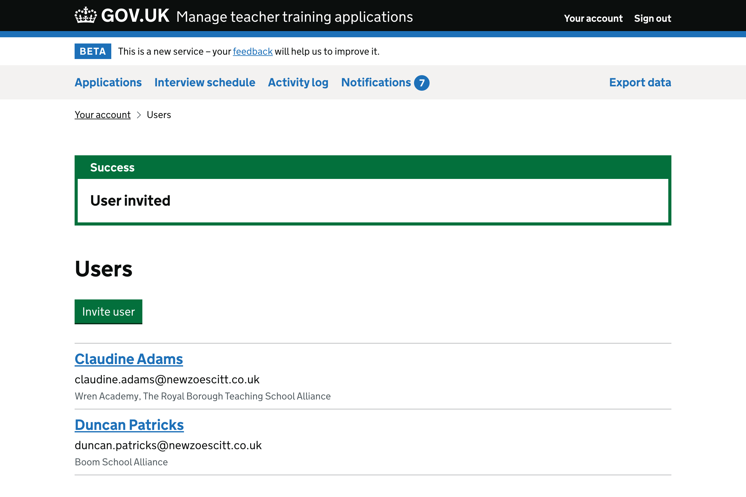
We’re now using bullets, which are easier to scan than a block of text. Only users who can manage users see the ‘invite or manage users’ bullet.
We also added an option to manage email notifications. This is a new feature and it’s something which users may want to do next.
User management
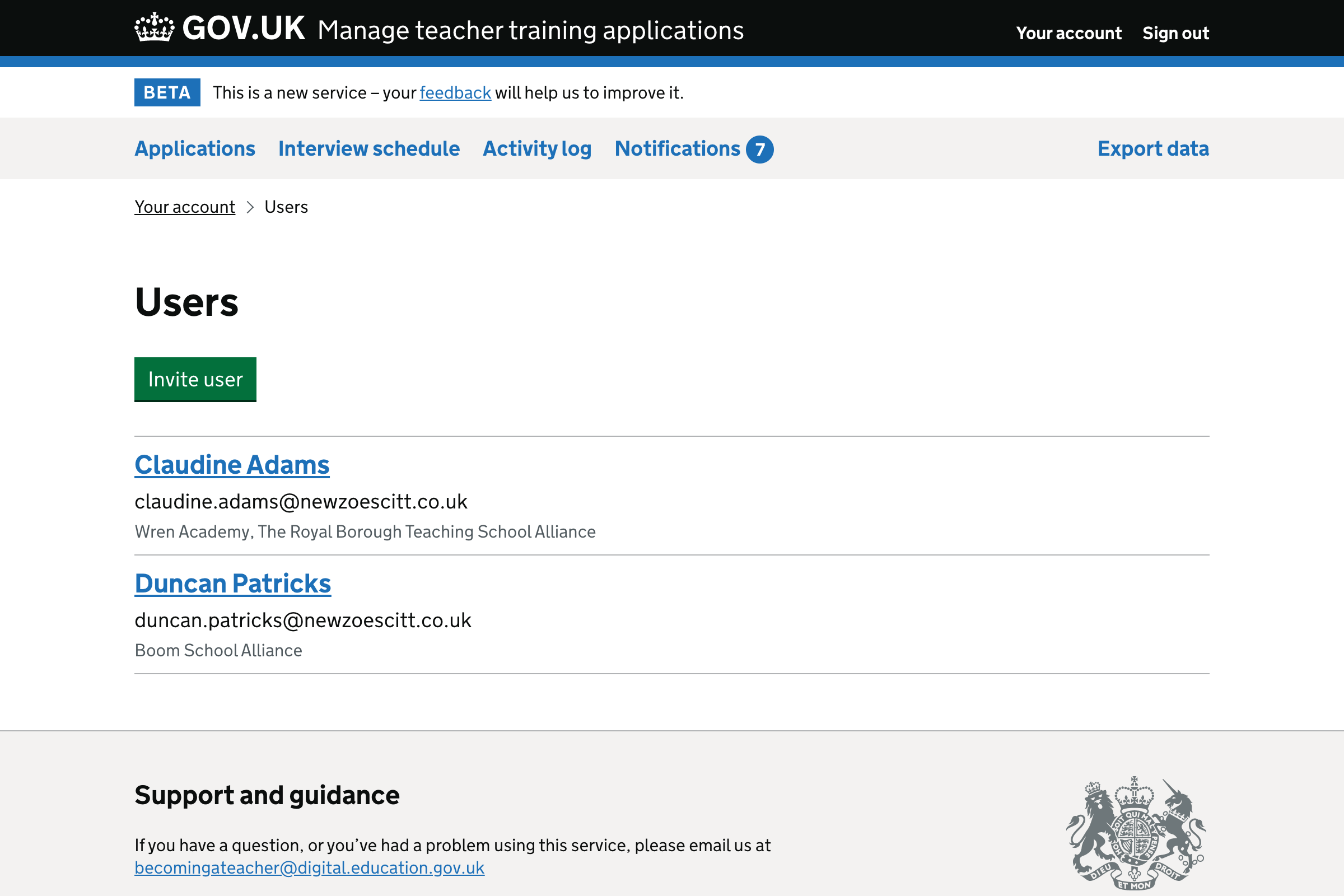
User list
If a user belongs to multiple organisations, we used to show just the first one and say (for example) “and one more”.
Now we’re just going to list them all as there’s plenty of space to do so. The full list may be helpful to users.
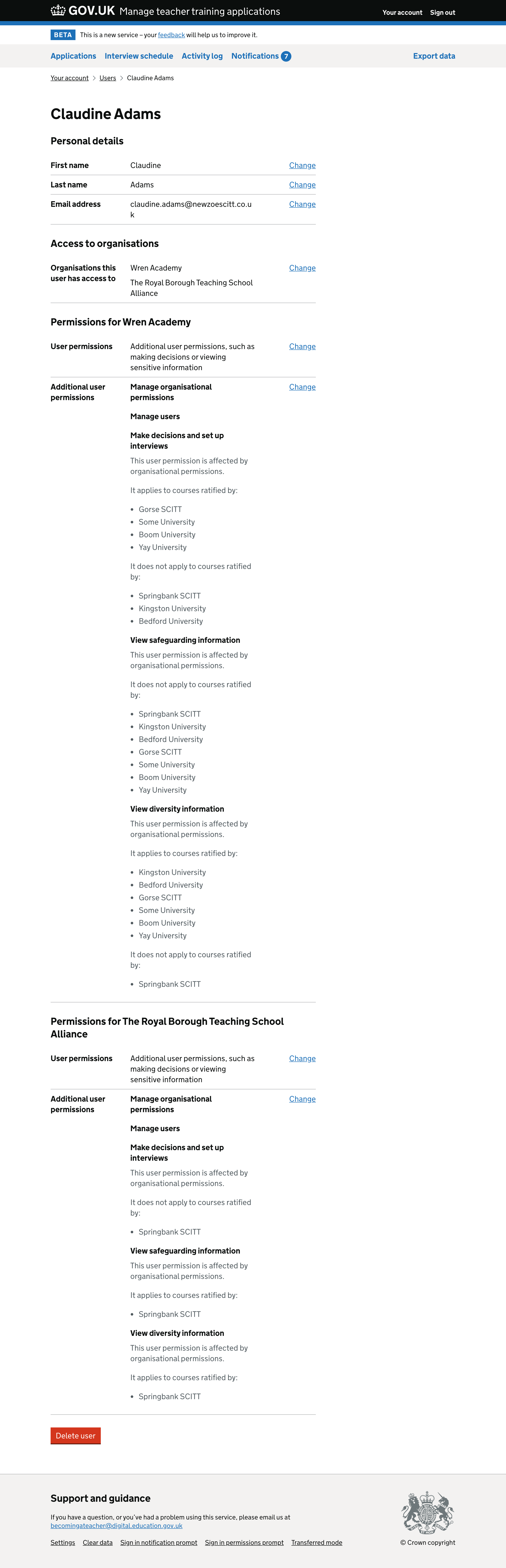
User details
We added subheadings to split up this long page. It makes it easier to see permissions for each organisation you belong to.
Inviting a user
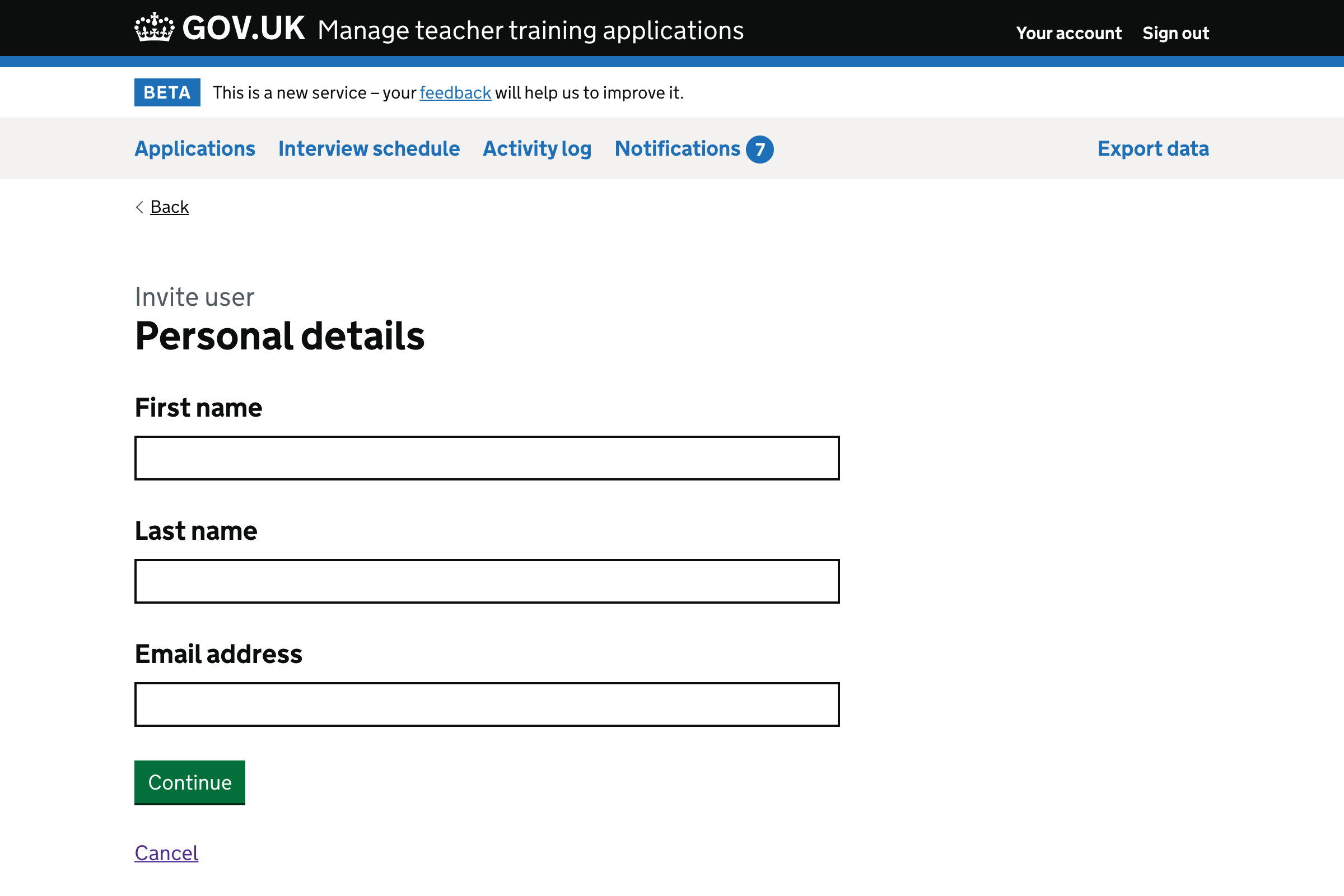
We added a cancel link to each step of the flow. This is standard throughout the service.
Personal details
We changed the h1 to ‘Personal details’ as that’s what we call this information elsewhere.
Email address is now the third field, after first and last name. Again this matches how we present these labels in other parts of the service.
We also removed the warning text which told users that “anyone you invite to your organisation will be able to view all applications”.
We did this because we address it better on the ‘user permissions’ page, with a more explicit radio button label. The information is at the point where the user needs to make a decision.
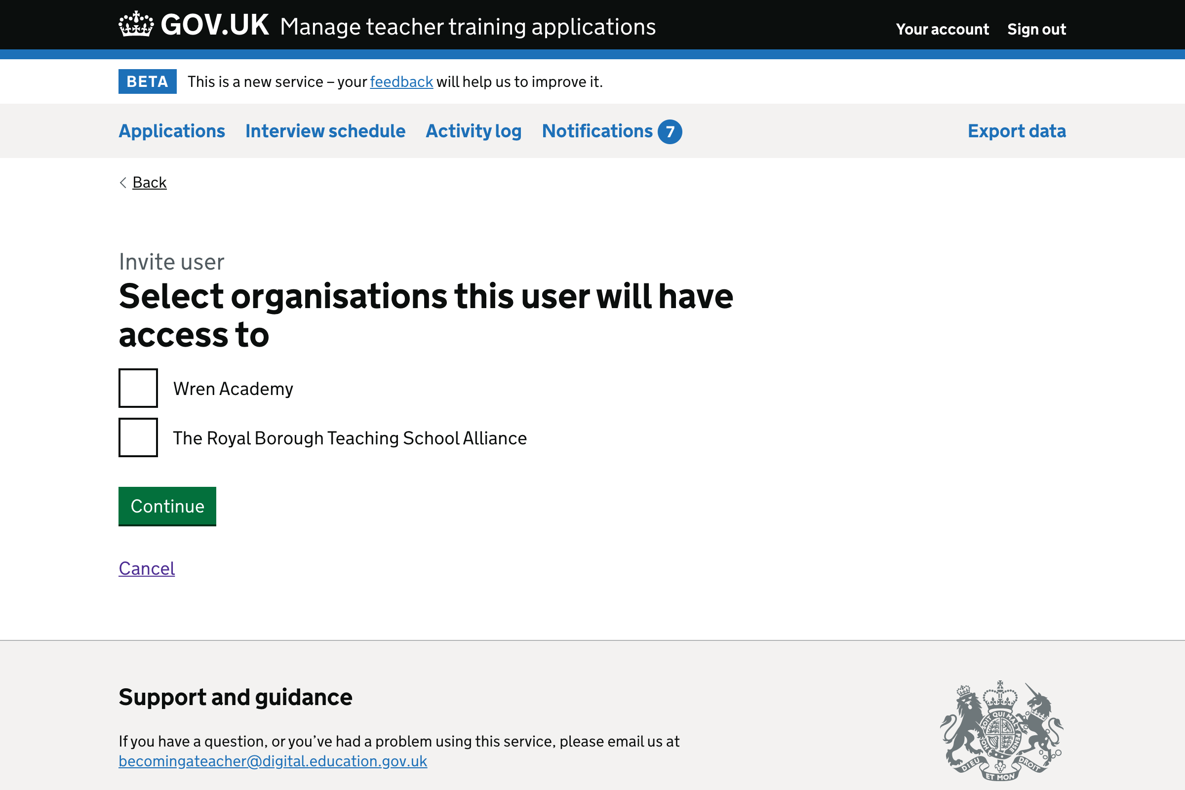
Organisational access
There are no changes to this page, other than the added cancel link.
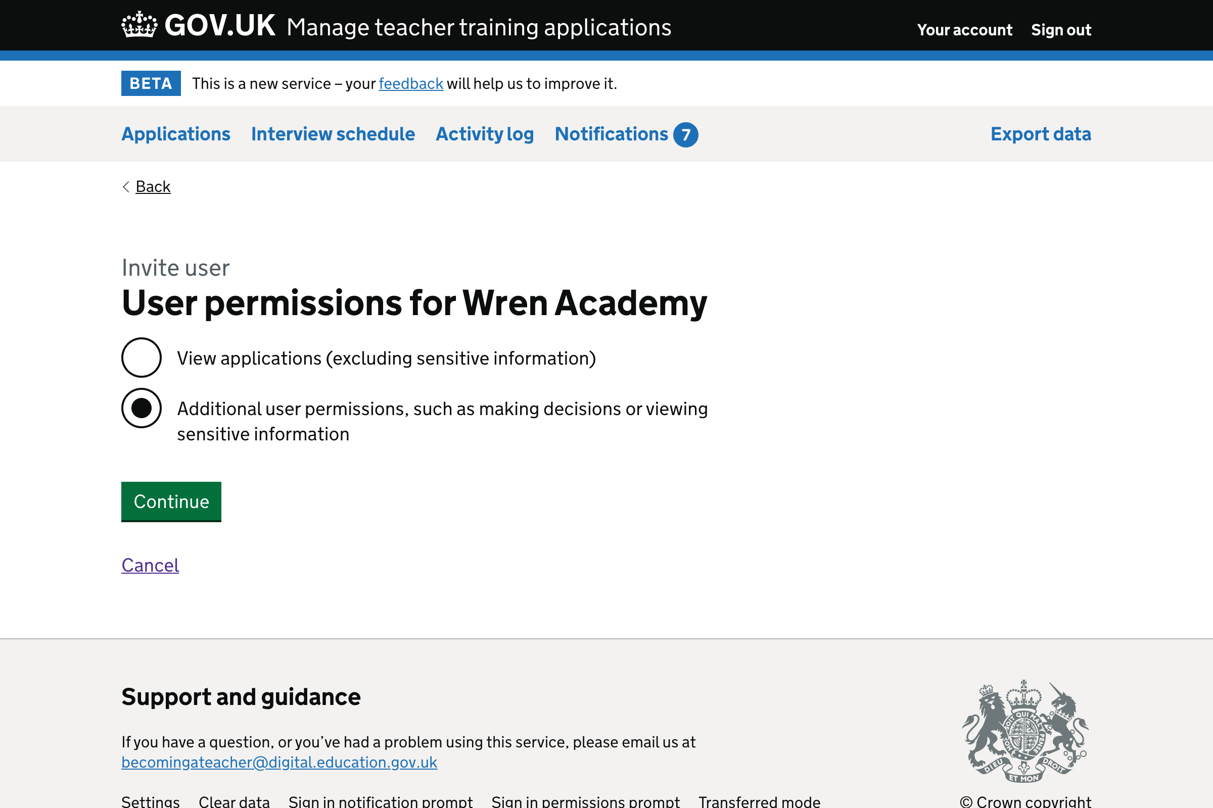
User permissions
We improved the labels so that we no longer need hint text.
We are no longer nesting the additional permissions on this page. They’re now shown on a separate page.
These changes should make it easier for a user to understand what is being asked and make the right choice.
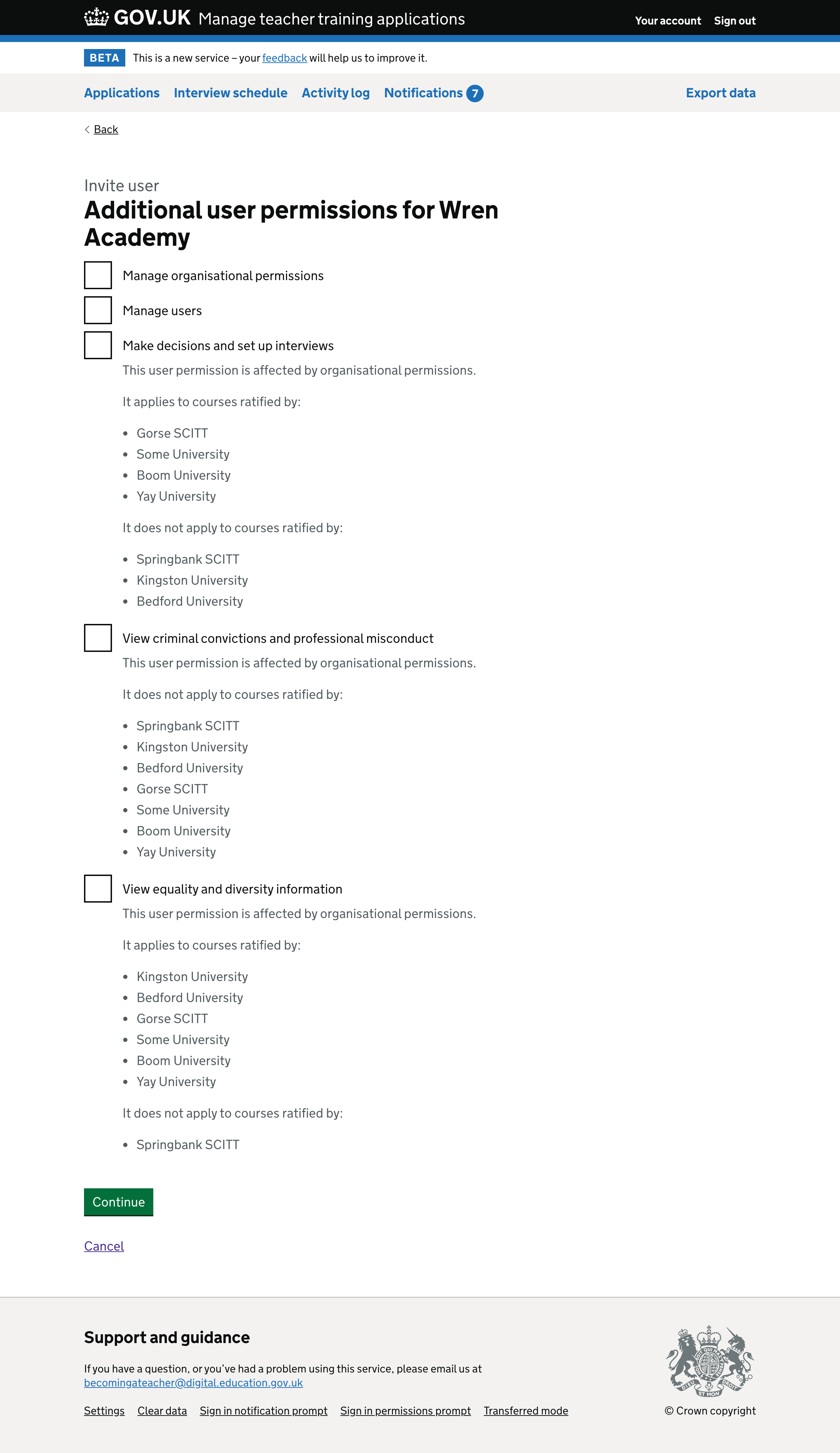
Additional permissions
This is now on a separate screen to make it easier to digest. We’ve made the labels clearer, so we do not need to explain what they mean in the hint text.
We removed the icons. The content should be clear enough to work without them, particularly since it’s hard to distinguish the tick and cross icons from each other.
We also made the hint text clearer by mentioning organisational permissions.
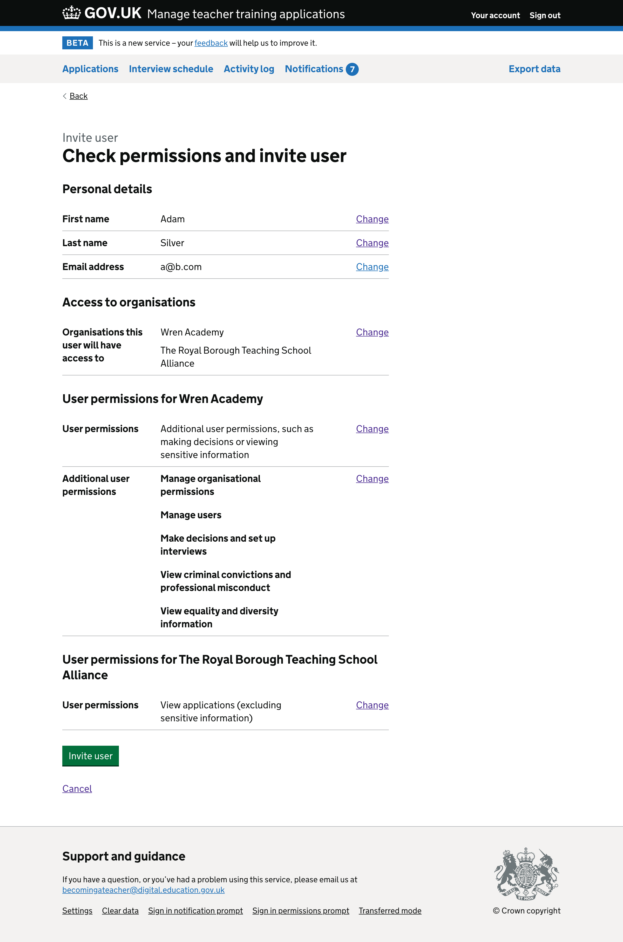
Check answers
We changed the h1 heading to make it clearer that completing this page will result in the user being invited.
The summary list now has subheadings to make it easier to understand.
We removed the warning text saying that we’ll email the user. This is not necessary since the heading and button make it clear we’re going to invite them.
Confirmation message
We updated the success message content. We no longer say “successfully” in the main text since it’s in the banner header.
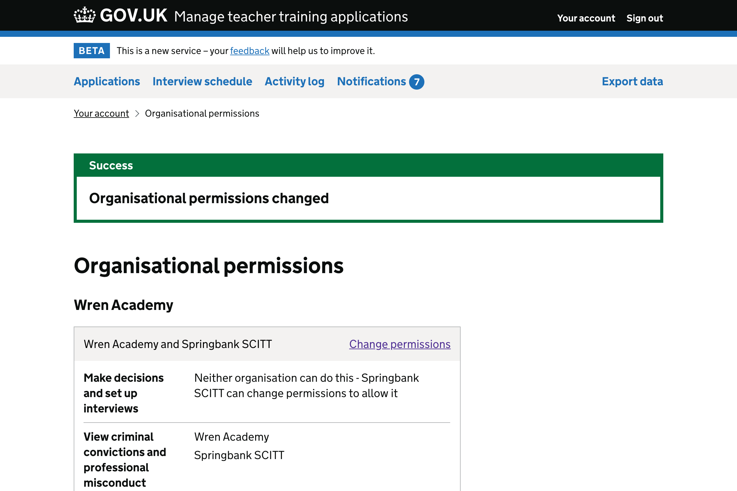
Managing organisational permissions
Organisational permissions landing page
This was a landing page listing each organisation the user belonged to. For most users, who are a member of just one organisation, this page was not necessary.
We will now display all of a user’s organisational permissions on one page. This means we no longer need to explain what this page is for, since we set out the permissions and have change links.
We changed the labels to match the ‘set organisational permissions’ journey.
We removed the tick icons. Since everything which appears gets a tick, they do not add any meaning.
We are no longer showing ‘view only’ permissions. These apply to all organisation relationships and cannot be changed on this page. We want the user to focus on checking the answers they gave.
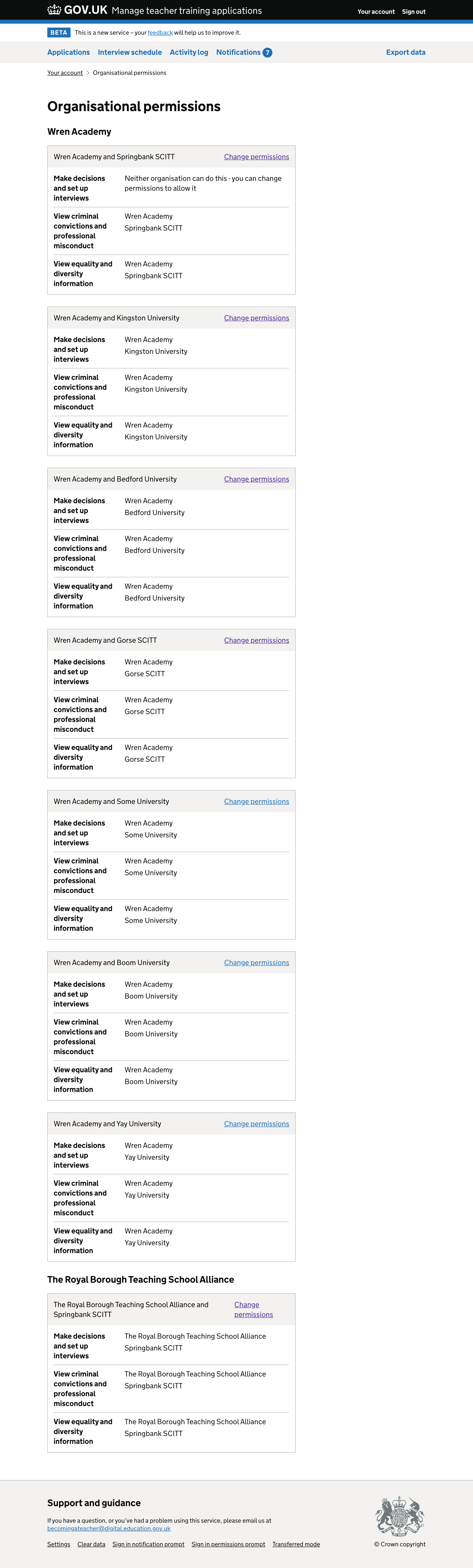
If a permission has not been set up yet, the message will be different depending on whether the user belongs to the training provider or accredited body. Only the former can currently change organisational permissions.
The message will be:
- ‘Neither organisation can do this - you can change permissions to allow it’ - if the user belongs to the training provider
- ‘Neither organisation can do this - [provider] can change permissions to allow it’ - if the user belongs only to the accredited body
The change permissions link will not be shown to a user who belongs only to the accredited body.
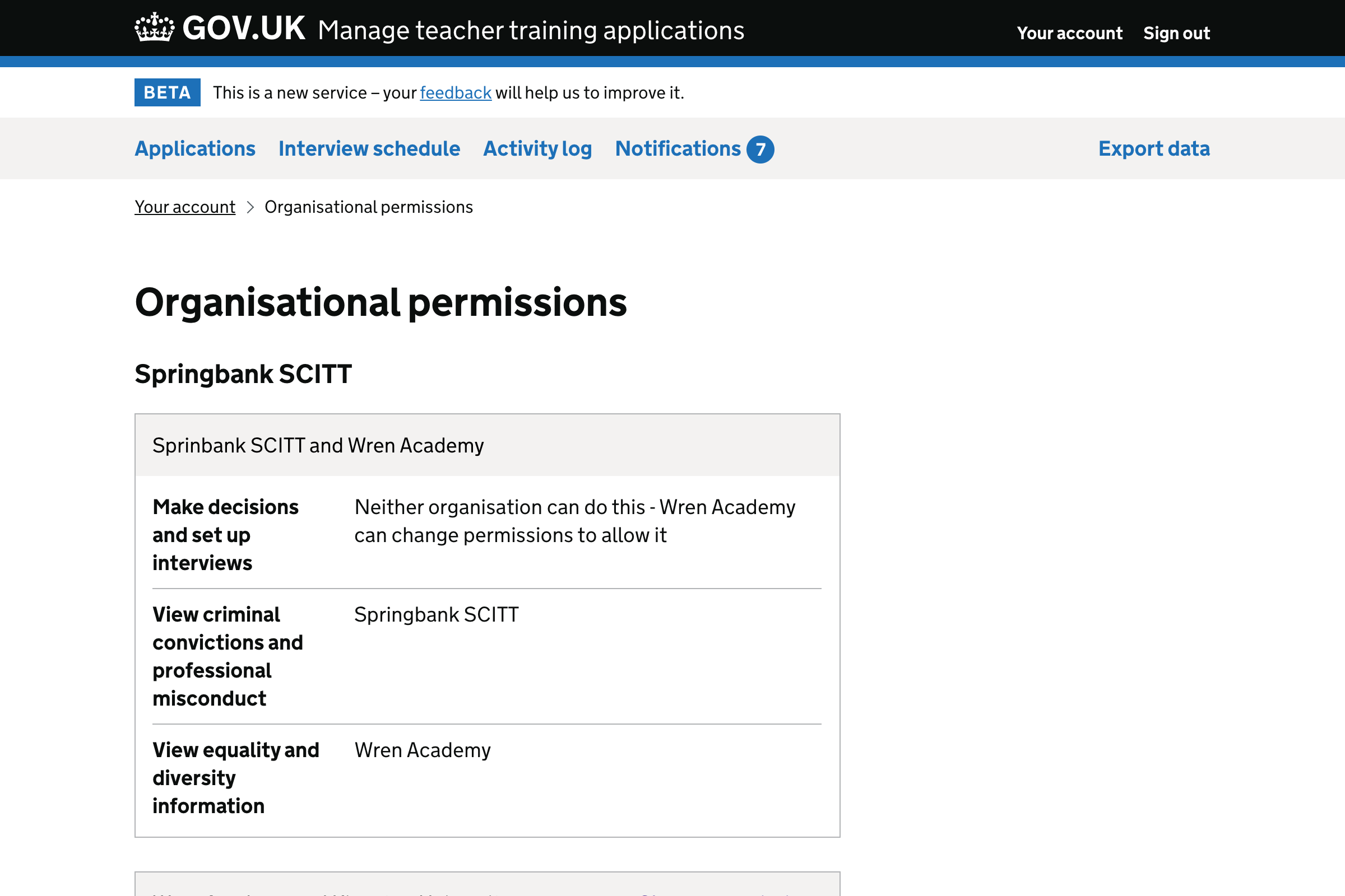
Changing organisational permissions
This has been changed to reflect the changes made to the flow for setting up organisational permissions.
Confirmation message
We’ve updated the content for the success message, calling them “organisational permissions” rather than just “permissions”.
Related data
- 80% of users belong to 1 organisation
- 14% of users belong to 2 organisations
- 6% of user belong to more than 2 organisations
The maximum number of organisations a user belongs to is 8. Only one user belongs to this many organisations.
Future considerations
We intend to:
- track how many users sign the data sharing agreement but do not continue to set up organisational permissions
- track form errors when setting up organisational permissions