We had already carried out research into two new reports showing:
- the status of applications to each course offered by a provider
- progress through the application process for each course
For this round of research we combined these reports with existing data exports under the heading ‘reports’. We wanted to understand if participants could find both things in one place.
We also wanted to do further testing of the status and progress reports. We had changed the progress report to include the numbers of applications as well as percentages.
Who we researched with
We carried out research sessions with:
- 5 higher education institutions (HEIs)
- 3 school-centred initial teacher training (SCITT) providers
All participants were administrators or admissions leads.
What we researched
We started participants on the application list page and prompted them to find either data downloads or performance statistics.
We wanted to find out whether they would locate these through the ‘reports’ link at the top right of the page.
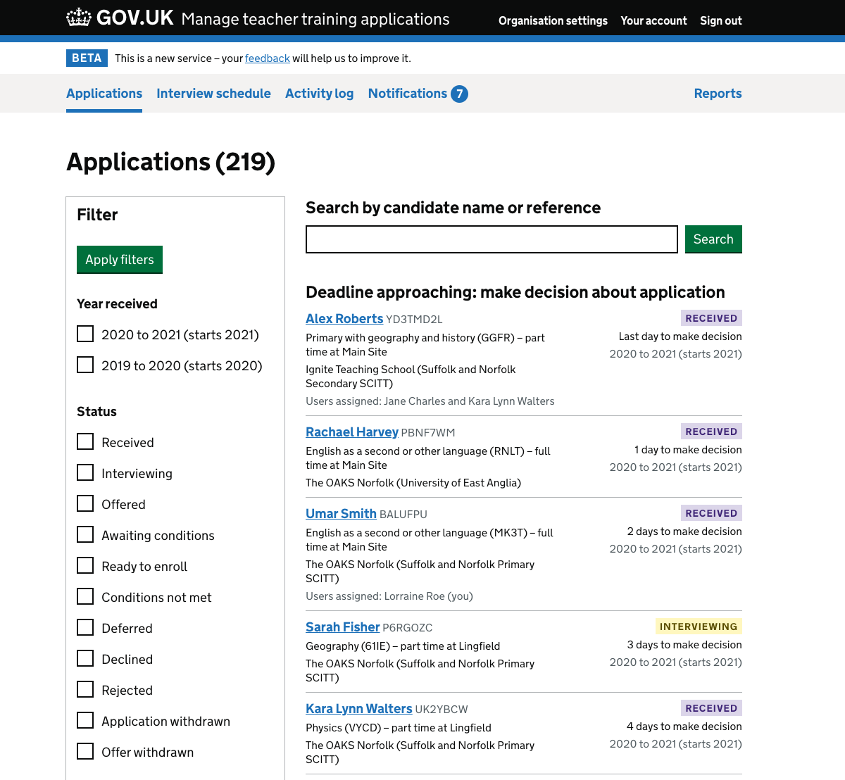
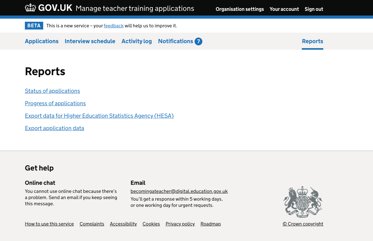
The reports page contained links to:
- export application data
- export data for the Higher Education Statistic Agency (HESA)
- status of applications
- progress of applications
The last two were the reports we wanted to test. We wanted to find out if participants could:
- differentiate between the report types
- select a report that was of most interest to them
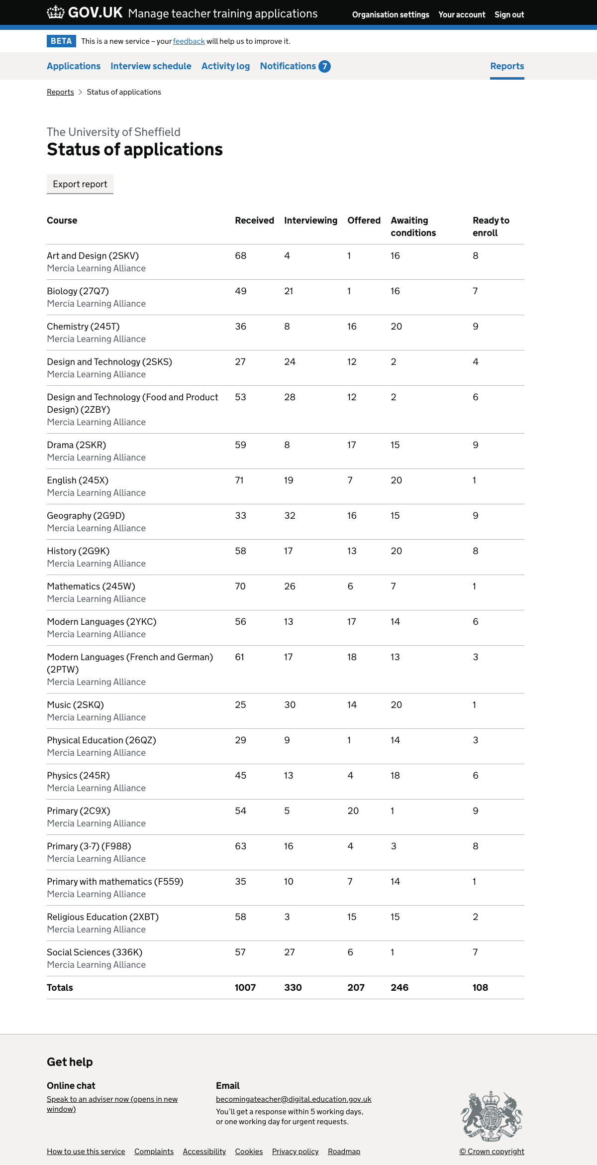
Some users went to the ‘status of applications’ report first. We wanted to find out whether participants:
- understood what the report was showing
- could use the report to answer questions about their current performance
- understood the terminology in the report, particularly the column headings
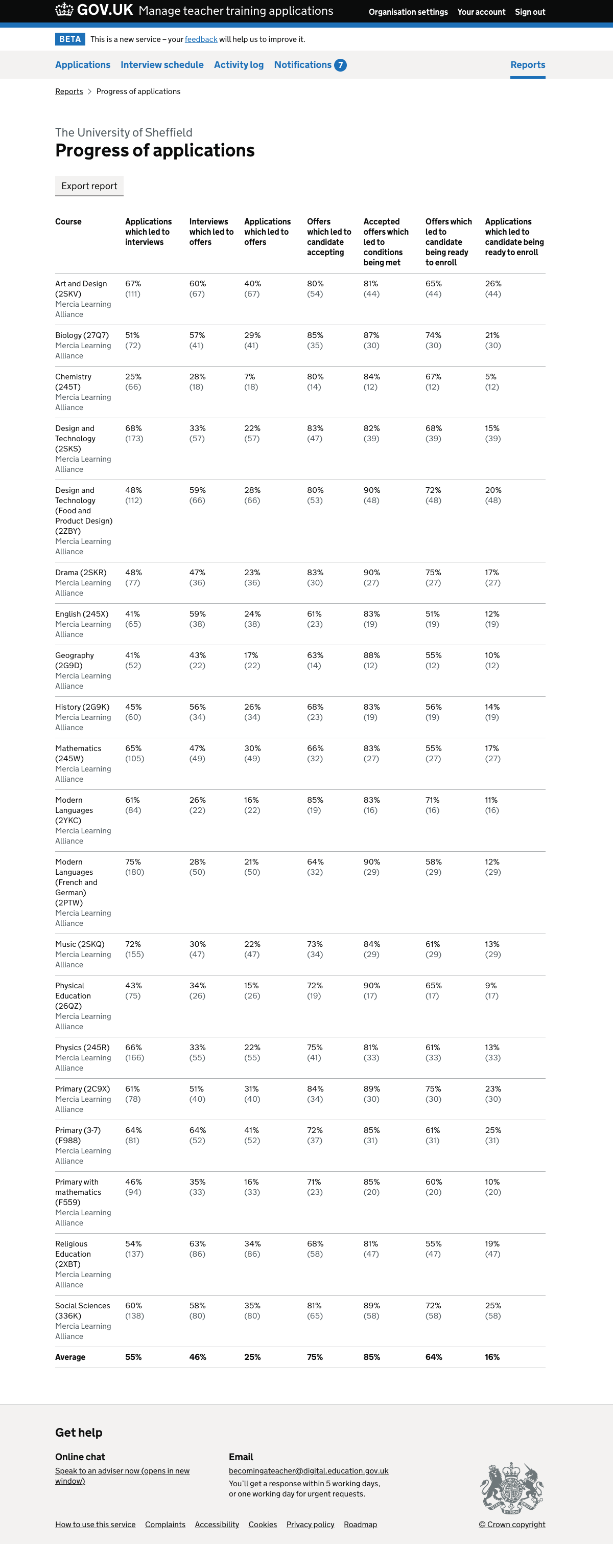
Other users went to the ‘progress of applications’ report first. We wanted to find out whether:
- participants could use the report to answer task-based questions
- the table provided data that participants would actually use
- the data was presented in a way that was easy to understand
- the column headings were easy to understand
What we found
We found that:
- ‘reports’ worked as the name of the section
- participants generally understood the data in the status report
- the terms ‘ready to enrol’ and ‘awaiting conditions’ were unclear
- participants would refer to the status report during the recruitment cycle
- participants would refer to the progress report throughout, but particularly at the end of a recruitment cycle
- it was not always easy for participants to pull out information quickly from the progress report
- there was a need to see where candidates left the application process
- showing numbers of applications in the progress report helped participants to understand it, to an extent
The name ‘reports’
When given a task to find either data downloads or performance statistics, participants navigated to the correct area without difficulty.
Understanding the status report
Participants felt that the data would be useful and were able to answer our questions about it.
They understood that the data was grouped by course and the partner organisations were indicated.
Some participants were not certain what the ‘ready to enrol’ and ‘awaiting conditions’ status labels implied about the state of applications.
Understanding the progress report
Some participants had to view the data very carefully to pick out specific information. This appeared to be partly due to:
- the length of the column headings
- subtle differences between the headings
In addition, some participants seemed to expect that the layout of columns from left to right would reflect the progression of applications.
This was not the case. For example, ‘Applications that led to interviews’ and ‘Applications that led to offers’ are next to each other in the report but are not adjacent stages of the application process.
This meant that users needed to concentrate carefully in order to understand the differences.
When participants would use the reports
Participants said that they would refer to the status report regularly during the recruitment cycle. They would use the data to monitor how fast courses were filling up.
Participants would use the progress report less frequently during the recruitment cycle. But they would also use it when reviewing their processes at the end of the cycle.
Seeing where candidates leave the application process
As we tested the progress report, a strong need emerged for participants to see the process of ‘attrition’ of candidates.
They wanted to see where in the process the candidates stopped applying because of reasons other than provider decisions. This includes where an application was withdrawn or an offer was declined.
Showing numbers of applications as well as percentages
Participants appreciated being able to see the numbers as well as percentages, but they raised more questions than they answered.
We did not include a column showing the total number of applications received. Several participants could not make sense of the number of applications that had made it to interview without seeing this total. Some attempted to calculate it.
In addition, the application numbers were the same in each of the final three columns:
- accepted offers which led to conditions being met
- offers which led to candidates being ready to enrol
- applications which led to candidates being ready to enrol
This is because each of these is the result of the candidate reaching the ready to enrol state. However, the percentages are different as they are calculated based on different starting stages.
For example, “applications which led to candidates being ready to enrol” is the total ‘conversion’ rate for the course. This will be smaller than the percentage of candidates who successfully complete their conditions.
Participants found this confusing and could not easily work out why the numbers were the same but the percentages were different. This also suggests that they did not fully understand the column headings.