We made some improvements to the content which users see when confirming a deferred offer.
We made the content clearer, more concise and consistent with other parts of the service.
What we changed
We made changes to the:
- application list
- prompt telling users that an offer needs to be confirmed
- flow when the course is available
- flow when the course is not available
Application list
We changed the heading from “Deferred offers: review and confirm” to “Confirm deferred offers”.
Prompt
We no longer mention whether the course is available in the prompt, since we give details on the next screen. Instead we just say “You need to confirm your deferred offer”.
If the user does not have permission then we:
- say “The deferred offer needs to be confirmed.”
- hide the heading and button
Flow when the course is available
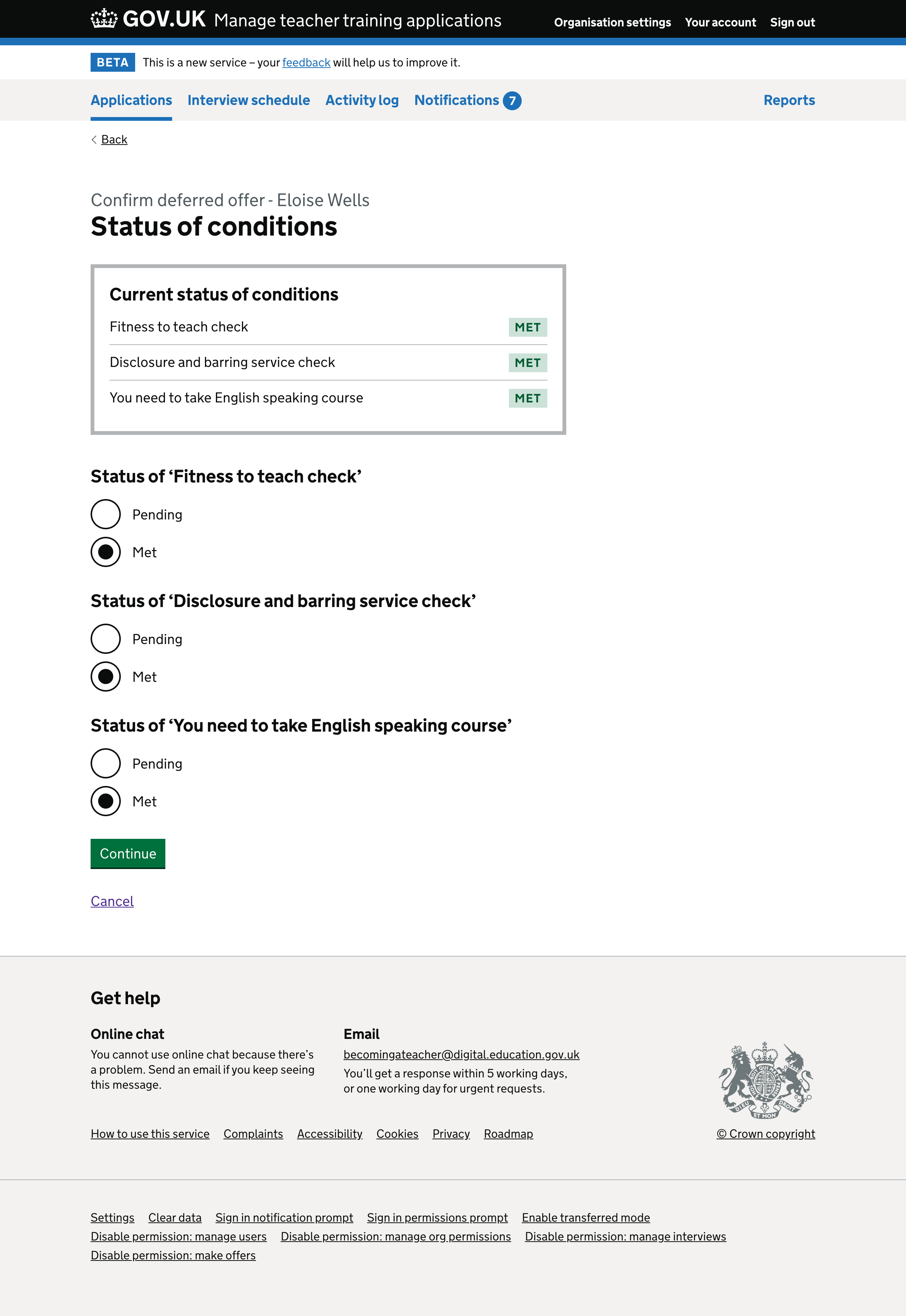
At the moment, the user is first taken to a page showing the status of conditions. In the new design they’re taken directly to the ‘check answers’ page, where they can update the status of conditions or add new ones.
We changed “Confirm status of conditions” to “Status of conditions”.
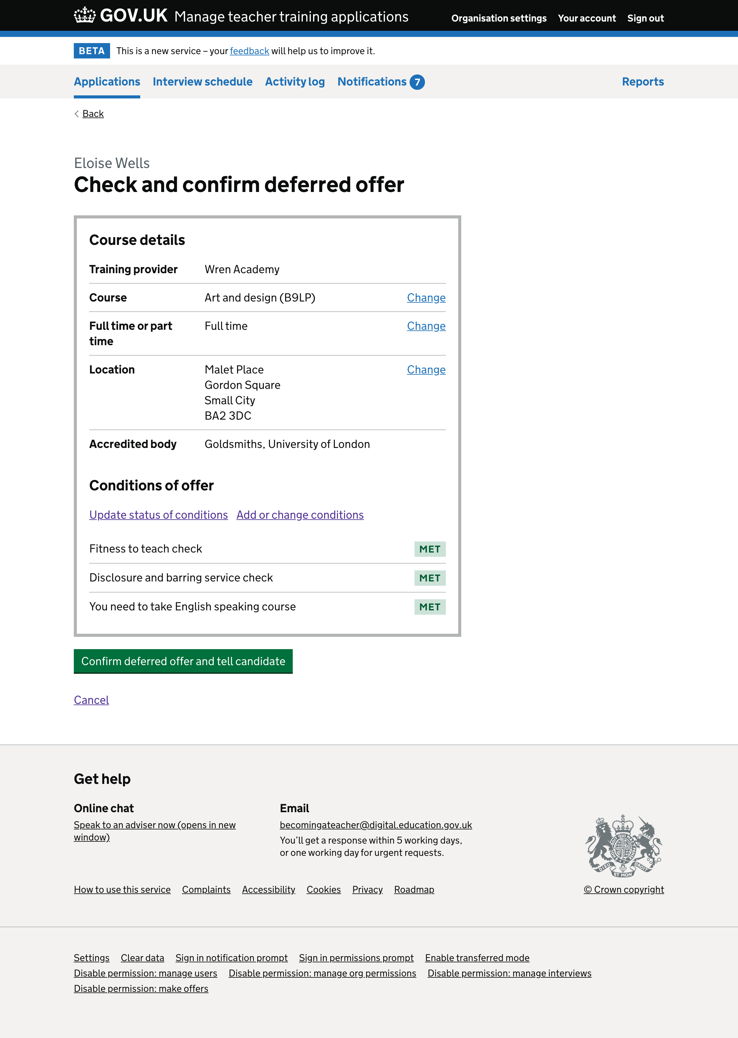
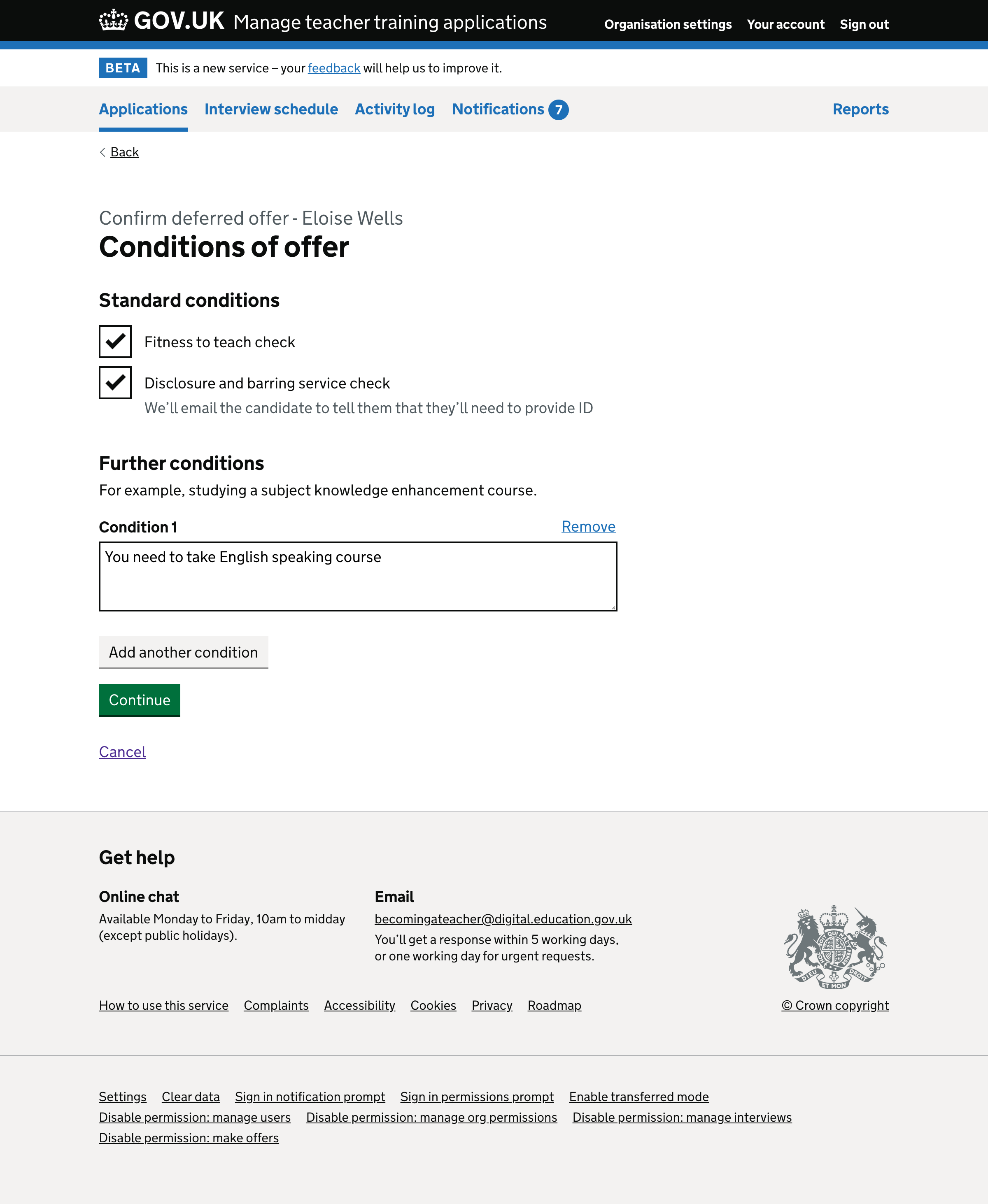
We changed the caption to be, for example, “Confirm deferred offer - Eloise Wells”.
On the check answers page we:
- changed the heading from “Review offer” to “Check and confirm deferred offer”
- changed the button text from “Confirm offer” to “Confirm deferred offer and tell candidate”
- removed the paragraph that says “We’ll email the candidate to confirm their new offer and remind them of the conditions for it.”
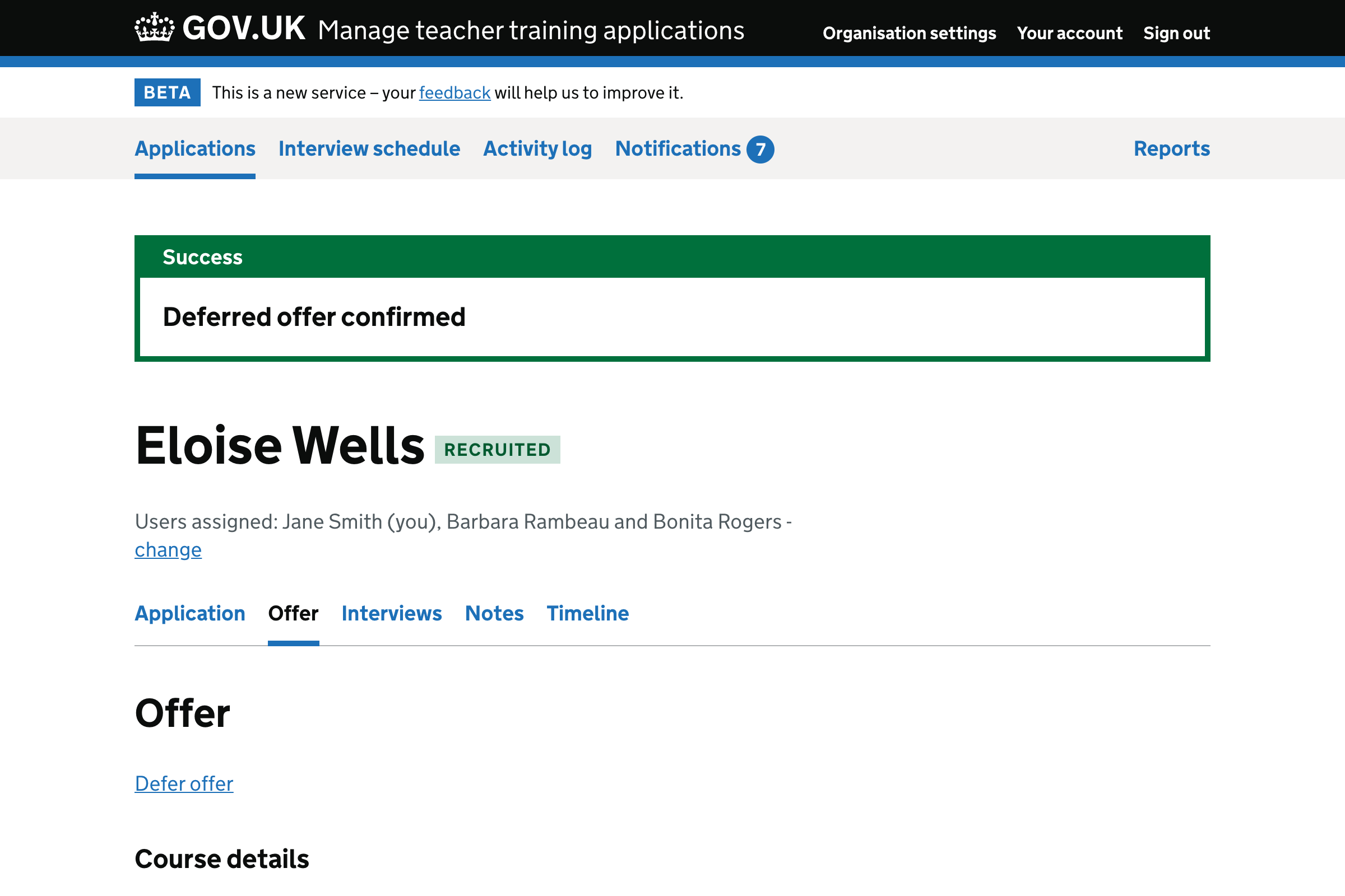
We changed the success message from “Deferred offer successfully confirmed for current cycle” to “Deferred offer confirmed”.
Flow when the course is not available
At the moment, users have to click to reveal the details of the deferred offer. We’ve changed this so that it’s always shown.
We changed the heading from “Review deferred offer” to “Confirm deferred offer”.
We also made several changes to the body text.
Screenshots#
Application list#
Prompt#
Prompt when the user does not have permission to make offers and reject applications#
Check answers page#
Status of conditions page#
Conditions of offer page#
Success message#
Confirm offer when the course is unavailable#
Timeline#
Activity log#