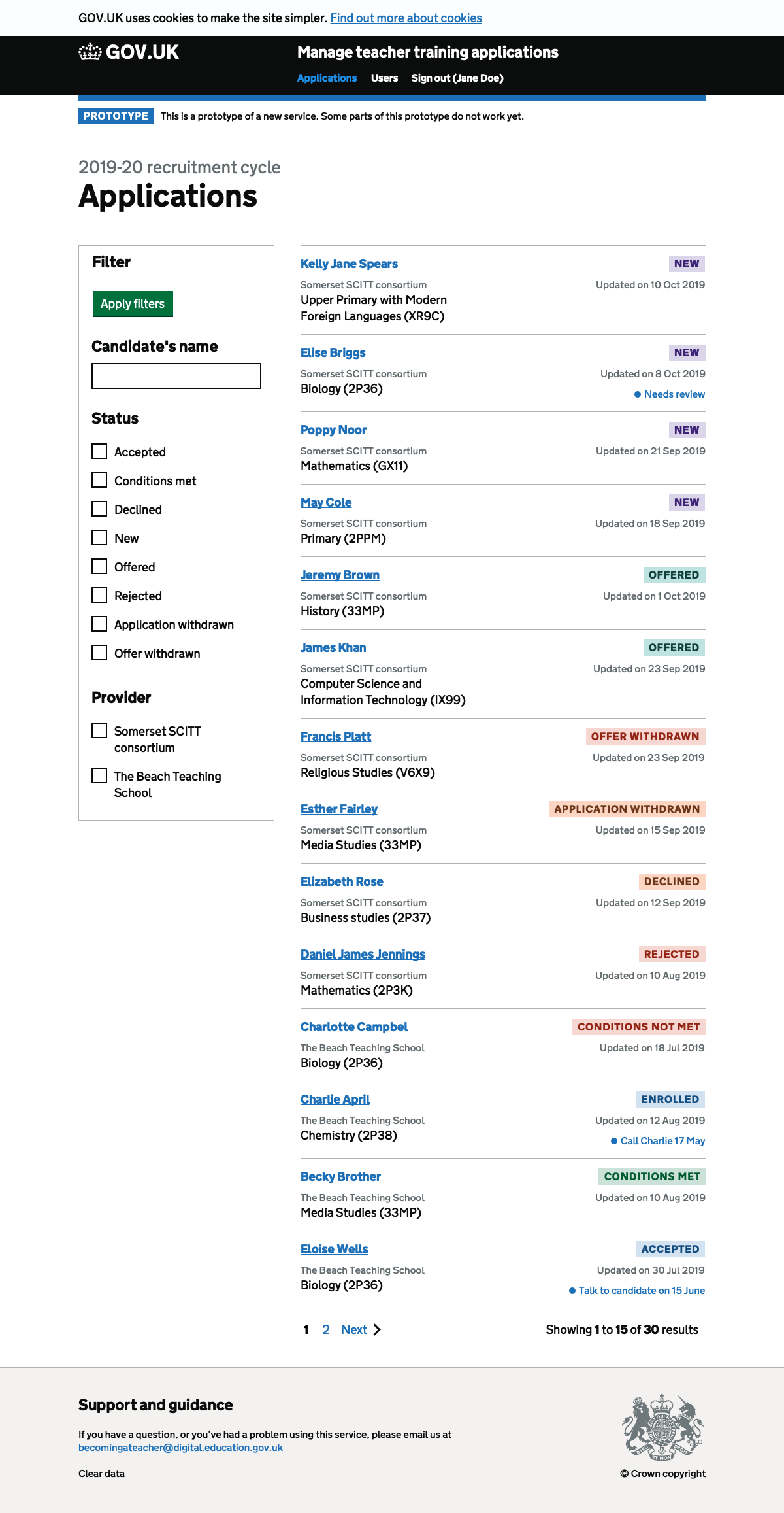
Use a card layout to fit more information inside each row without sacrificing readability and scannability.
Hypothesis
Currently the application list uses a table layout. We’ve been able to keep using a table because we:
- combined reference number with name to save space
- combined provider with course to save space
- increased the page width to 1220px to make more room for the filter without taking space away from the table
- added a scrollable area so that the table can be scrolled horizontally
But:
- horizontal scrolling is hard to use and means some of the data is not in view
- we need to add further details into the cells like notes and accredited body
- increasing the page width means some users may need to move their head in order to read the content on screen
- tables don’t work well on smaller viewports like those on mobile
If we use a card layout
Then users will be able to see all of the information easily without scrolling horizontally
We’ll know this works when:
- Users can find the application they’re looking for
- Users can get a sense of the status to help choose an application to work on
Screenshots#
Application list#