In the previous round of research, we tested a way of allowing users to configure their own data reports.
This was flexible but would require a large amount of design, research and development work. We decided to try something smaller which would meet specific user needs.
For this round, we tested 2 reports which could not be configured and showed:
- numbers of applications at certain statuses
- progression through the application journey
We chose these because research had suggested they would be useful to providers. We wanted to check this and find out how the reports would support their needs for data.
We had 2 different designs for the progress report and wanted to establish which would work better for providers.
Who we researched with
We carried out research sessions with:
- 2 higher education institutions (HEIs)
- 4 school-centred initial teacher training (SCITT) providers
- 3 school direct providers
All participants were administrators or admissions leads.
What we researched
We started on the application list page. We asked participants either to:
- look for statistics about how recruitment was performing
- download application data
We wanted to know whether they found the ‘reports and data export’ link.
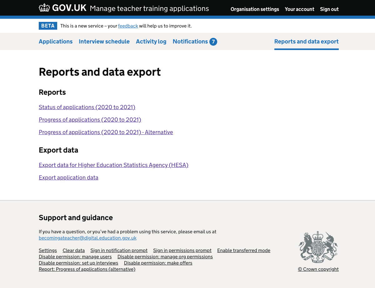
Once they followed the link, participants reached a page listing the available reports and exports:
- status of applications
- progress of applications
- export data for Higher Education Statistics Agency
- export application data
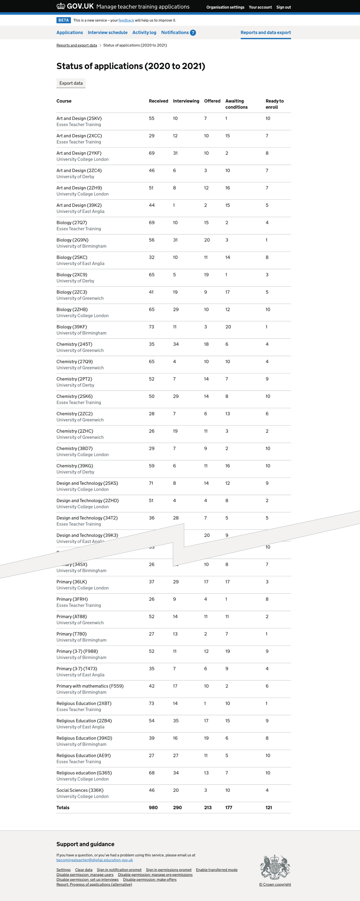
The status report gave absolute numbers only, for example the number of applications in ‘offered’ status for a particular course. Each of the organisation’s courses had its own row, with the partner organisation indicated in grey text.
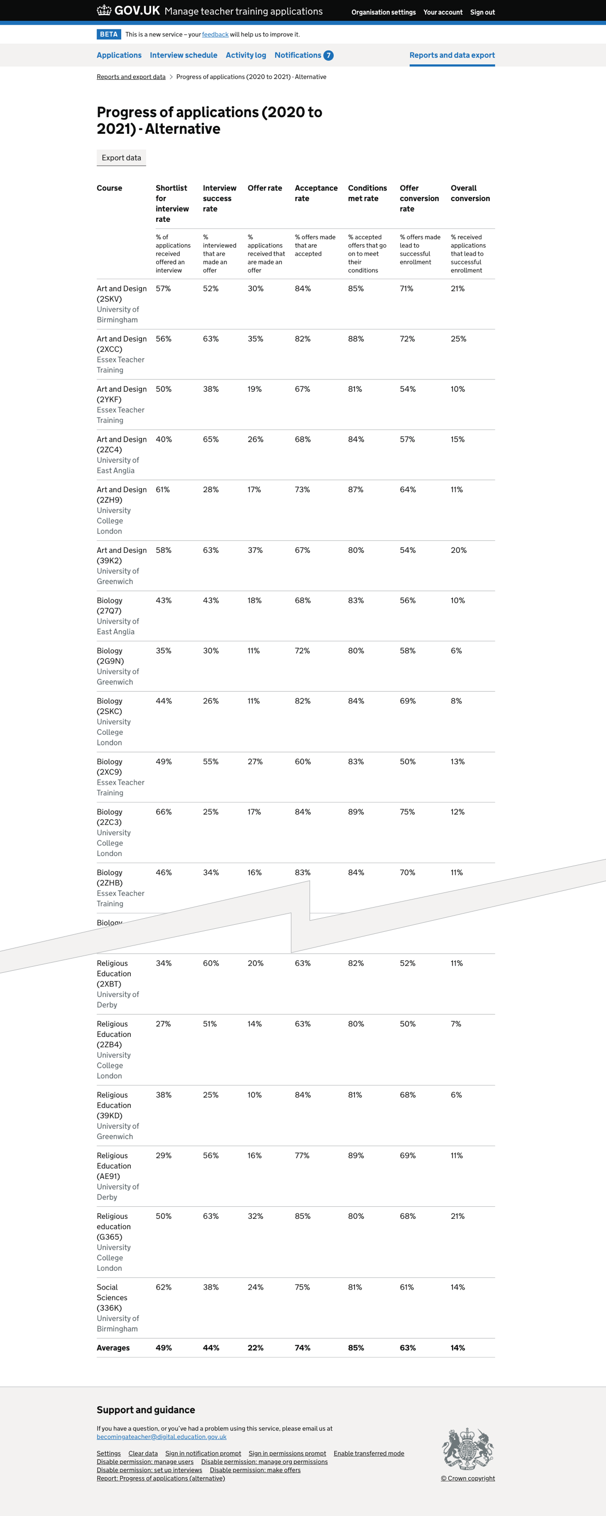
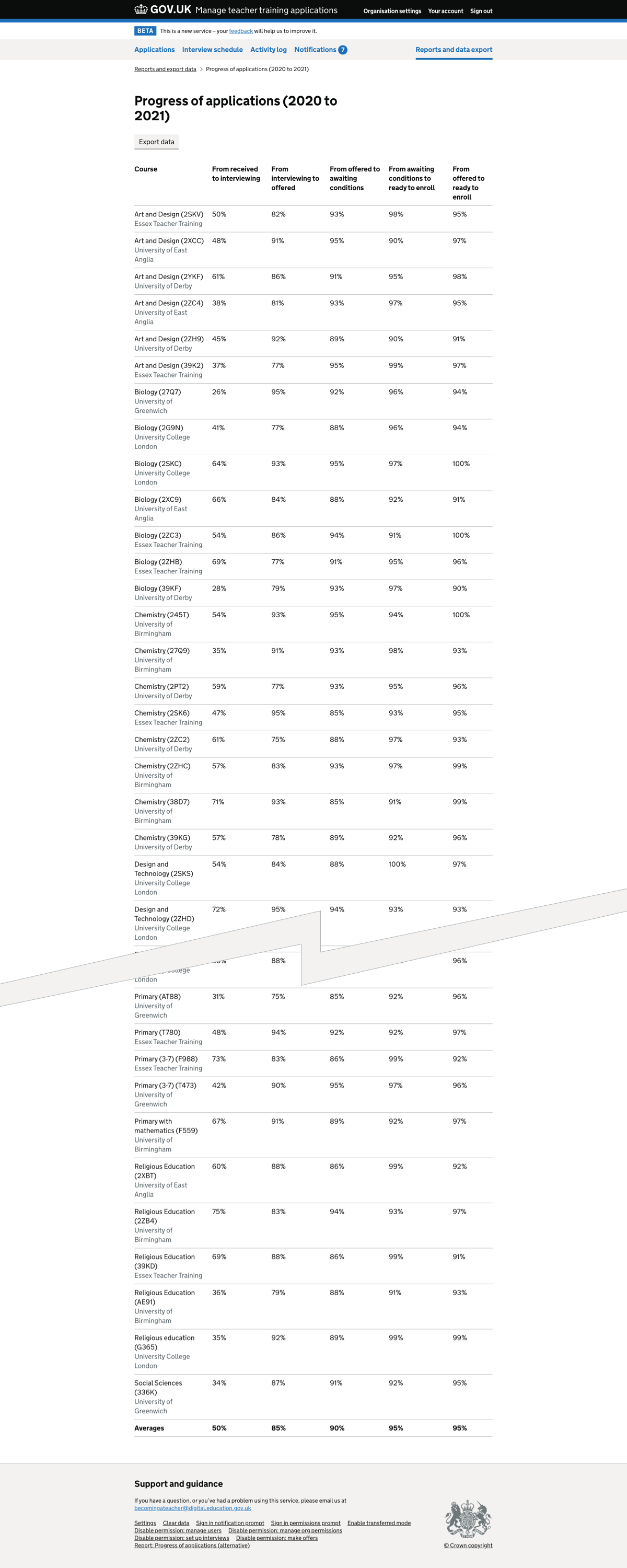
There were links to 2 versions of the progress report. They showed the same data but had headings which:
- just indicated a change of status
- focused more on what the change of status represented, with a second row indicating the change of status
The progress reports gave percentages, for example the percentage of applications which made it from ‘interviewing’ to ‘offered’ status. Again each of the organisation’s courses had its own row and the partner organisation was indicated.
What we found
We found that participants:
- located and used the ‘reports and data export’ link
- said that the reports would help meet some of their needs
- would use the status and progress reports at different times
- preferred the progress report with more descriptive headings
- found it harder to understand the table once the headings had been scrolled off screen
- were not always familiar with the statuses used in the service
They also made several suggestions for additional features.
Finding the ‘reports and data export’ section
All participants found and used the reports link.
This was the case whether we asked them to find statistics about how recruitment was performing or to download application data.
Using the reports
Participants said they would find the data in the reports useful. They could relate the reports to different scenarios which they encounter in their work.
The status report appeared to meet the need to understand the state of recruitment and manage course capacity.
Participants said that the progress report would be helpful in understanding trends. It could replace reports that providers currently create themselves, with difficulty in some cases.
Choosing between 2 versions of the progress report
Participants preferred the version of the progression report with headings which focused on what the change of status represented. We found that:
- the description in the first row gave participants a concise term to refer to
- the indication of the status change in the second row helped them understand how the percentages were calculated
Participants mentioned specific terms which were in the table and they also used, such as ‘conversion’.
Scrolling down the data tables
Participants mentioned that it was hard to know which column was which once they had scrolled down the report.
It will be harder for users to make accurate use of the figures if they cannot be certain what the data shown in a particular column means.
Understanding statuses
HEI participants were not familiar with the statuses used in Manage. In particular they could not accurately describe what ‘offer accepted’ and ‘ready to enroll’ meant.
If they sometimes need to use our service rather than their own student record systems, HEI users will need to learn how our statuses relate to theirs.
Feature requests
Participants said they would like to see additional functionality for the reports, including:
- comparing the data to the same time last year
- separating the courses by primary and secondary
- filtering the report by partner organisation
- showing the numbers of applications as well as the percentages - for the progress report
- overlaying diversity information to help spot any recruitment biases - for the progress report
Screenshots#
Reports and data export page#
Application status report#
Application progress report with shorter headings#
Application progress report with longer headings#