Hypotheses
Download application as PDF
Providers have consistently shown in research that they need to share applications with their colleagues. They do this either by printing the page or by saving the page as a PDF.
Many computers offer the ability to ‘print to PDF’ but many people aren’t aware of this feature.
If we let users download the application as a PDF then they can print it out or send it via email.
We’ll know this works when we see users sharing the PDF application with colleagues.

Layout of disability, access and other needs
Previously this section was labelled Accessibility needs. But research showed that providers didn’t fully understand what it meant.
Disability information needs to be accessed after the application has been reviewed and sifted. The specifics of the application are less relevant to the continued processing. Whereas information about disability will be needed up until the point of enrolment.
If we include “disability” in the title and move it to the top
Then providers will understand it and be able to get to it more easily

Layout of criminal convictions and professional misconduct
Previously this section was labelled Safeguarding. But research showed that providers didn’t fully understand what it meant.
It was also positioned lower down within the personal statement section in order to avoid unconscious bias against candidates who have disclosed something. But research showed it was often missed.
Safeguarding information needs to be accessed after the application has been reviewed and sifted. The specifics of the application are less relevant to the continued processing. Whereas information about safeguarding will be needed up until the point of enrolment.
Therefore, it makes more sense to put safeguarding information to be in a place that’s distinct and easy to spot. Putting it toward the top is the simplest way to do this.
If the section is labelled ‘Criminal convictions and professional misconduct’ and displayed toward the top
Then providers will understand it and be able to get to it more easily

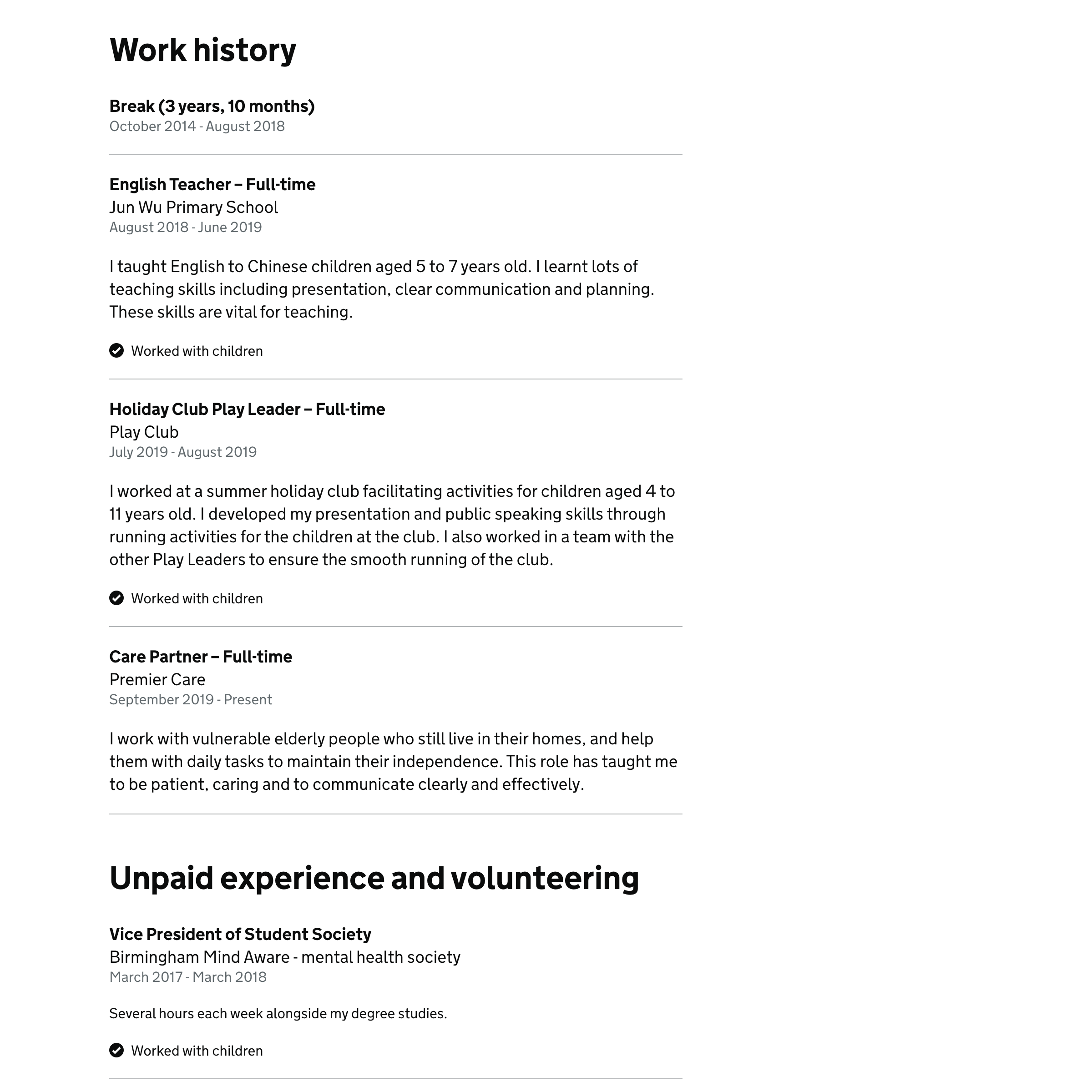
Layout of work history and unpaid experience sections
Previously these sections were designed with collapsed sections but only launched as a summary list which is quite hard to read and means users have to click to reveal the content. It’s also quite different to the way most CVs are laid out.
If the sections are laid using headings and paragraphs
Then it’ll be more familiar, easier to read and won’t need to be revealed
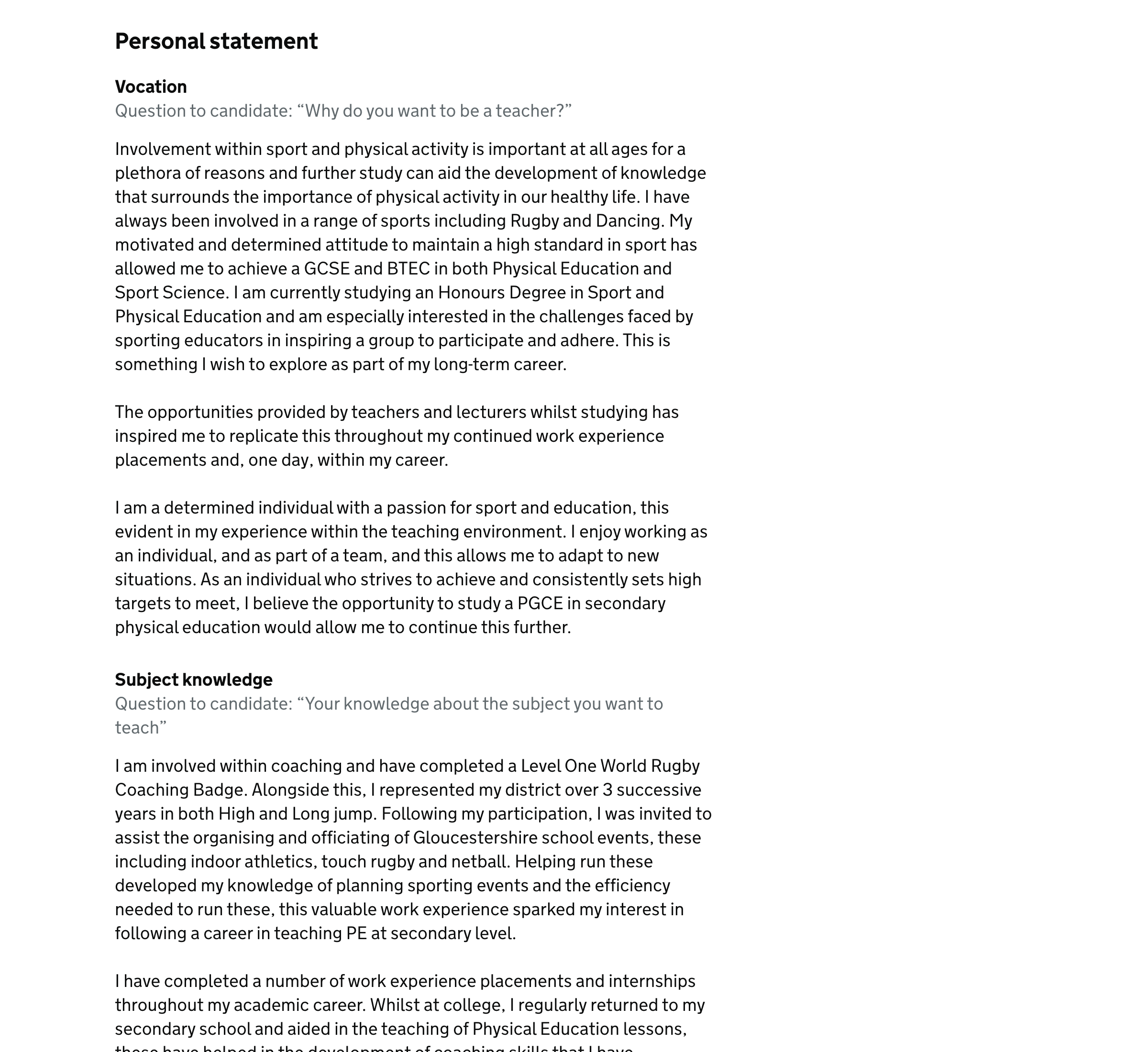
Layout of personal statement section
Previously the personal statement used a summary list. But this is problematic because:
- there’s limited space in the right column to fit the content nicely
- there’s not enough space in the left column to explain what the candidate’s view is
If the sections are laid out with simple headings, paragraphs and sensible line lengths, then it’ll be easy to read
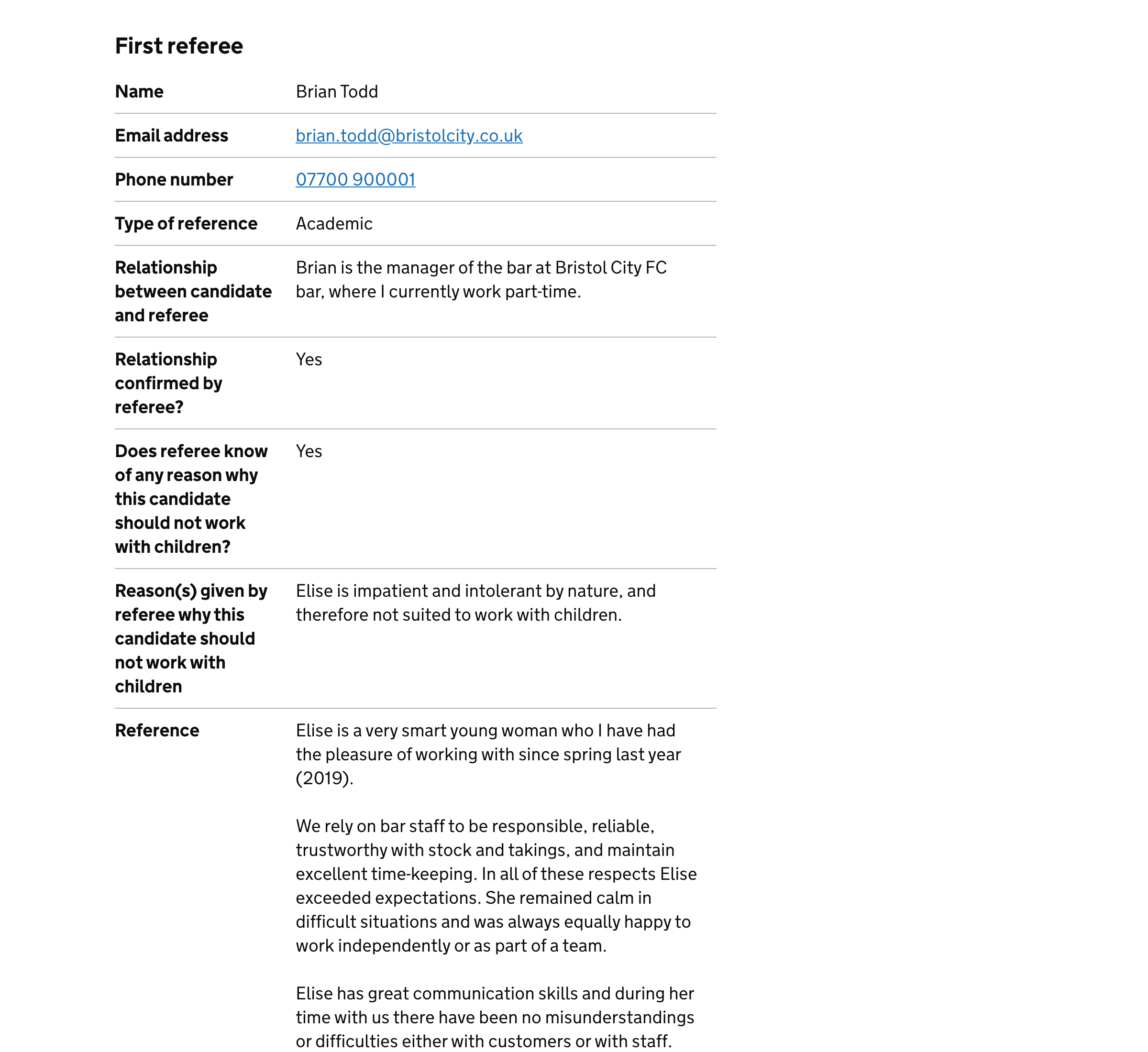
Layout of references section
Previously the references section put multiple answers in one row and used inset text to signify the details the referee gave.
But putting multiple answers in one row could confuse users—especially screen reader users—who expect the row’s key to describe the row’s value. And it may not be clear what the inset text signifies even if it is noticed.
If we use one row per question
Then the row’s key will clearly describe the row’s value so users will understand it
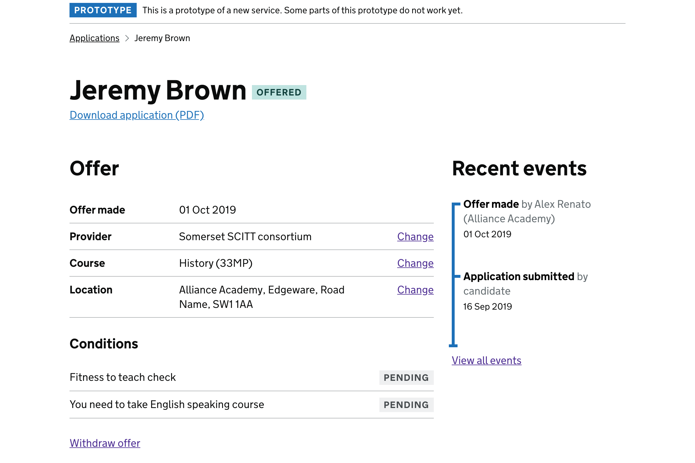
Box panel for offer
Previously the offer was wrapped in a box in order to distinguish it from the application.
But with the addition of the notes section, making the offer panel more prominent could mean the notes get lost.
If we just use headings and whitespace to differentiate between the parts of the page
Then the sections of the page will be more equally weighted
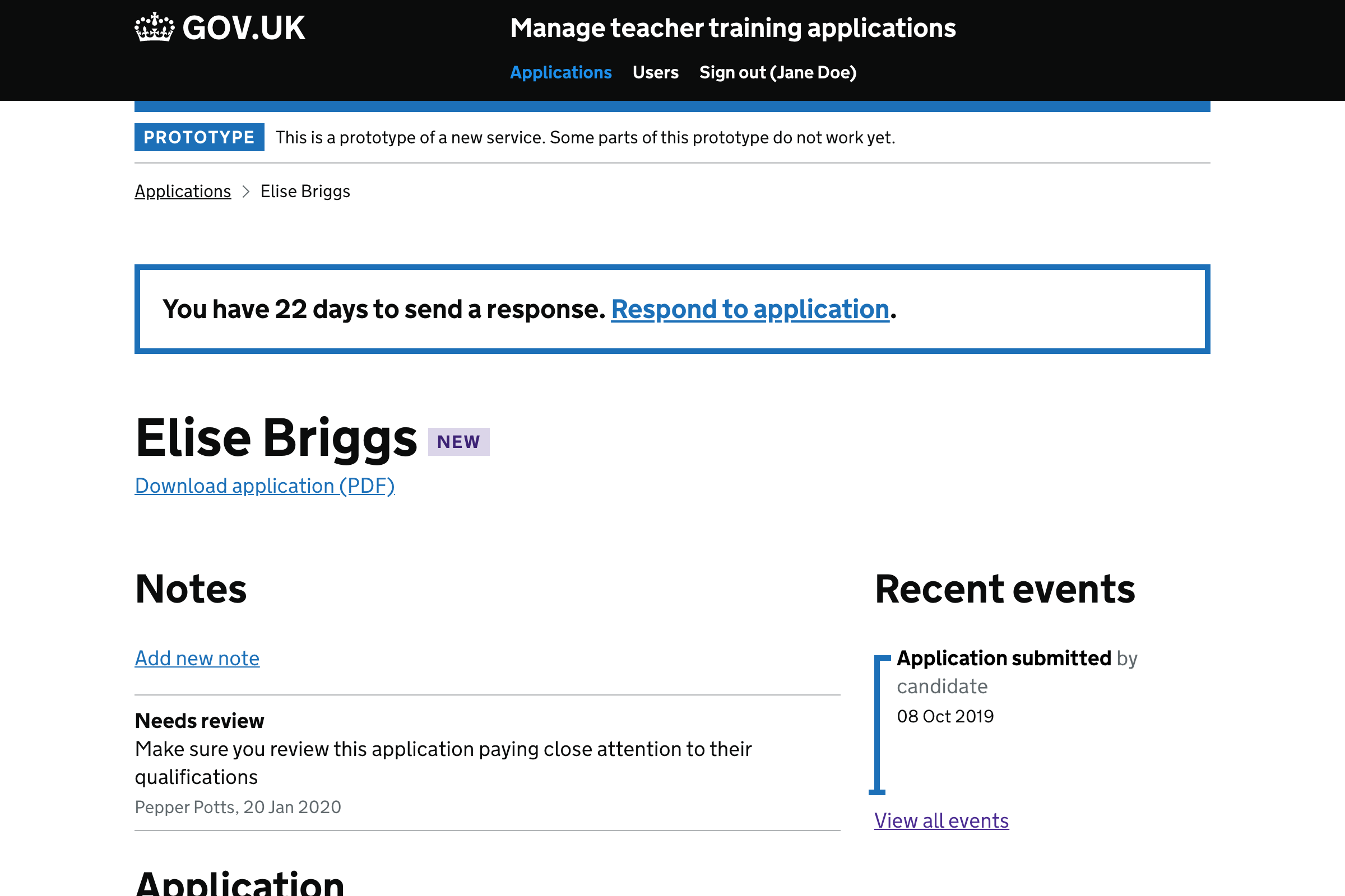
Box panel for respond to application
Previously the respond to application section was wrapped in a box.
The main reason for the box was to differentiate the offer from the application. But putting ‘Respond to application’ inside the box is problematic because:
- it doesn’t represent an offer
- other important details like ‘Respond to applicant by’ could be more prominent
- the status banner used to prompt candidate to give a new referee is a better way to lay this out
If the status banner is used then it:
- won’t be confused for an offer
- will use a more suitable pattern
- will make the respond by date more consistent
We’ll know this works when:
- users spot the banner and click on ‘Respond to application’