Having conducted a design review on the original design, we made a number of changes:
- The number of courses found is now shown in the search results page heading
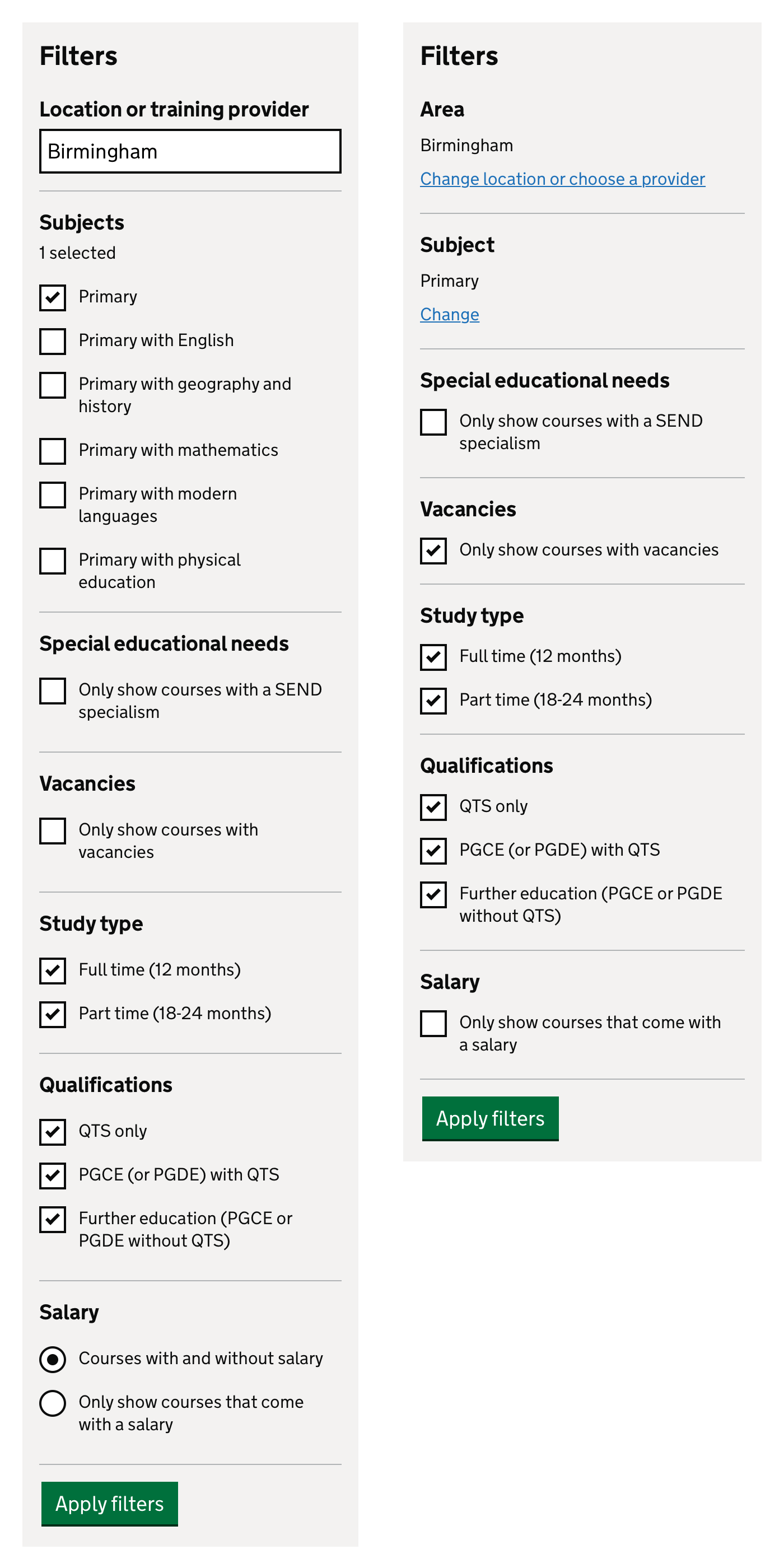
- Some filters have been changed to make them more user friendly:
- Salary filter changed from radios to a checkbox
- Location and subject filters link off to separate pages
- London boroughs moved into filter sidebar
- The way search filters appear on mobile devices is now in line with Manage and Support
- We’ve split out qualifications from study type in search results
- We’ve removed Get Into Teaching branding from the standardised guidance shown on course details pages
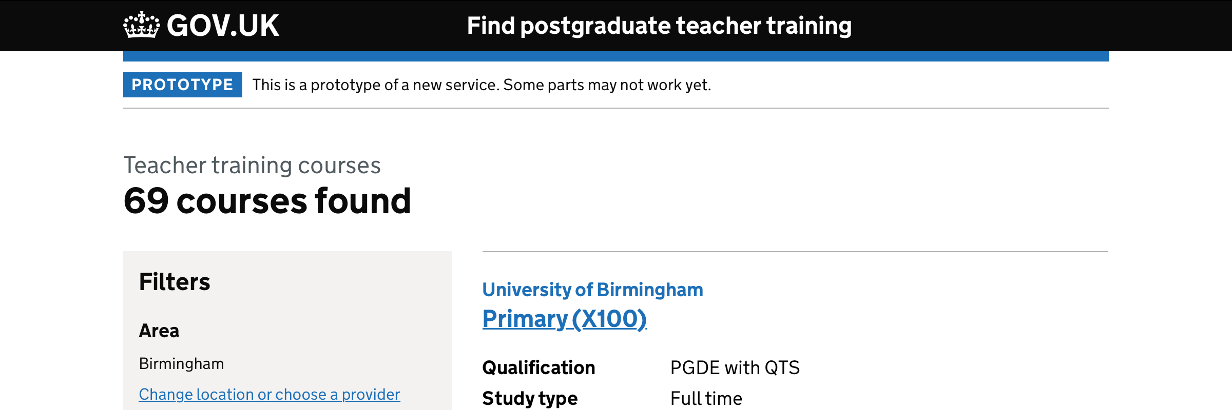
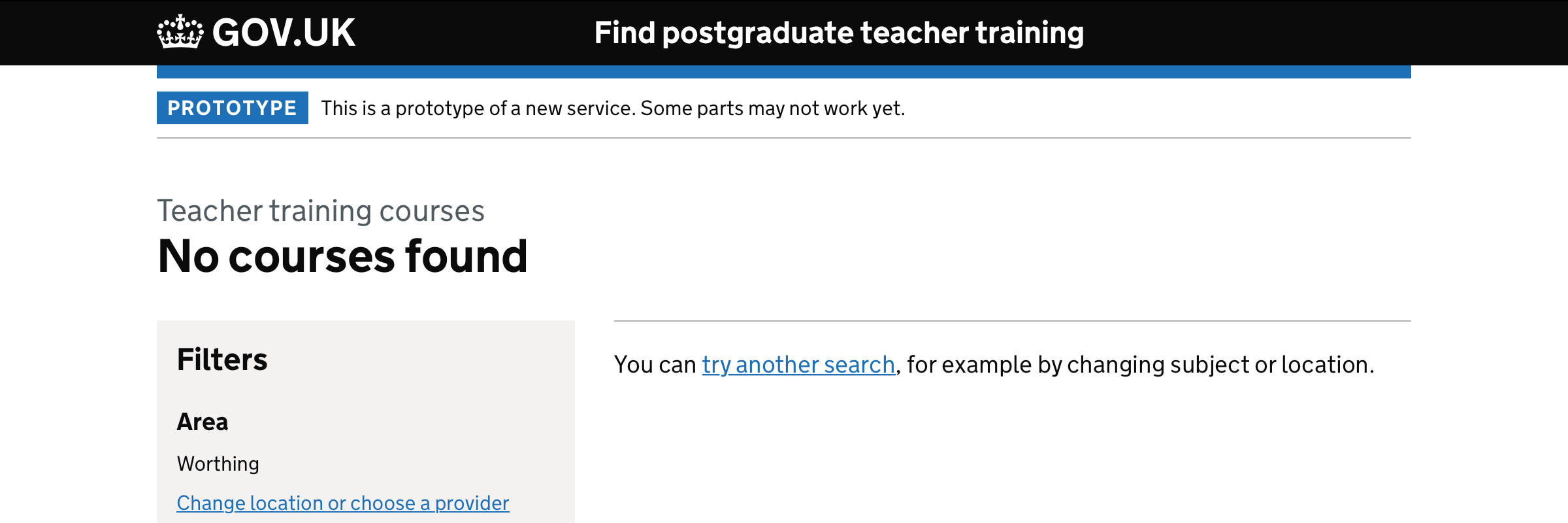
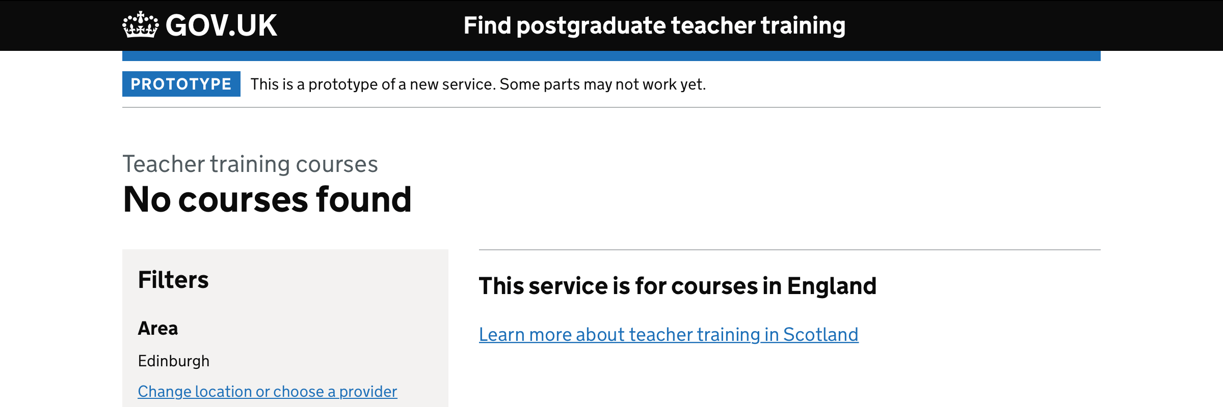
The number of courses is the search results page heading
We’ve changed the position of the number of teacher training courses returned in a search:
- It used to be above the list of results
- Now, it’s the page heading
This makes the page look less cluttered and makes headings consistent - previously it was different for each search type (area, provider, across England, no results).
It also means accessible technology will give users a clearer understanding of what’s changed after they change the filters.
Improved search filters
Salary filter changed from radios to a checkbox
We’ve changed the salary filter:
- It used to have 2 radios (‘Courses with and without salary’ and ‘Only show courses that come with a salary’)
- Now it’s a checkbox (‘Only show courses that come with a salary’)
The changes mean this filter is consistent with other checkbox options.
Also, having a checkbox choice means the content is clearer and easier to understand.
Location and subject filters link off to separate pages
We’ve changed the location and subject filters:
- For area, we’ve replaced the search box with a link to a page where candidates can change their location or choose a provider.
- For subject, we now link to a page where candidates can select a different subject. This removes the scrollable list of subjects that previously appeared in the filter sidebar, which may have caused accessibility problems on mobile devices.
In future we might want to look at updating searches automatically (so users do not have to use the ‘Apply filters’ button). This does pose usability and accessibility questions so we’d need to be sure it would work before investing in it.
London boroughs moved into filter sidebar
We’ve changed where the London boroughs show on the search page:
- They used to be above the list of results
- They’re now in the filters section under ‘London boroughs’
This declutters the page and brings the London search results in line with other location filter options.
Changing how search filters look on a mobile device
We’ve changed how the search filters appear on a mobile device;
- They used to be behind a toggle
- They now appear from the side as an overlay
This makes the design more consistent with Manage and Support.
-
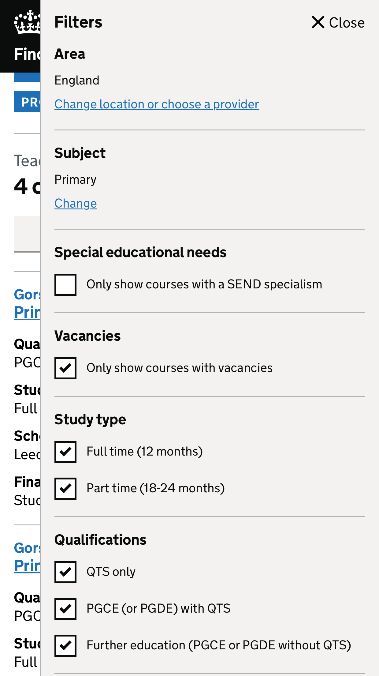
Filters revealed.
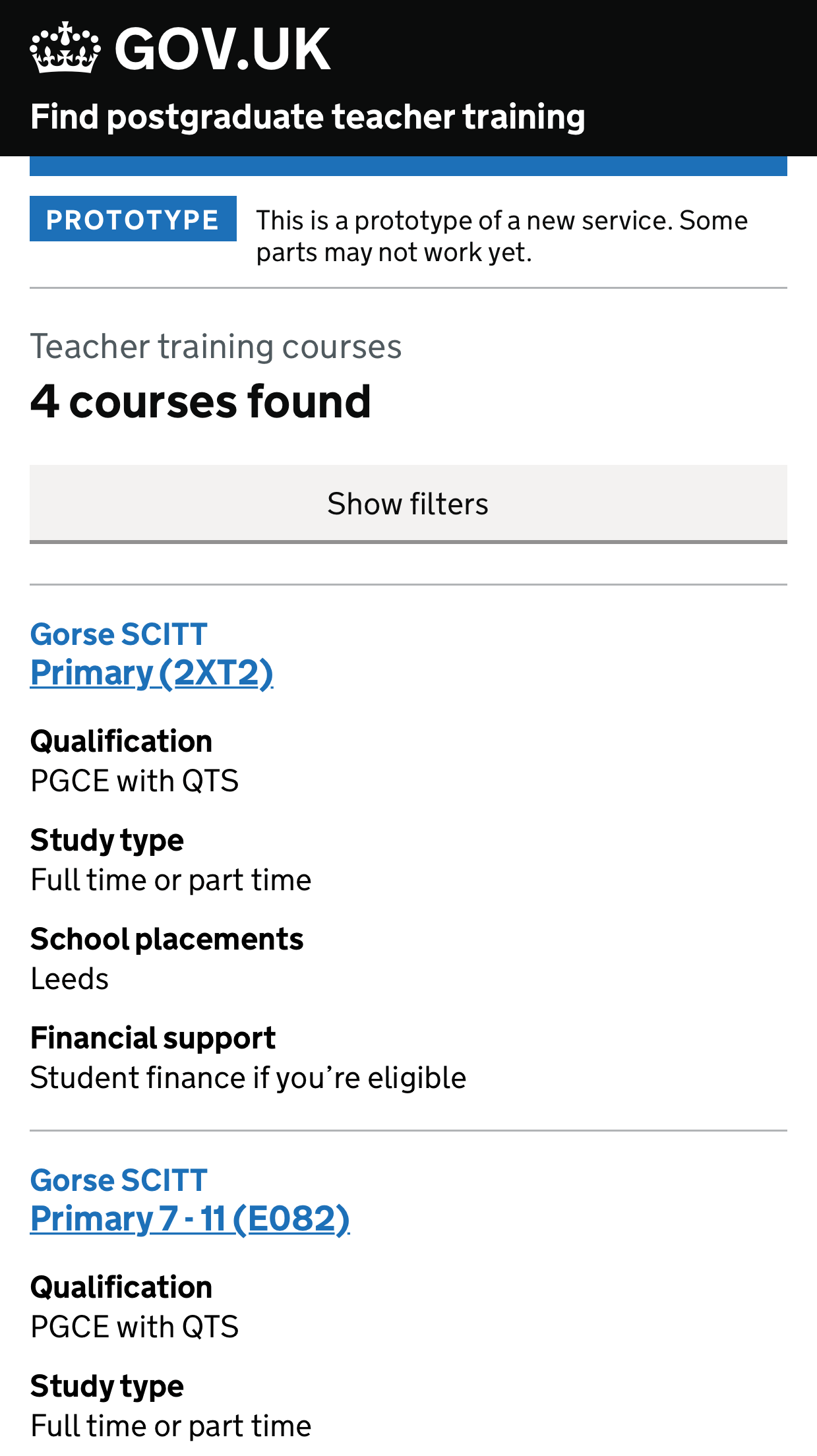
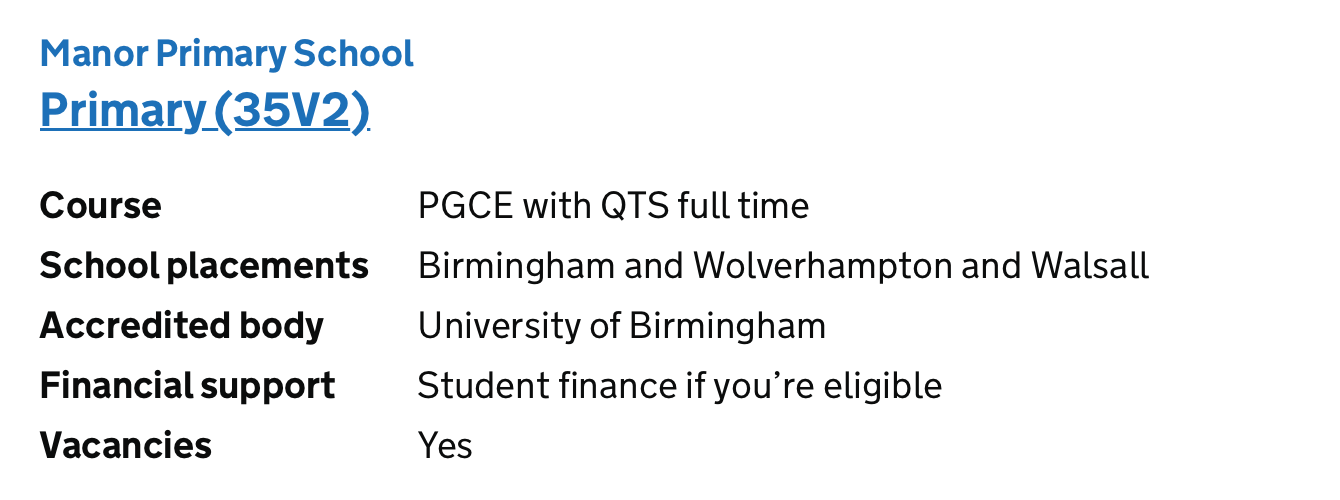
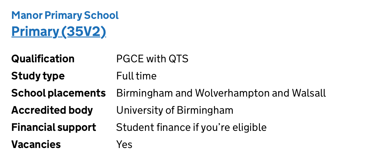
Splitting out qualification and study type in search results
We’ve changed the search results filters:
- It used to have the field ‘Course’ which contained study mode and qualification
- It’s now split out into ‘Qualification’ and ‘Study type’
This was changed to bring it in line with other values in search result items which are not combined with other values, and should make it easier to compare items.
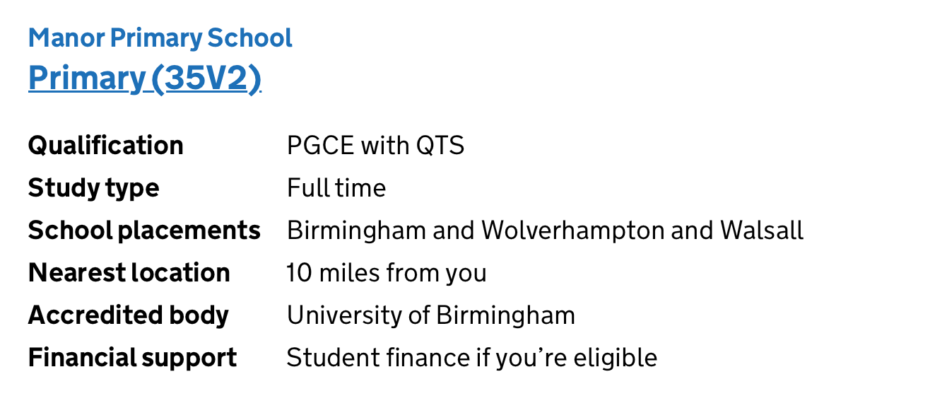
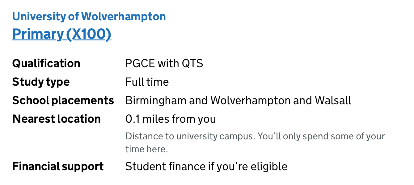
The new design for search result items depends on candidate’s being able to use the new location model to search for courses.
Until we roll that out, we can combine aspects of this new design with elements from the current design, which show the distance to the nearest location we know about:
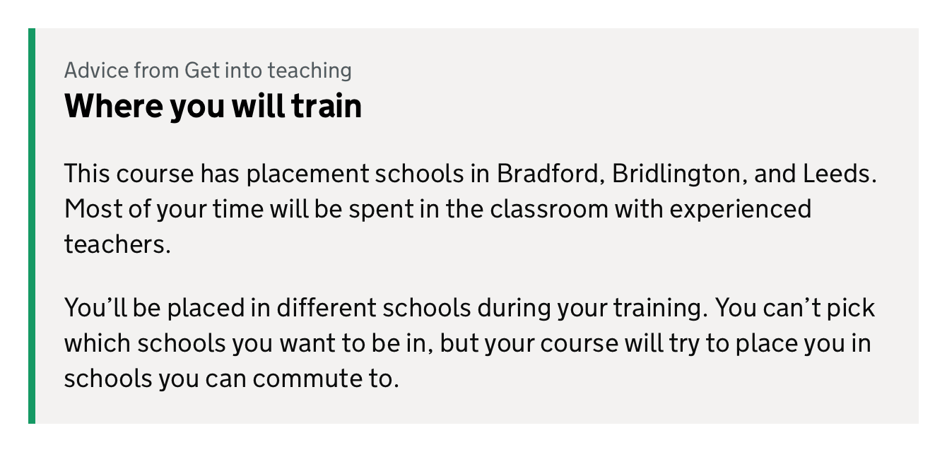
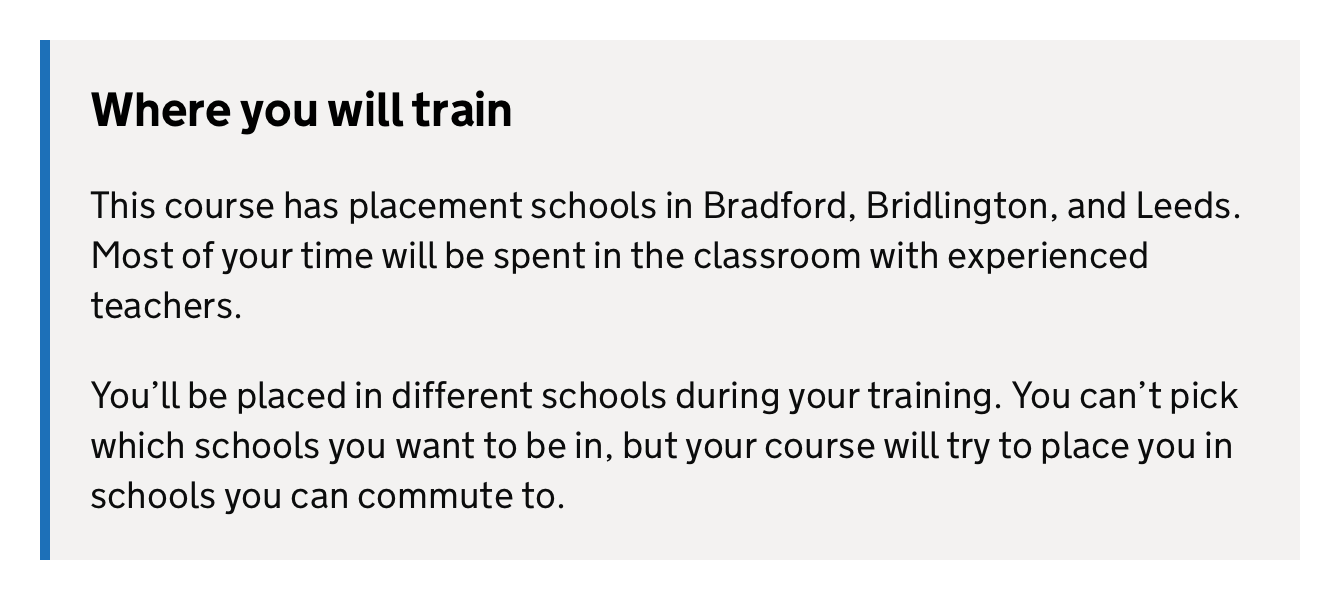
Remove GIT branding from standardised guidance boxouts
We’ve changed the standardised guidance boxouts:
- They used to say “Advice from Get Into Teaching”
- They now do not say “Advice from Get Into Teaching”
We changed this because research suggested candidates did not notice who the guidance was from. Also, sometimes guidance points to GOV.UK, and the GIT reference was in a small font that had accessibility issues.
The boxouts colour bar has changed from GIT green to GOV.UK blue.