We’re 6 months into this year’s recruitment cycle and, for the first time, the Department for Education (DfE) has data on how candidates are searching for courses.
Over the past 6 months the team have been iterating the product, transitioning with UCAS and developing analytics for the service.
Following recent product developments, and a push to find out more about the new service, we’ve started to put a framework around how we measure user success by outlining our objectives and key results (OKRs).
At a high level, we’re looking at 3 objectives:
- we want people to use our service
- we want people engaging with the service in the way we’ve intended
- we want people to feel like they’re ready to go on and apply once they’ve used our service.
For the first iteration of this report, we’ll use the following structure to outline how we’re measuring against these objectives and what sort of performance we’re seeing. The service overview will focus on service usage and general user behaviour, our success measures will cover two-parts:
- the percentage of users who have experienced a successful journey
- those that convert from Find postgraduate teacher training (Find) to UCAS registration.
You can see the live report in our dashboard.
Contents
Service overview
Peformance data on Find
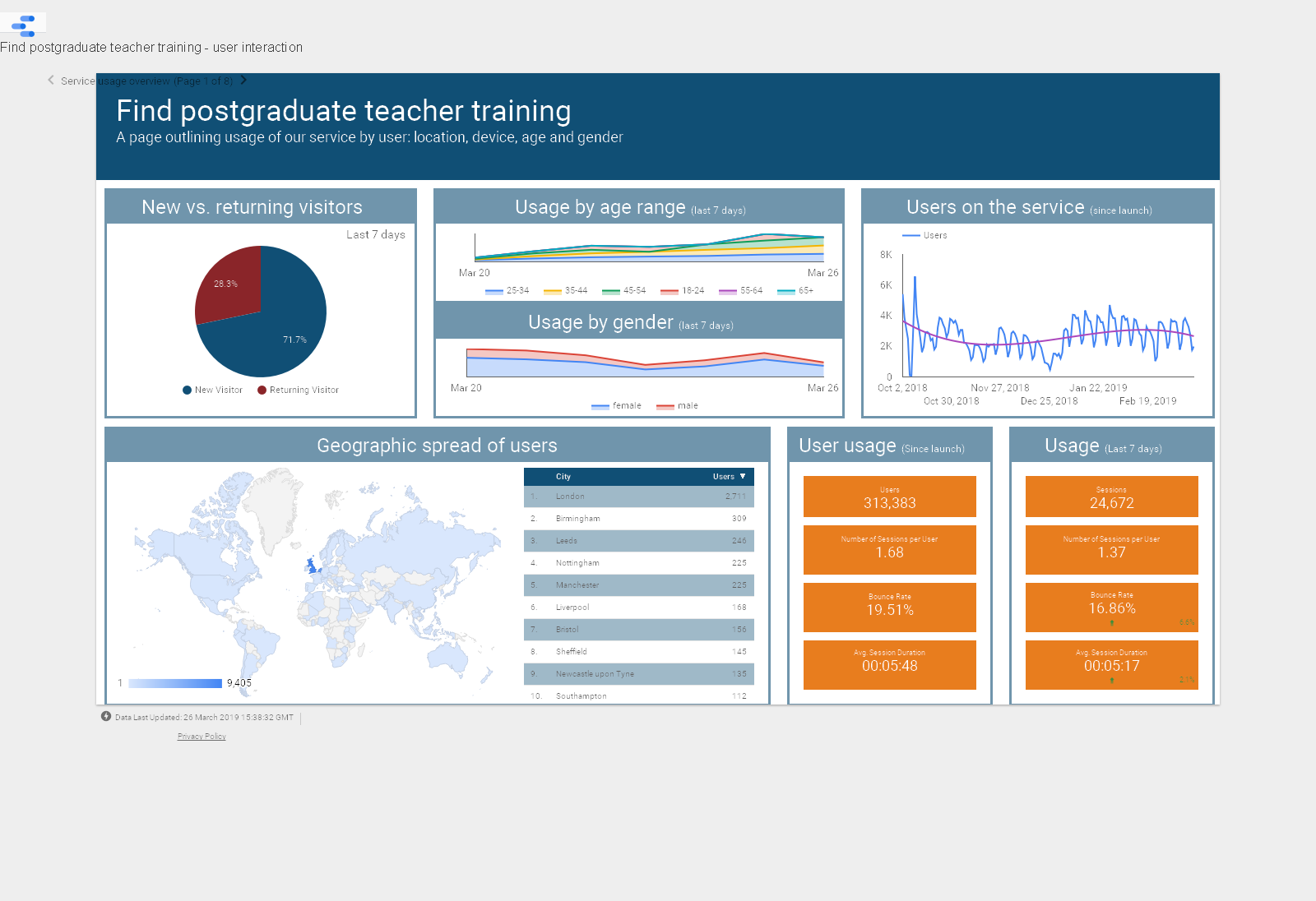
Since launch the service has seen 313,383 users visit the site. January to March of this year represents 55% of total service usage, since launch. However, since January, we’ve seen total usage drop by 29% from 73,793 new users in January to 52,090 in March. This looks like a reasonable monthly benchmark for performance – consistent across October, November, February and March of this recruitment cycle.
Our analytics tells us that the average user participates in 1.7 sessions. It’s hard to say at this point whether this is high or low. However, it’s fairly clear that if a user only visits the site on average 1.7 times, then we need to ensure they are able to quickly, and accurately, find the thing they need to progress in their journey to become a teacher: they need to find courses.
The average user who finds a course page will visit at least 4 pages on the service. Since launch, our users have averaged 6 pages per session. This might mean a number of things, either users are tweaking their searches to find more appropriate courses, or they are viewing a couple of courses at a time. To understand things a bit better, we’ll have to look into user behaviour (how users are engaging with various features within the tool).
Success measures
Successful journeys – building out a benchmark
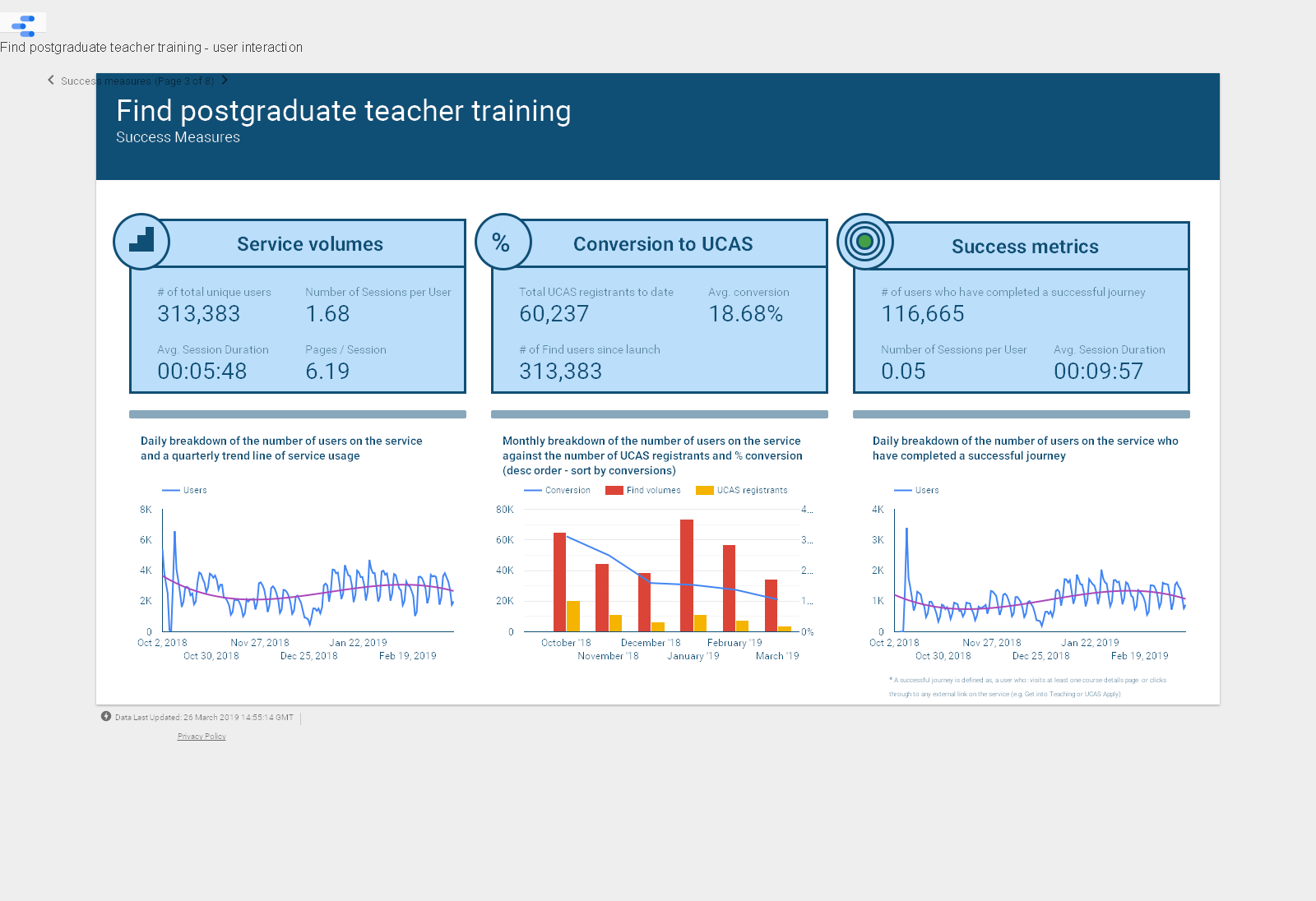
A successful journey is defined as, a user who:
- visits at least one course details page, or
- clicks through to any external link on the service (eg Get Into Teaching or UCAS Apply)
Since the launch of our service, the site has seen 116,665 users complete a successful journey. This makes up 37.2% of our total user base. On average, a ‘successful’ user will visit ~9 pages per session, spending 9 minutes and 56 seconds on the service. This is around 2x the time spent by your average user, visiting 3 more pages per session.
We’re starting to get a benchmark for what good looks like and how much time users will be spending on the service if they are to convert from an ‘average’ to ‘successful’ user. However, we need to research the behaviours of these users more to understand their motives. This will allow us to design improvements to the service that lead to more successful journeys.
Focusing on this quarter – since January the service has seen an average of 8,000 users completing successful journeys on the service per week. However, as mentioned previously, following an initial spike in usage through January, the number of visitors to the site has levelled off at ~50,000 per month. This means that the percentage of successful journeys has increased to 50% of our user usage in March, compared to 44% in January. This indicates that whilst our user volumes spiked in January, relatively speaking, this did not convert to successful journeys.
This could be indicative of a number of root causes, most notably: campaign pushes resulting in an increase in people ‘just having a look’ or the ‘new year, new me’ user equally trying to satisfy their desire for change by exploring different avenues. This behaviour of exploration is supported by a similar spike in usage on the Get Into Teaching service over the same period, both in this recruitment cycle and in the previous.
Conversion – trending downwards or levelling off… what’s the difference?
If we look at the service from the other side (how are users converting from Find to UCAS), we’ll see that UCAS registrant figures are currently dropping at a faster rate than the number of users on Find.
Since January, Find user volumes have dropped by a monthly rate of 13%. Comparatively, UCAS registrants have been dropping at a rate of ~30% (March registrant figures forecasted out at a multiple of 1.5x from 17 March 2019).
This indicates that, whilst users may be successfully moving on from Find at a steady rate, increasingly, the next step does not involve UCAS registration. This may mean that users are instead opting to source more information, looking to provider websites and get into teacher to find out more information or, for a subset of users, this is the point at which they have decided teaching is not for them.
Conclusion
What does good look like?
This year is all about building up the picture, getting a better sense of how Find can play a part in the journey to become a teacher and identifying where we might be able to make improvements to the service in the future.
From our usage reports and success measures, we’re getting a sense of what we should be expecting by way of usage each month. This report has only provided a high level overview of some of the key objectives.
In future weeks, we’ll start reporting on some of the more behavioural trends coming out of our analytics. This should start to give you some insight, not only into whether users are successful in their journey, but also how they navigate the service. For example, where they are looking to train, in which subjects and at what pace.
In the meantime, feel free to keep an eye on our dashboards and start familiarising yourself with some of the ways we’re looking at service performance.