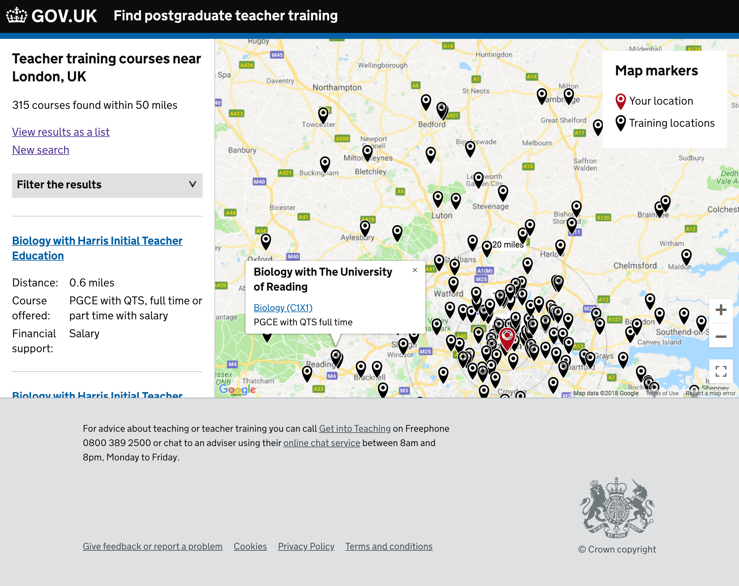
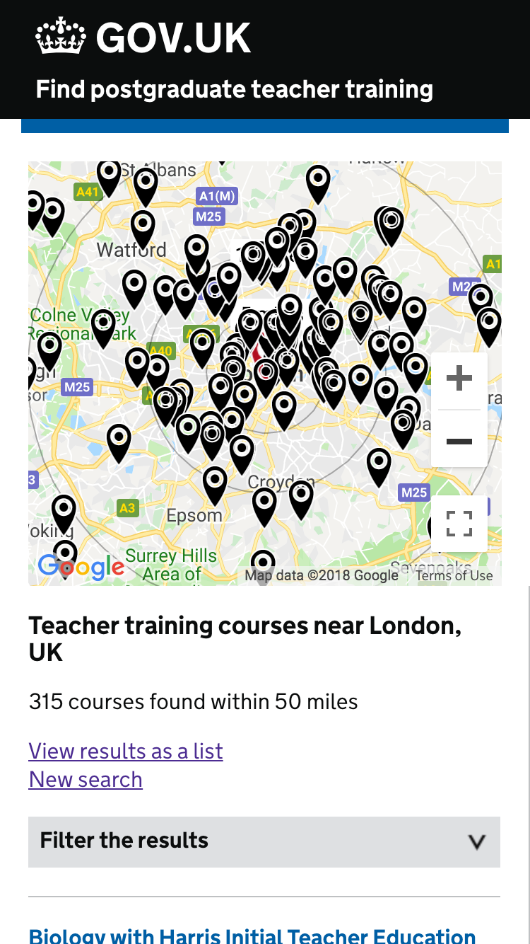
We tested a new iteration of maps with 5 users on 18 October 2018. It is a combination of the best bits of the previous two designs which we tested together.
In this design we did not include individual training locations.
Finding the map
The map can be found behind a ‘view on map’ link near the top of results. Users however were more likely to jump to the first few results. P1 said she saw the link but did not use it. P2 needed it pointed out.
When users opened the map they responded positively. The large map did not confuse them.
“I think that’s really good, I quite like that”
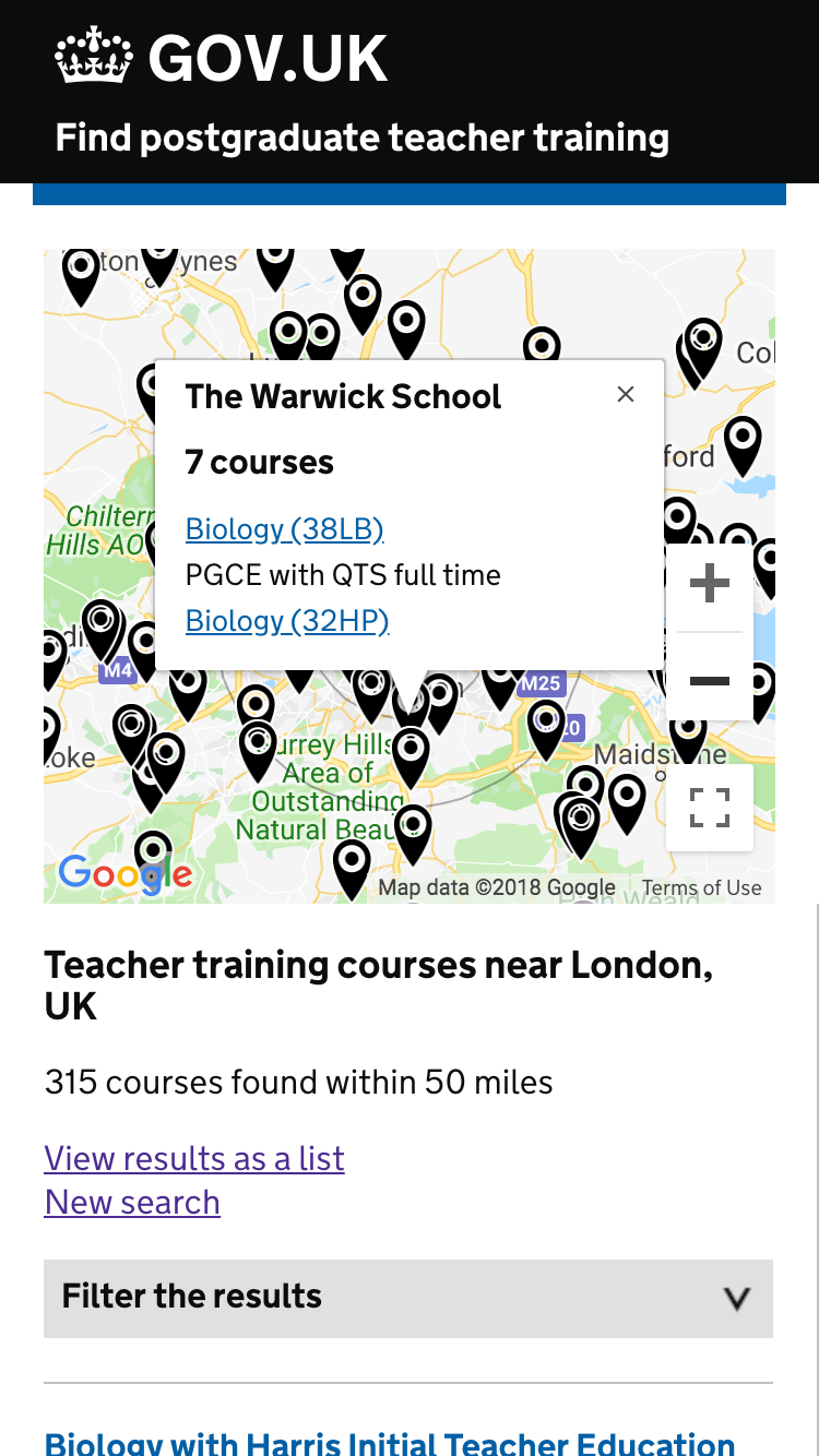
Training locations were missing from the map
A user saw a training location listed in the search results – it was the nearest one. This did not show on the map view because we were only showing administrative locations. We must show consistent locations.
‘This school is not on that map’
‘There are schools missing, so it needs a bit of work’
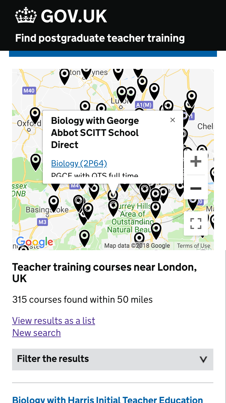
When asked about the meaning of a pin on the map, ‘that’s the school where you’ll train’. Right now that’s not necessarily true.
“This would just be the base of a course”
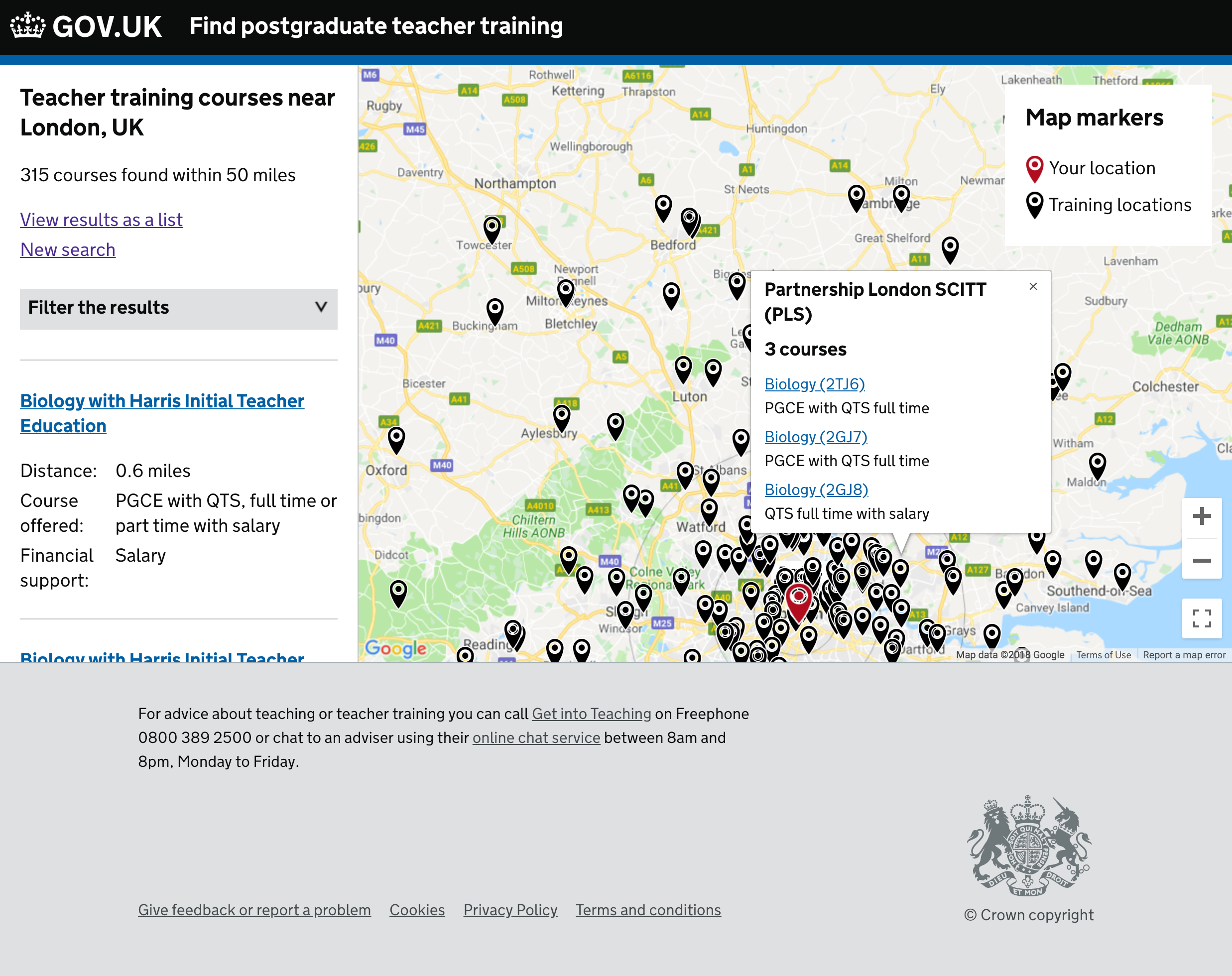
Results outside the search radius
By including results outside the circle it suggests that we’ve searched that area fully. We have not, it’s a quirk of a course with multiple training locations (or in this case an admin location) that’s a bit further away, but with one location within the radius.
For example, with a radius of 20 miles, one result might show 25 miles away if that’s where its admin location is listed. We will not however show any of the other potential courses that are between 20 and 25 miles away.
No user understood this. It is misleading.
To fix this we could:
- show all results – from the start or as they move around
- show nothing outside a certain radius, using the outer circle as a bounding area
“As I zoom out I’d expect to see more pins pop up elsewhere”
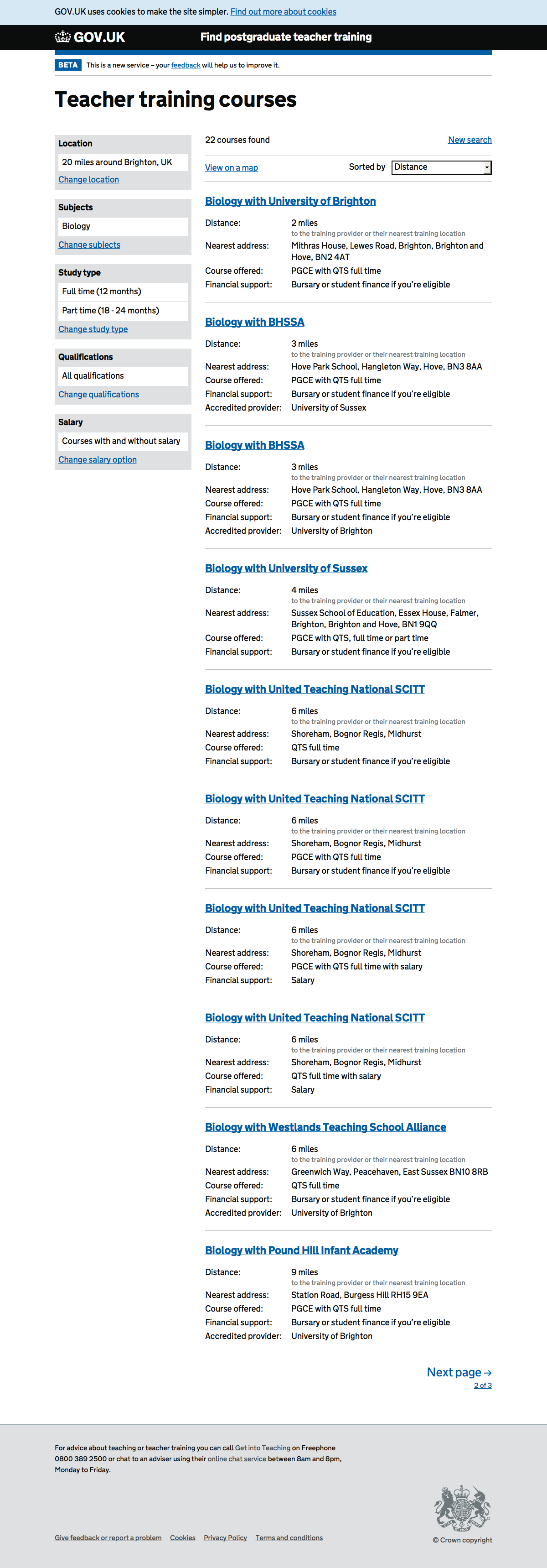
Setting a radius
The choice of how close a course is can be moved from the ‘Find by location’ screen to the map view.
On the map view it does not make sense to search a specific radius, instead the user can zoom and move around and focus on areas directly. Users can also make a more informed choice about distance – eg if a course is further away but along a motorway, it might be faster to get to.
“they’re not too far away that I could travel to them and still live at home” (courses were about 15 miles away, but not hard to get to)
Users found the radius circles useful. They can easily see how far away a location is.
“If it’s just outside the radius I would have missed it”
“Nice to have the option just outside the 20 miles”
On the list view the radius changes only the number of results. The closest are always first. To see things further away users can keep scrolling or paginating.
Course codes
We put the course codes as a differentiator in maps. Users expect to see that code prominently on the course page too.
List view alongside map
Expected to be able to click in the list and see the result on the map. See video
P2 ‘would not use the list. Map is more interactive’
P4 used the list but expected the results to be indicated on the map somehow. “pin would bounce”.
Screenshots#
List of results#
Results on a map#
Result open on a map#
Another result open on a map#
Mobile results for london#
Single result open on mobile#
Multiple courses open on mobile#