We explored some alternative designs for the initial flow of the service, with the aim to make more of a browsing experience.
The issue
We ran a diary study with participants who were early in the process of deciding whether training to become a teacher was right for them, and if so which courses to consider.
When encountering the Find website, several participants made comments suggesting that the current design, where they are asked a series of questions before seeing matching courses, was off-putting or did not work for them.
Some of the reasons for this were:
- they did not have a specific location in mind, as they were willing to move
- the questions made them worry they were about to start an application, but were not yet ready to commit
- they did not yet understand how the process of finding and applying for a course worked
- the GOV.UK branding looked ‘official’ (like submitting taxes) compared to the marketing websites
Hypothesis
Our hypothesis is that switching from using form-based components (radios, checkboxes and button) to using plain content, links and stand-alone buttons may give users more confidence to navigate between pages without feeling like they were making firm decisions.
What we changed
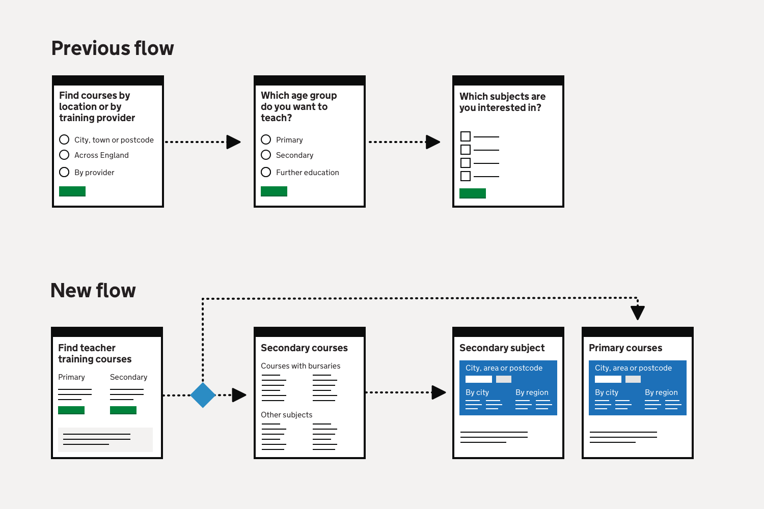
We removed the questions about age group (primary or secondary), subject and location. Instead, we embedded links and buttons into blocks of content.
First page
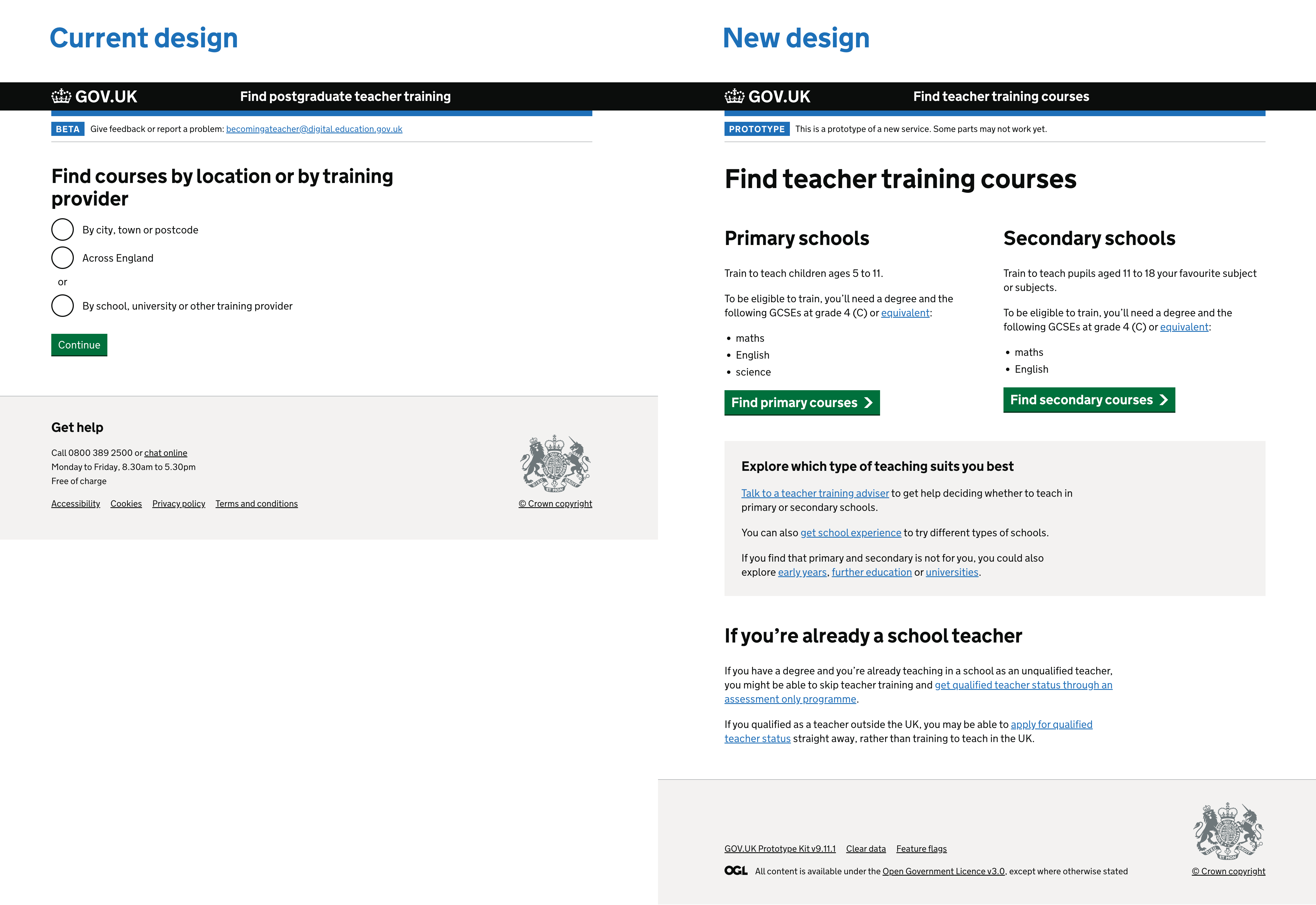
We changed the first page of the service, so that instead of showing 3 radio button options, we had a lot more content and links on the page.
The first section of the page described the differences between training to teach in primary and secondary schools, including the age ranges (for those who might not be familiar with the English school system) and the different minimum entry requirements.
A green button was added for each age group.
Below this, we added some content to guide users who may not yet have decided which age group to teach. This promoted the teacher training adviser and get school experience services. We also added some links to guidance for teaching age groups not covered by service.
Finally, we included some guidance for people who’re already school teachers - who may be eligible to qualify as a teacher a different way.
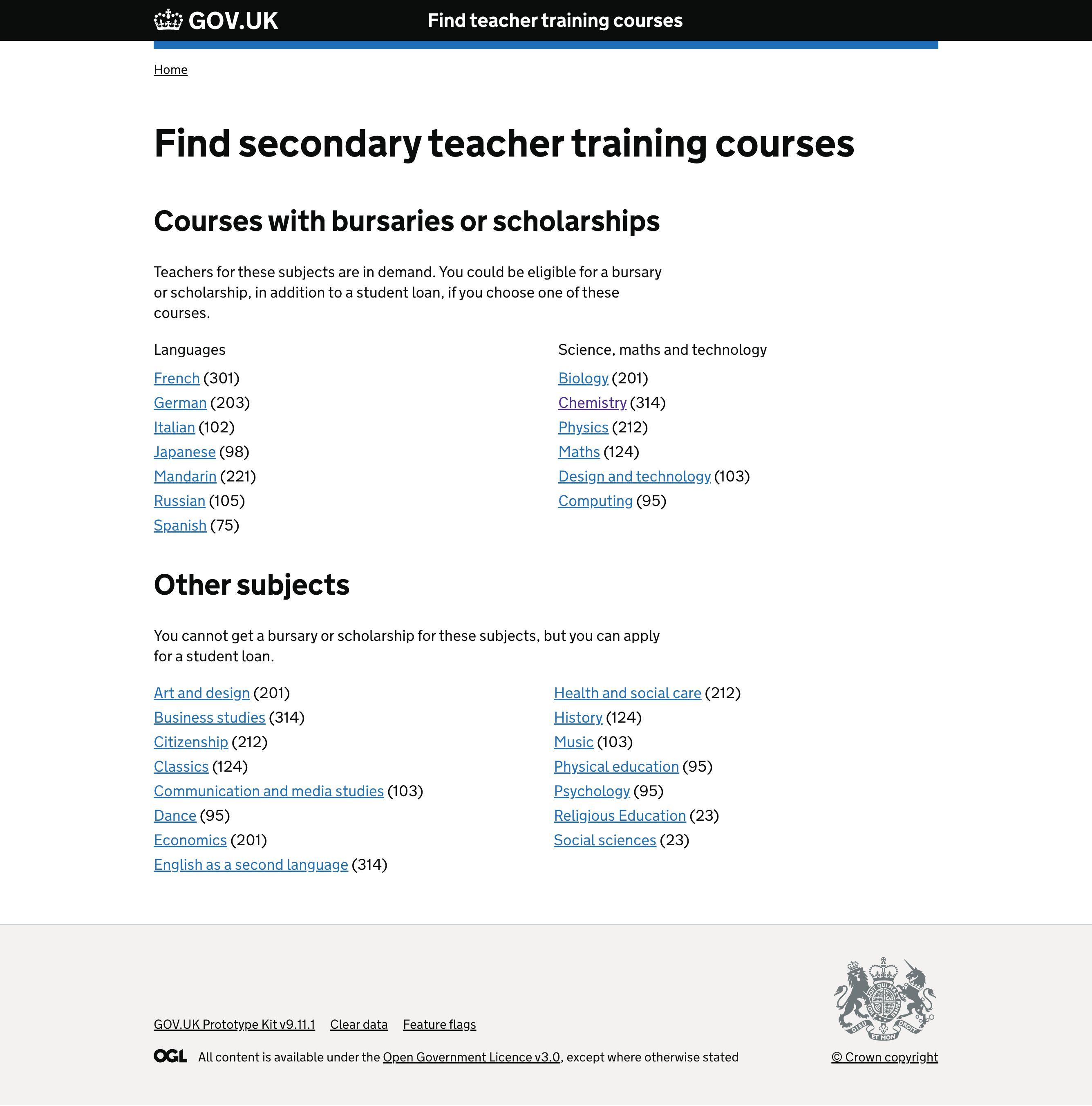
Secondary subjects
For the secondary age group, we then then took users to a page listing all the different subjects available, divided into 2 lists depending on whether a bursary or scholarship was on offer. We added numbers in brackets to indicate how many courses were available for each subject.
Location
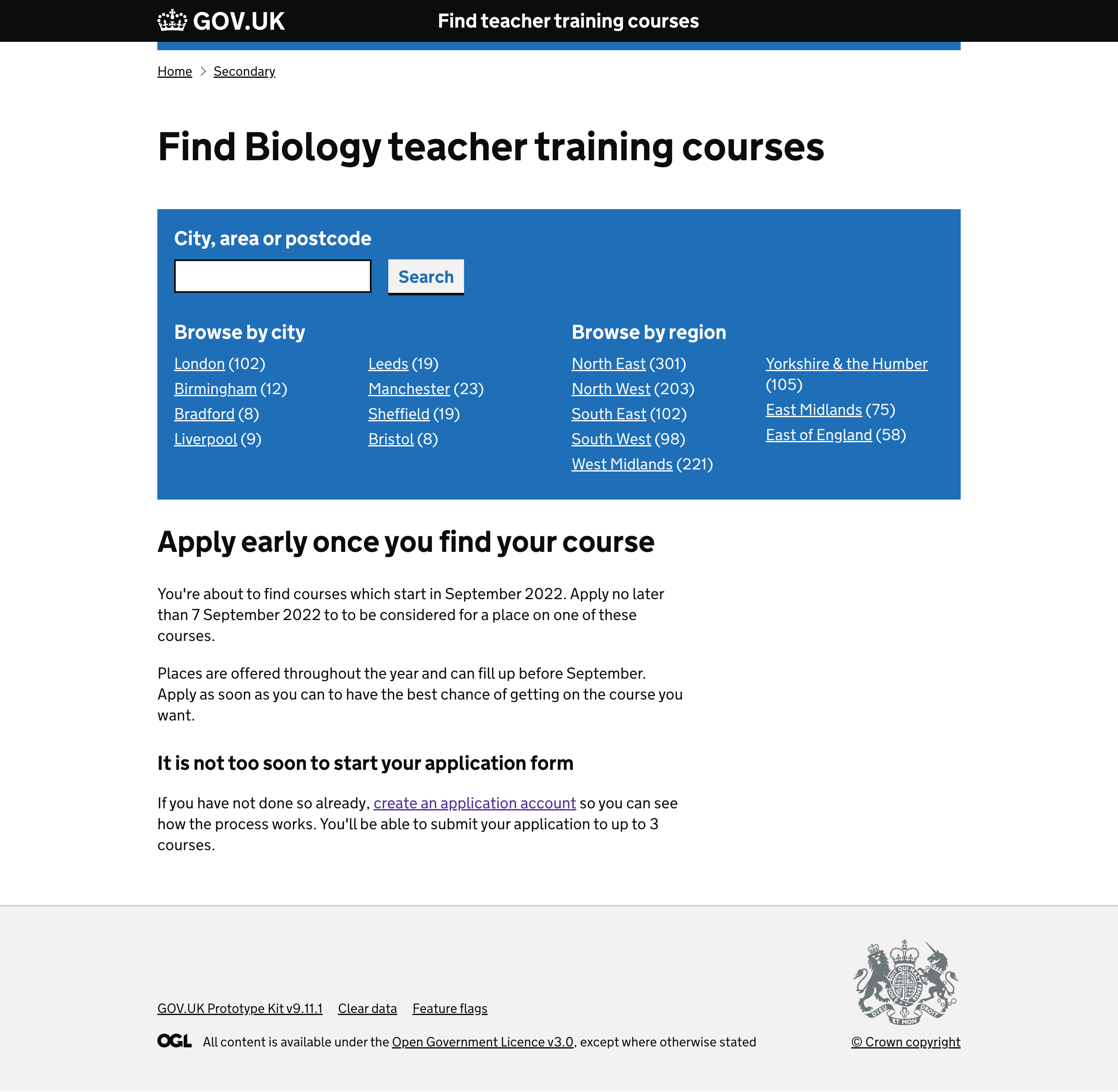
The secondary subject links took users to a page for that subject which had a search box for location, but also listed regions and cities as links, again with numbers in brackets to indicate the number of courses available.
Beneath the location box we added some guidance about the application process, including:
- when most courses start
- when the deadline for applications is
- that courses can fill up before the deadline
When selecting the primary age group, we skipped the subject page and took users straight to a similar page listing regions and cities for primary courses. This was because the number of primary specialist subject courses available is very small, and users sometimes misunderstand how these courses work.

User research summary
The team researched this speculative design using a concept testing approach in May 2022, with 9 candidate participants, to gather evidence to decide if investing in a design that better supports a browse experience is worthwhile. Overall, the research findings suggested this design approach could provide a better experience for candidates, especially in presenting useful information in the context of searching for providers and courses to apply to.
Summary findings
- Candidates responded positively to the new design concepts, navigating to the results page without issue.
- Find is a good place to present information that candidates can often miss, as candidates noted this information unprompted and found it useful or new.
- Most participants had spent time on Get Into Teaching (GIT) but had not always retained information that would help them in their search.
- A dominant mental model for candidates is choosing a training provider rather than a course. This design approach better fits this mental model.
- There is a need for more clarity for school-led courses and provider types, but this could reinforce existing misconceptions.
Further work
If we were to take this approach forward, we should iterate the design to make the guidance about the application process more visible and faster to read.
We should also do some further research to check that the design is still usable on a mobile screen.