We have improved the ‘Your applications’ interface and course application page to meet user needs.
This change will be released in early 2024.
The issue
We have found from previous user research and the support tickets that navigating through several different applications has been challenging for users. Key information about their applications was missing, user needs were not adequately addressed, and there was uncertainty during the waiting period about when training providers would make decisions.
What we did
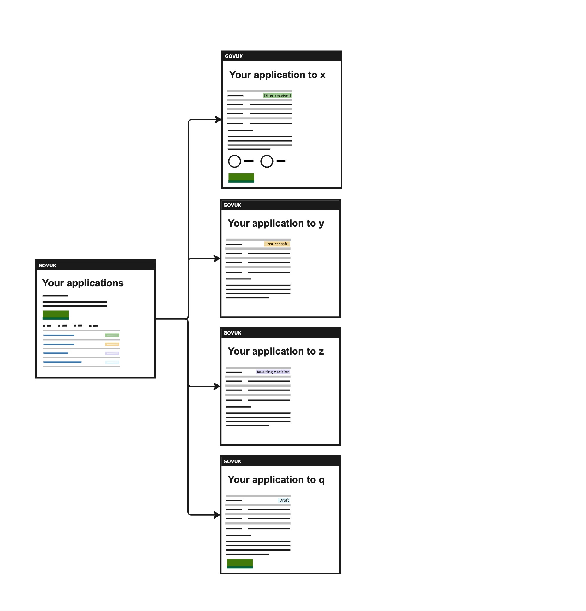
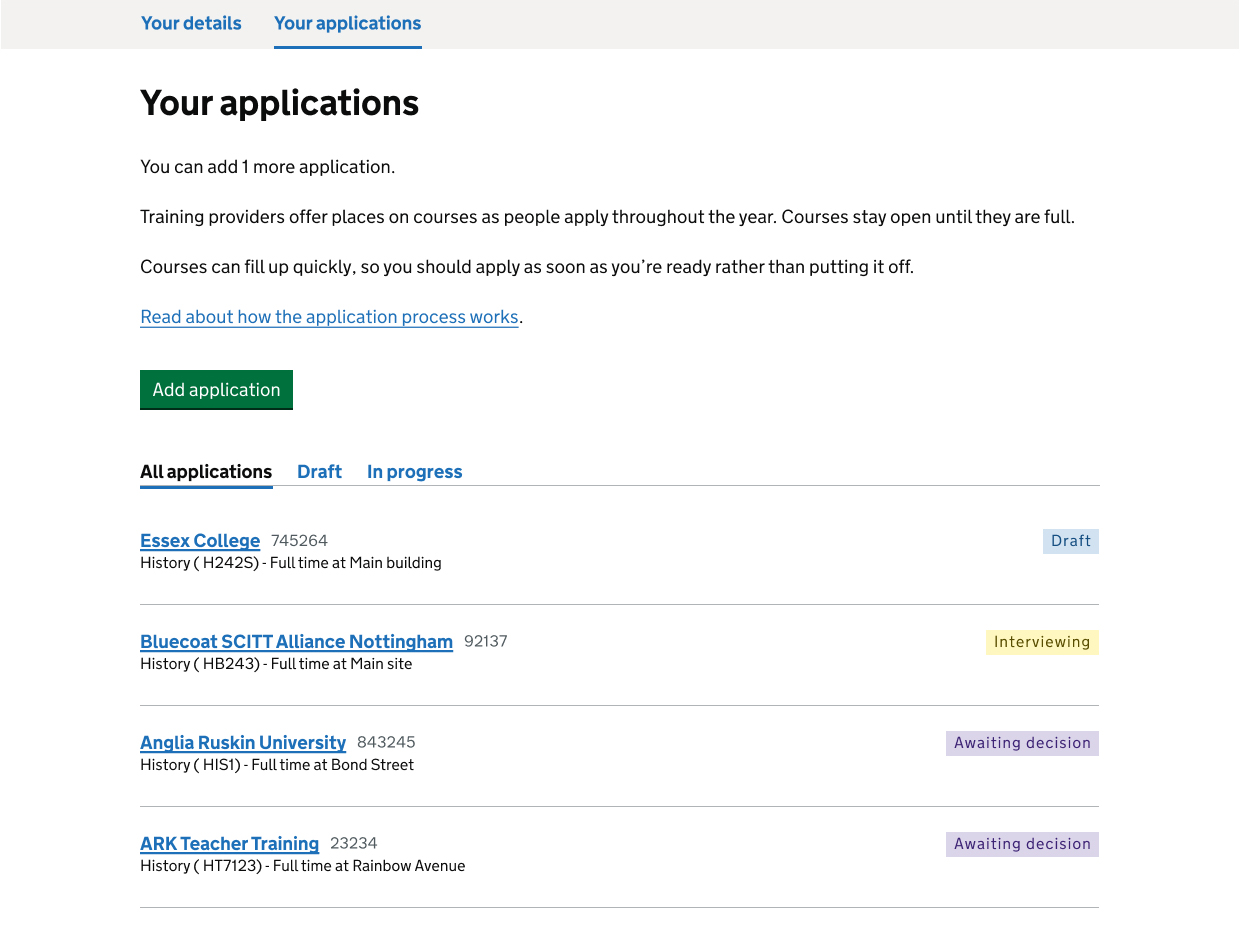
We overhauled the appearance of the ‘Your applications’ tab to provide a cleaner and more organised view, considering the increased limit of 15 applications. We replaced a card-style display with a simpler yet comprehensive design. Each row now showcases the provider’s name, application number, status, and links directly to a dedicated application page for that course.
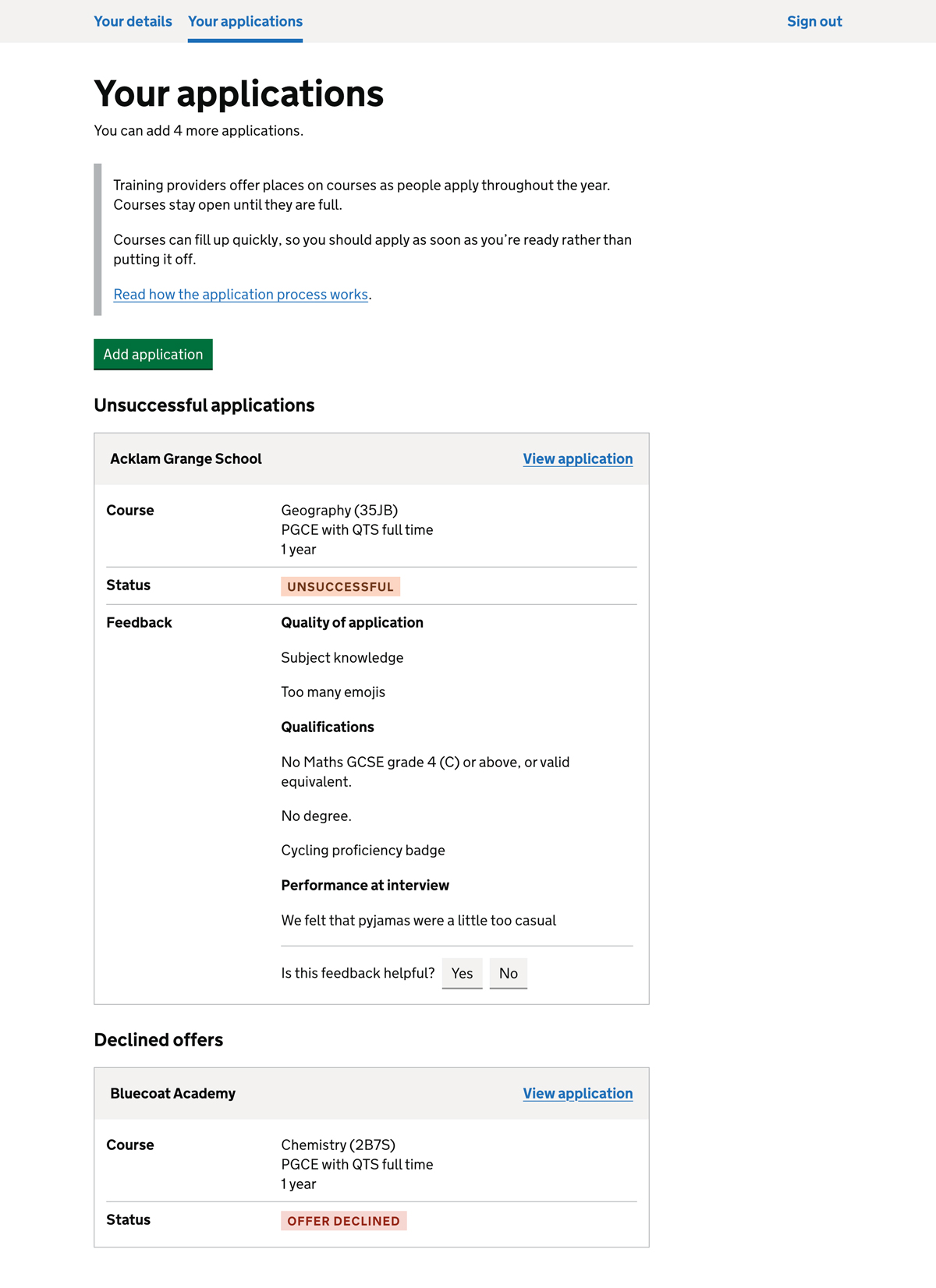
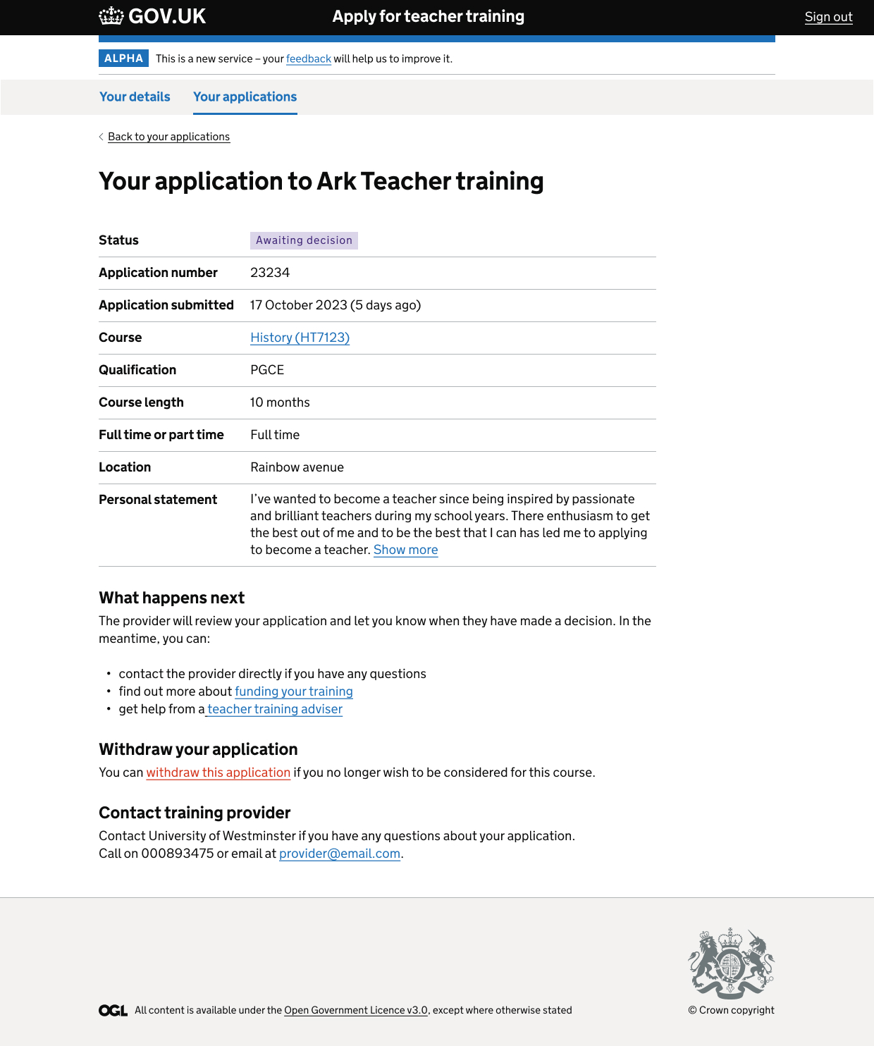
To avoid clutter, we moved actionable links like ‘Withdraw,’ ‘Continue application,’ ‘Remove application,’ and ‘View application’ to their respective application pages. The redesigned application pages offer a detailed summary list, displaying additional information such as status, application number, submission date, course details, qualification received upon completion, and course length.
In response to user needs, we introduced new sections like ‘What happens next’, ‘Withdraw your application,’ and ‘Contact training provider.’ Contact details of the training provider are now prominently displayed on application pages to address the challenge users faced in finding this information. ‘What happens next’ is a new pattern guiding users on what to do while waiting for a decision. This pattern provides information on seeking help from training advisers, funding options, interview preparation, and submitting another application if needed.
The status ‘Not sent’ has been renamed to ‘Draft’ for consistency across the service. Additionally, we added a ‘Delete draft application’ section on the ‘Draft’ application page, which appears only after the application has been saved as a draft.
We refined the ‘Delete page’ content and incorporated a ‘Cancel’ button following the Government Digital Service (GDS) pattern.
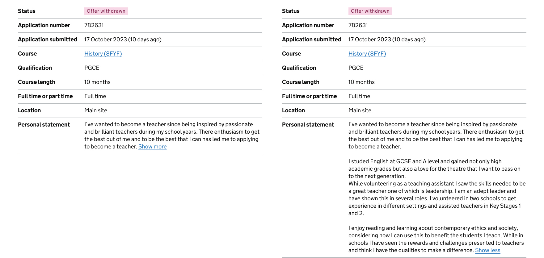
To optimize space, we restructured how personal statements are displayed on application pages. They are now integrated into the summary list row, allowing users to expand them if needed.
User testing
During user testing sessions, participants found the redesigned interface to be useful, although some adaptation was required. Users appreciated the enhanced information display, especially the inclusion of training provider contact details and the ‘What happens next’ content.
Further considerations
While initial designs have been well-received, further iterations and testing are needed. For example, the ‘Offer received’ status and the user journey of accepting an offer leading to the ‘Your offer’ tab. These areas will be refined to meet user requirements and expectations.