Changes to our initial design to improve the application process when applying again, following research. Some changes are applicable to the initial application too.
Hypotheses
Success banner: prompt candidates to review all sections
Until we introduce structured reasons for rejection, we can’t tell candidates what parts of their application to pay special attention to. Even so, candidates may still want to review other parts of their application that weren’t highlighted.
If we tell candidates to review all sections
Then candidates are more likely to improve their application
We’ll know this works when candidates spot the banner
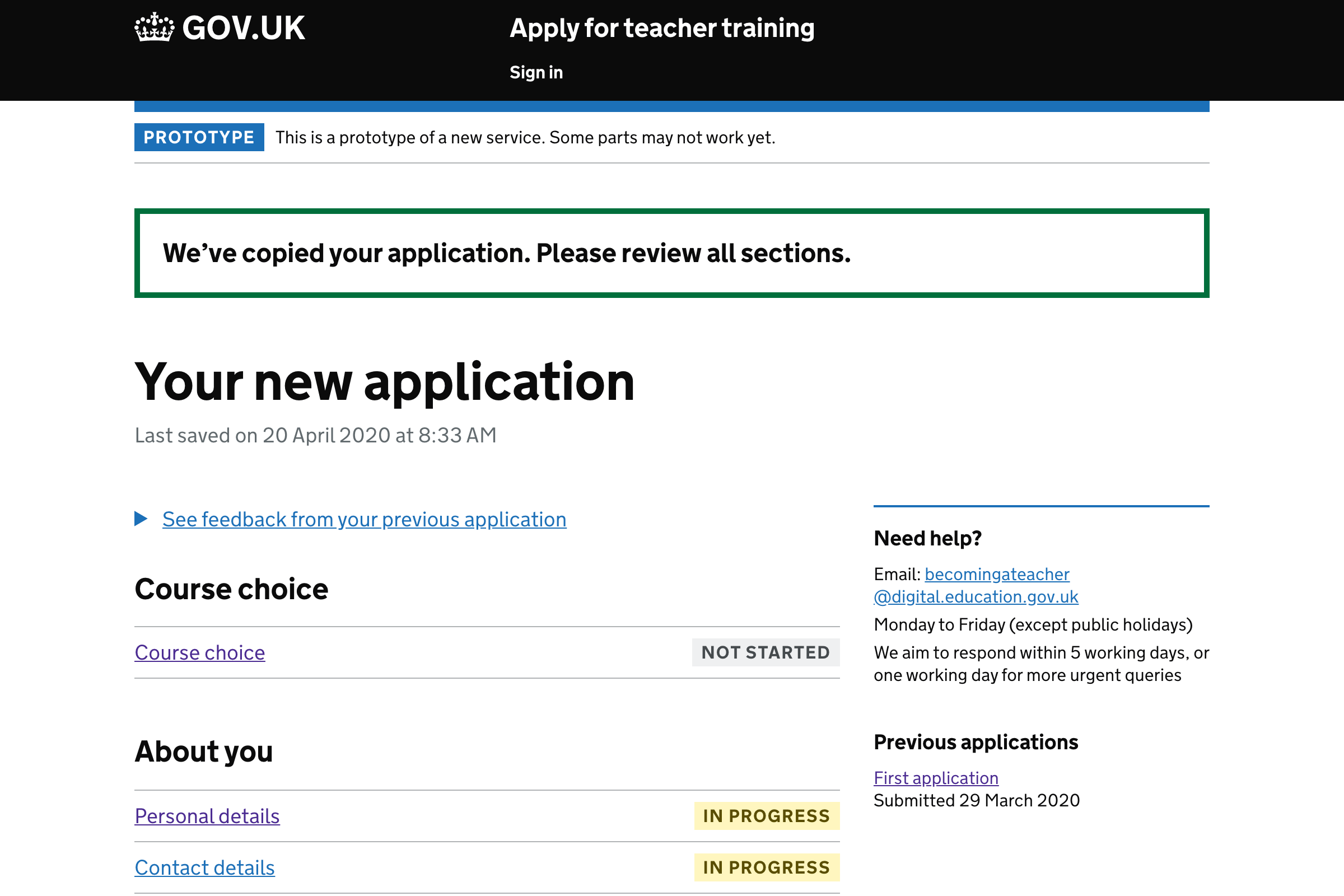
We’re not sure this wording had any real impact. Participants spotted the outstanding tasks and scrolled down.
Show reasons for rejection
Previous iterations let users click into previous applications. But this means reasons for rejection are quite hard to access.
If we show the reasons more prominently on the application page
Then candidates are more likely to incorporate the feedback
We’ll know this works when users spot the feedback
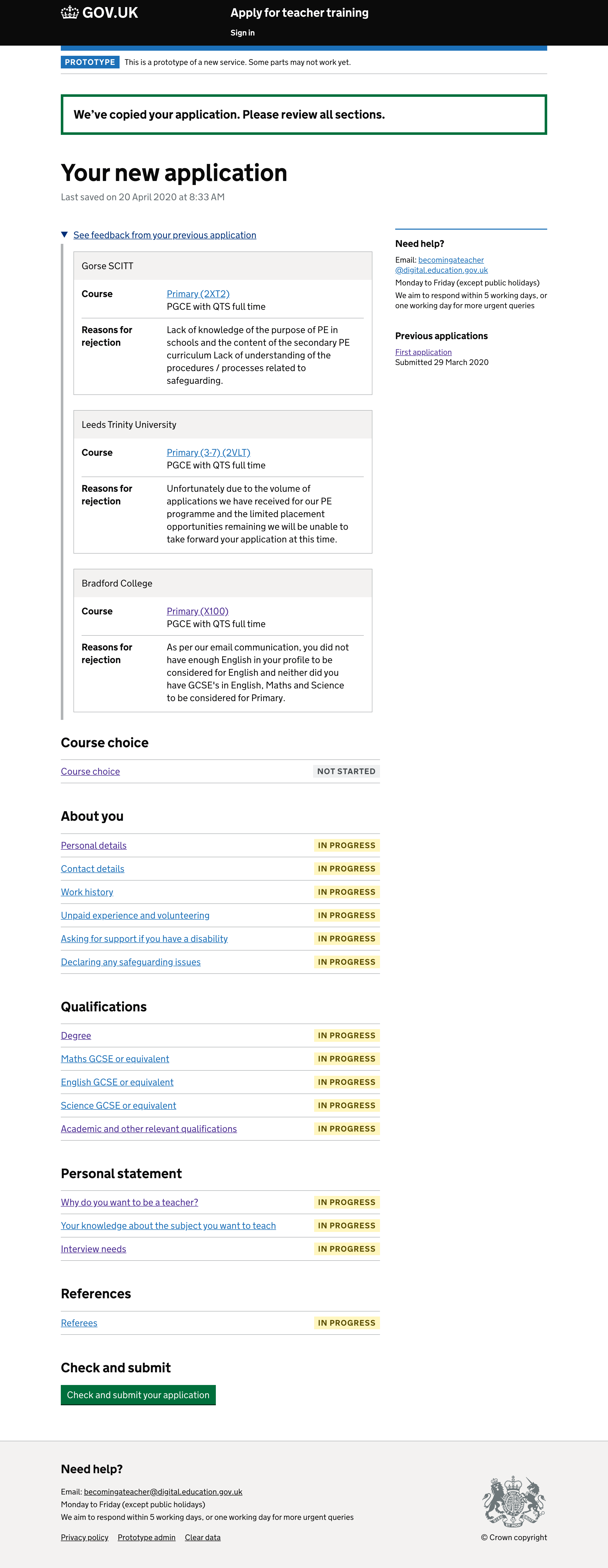
12 out of 13 participants found the reasons immediately and reacted positively to them. Just 1 participant who had lower digital literacy failed to find it immediately. But even then eventually did find it.
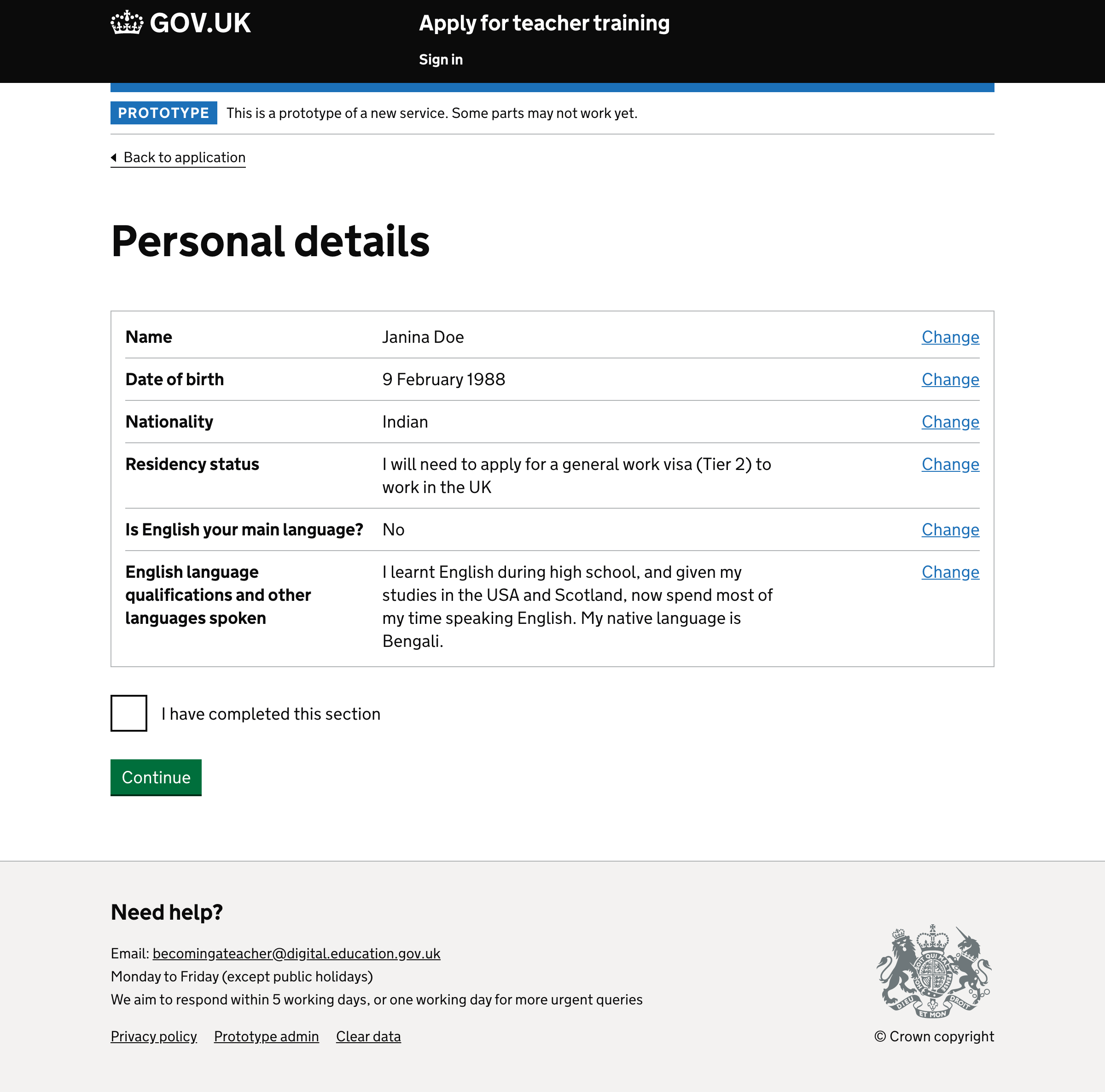
Explicitly marking every task as complete
Some tasks, like personal details, are automatically marked as complete on the basis that the fields have been filled in. Other tasks, like course choice, have to be explicitly marked as complete. This is because candidates can add between 1 and 3—and we don’t know which it’ll be.
When the new application is copied, all sections should be marked as incomplete. But for tasks like personal details, there would be no way to mark the task as complete again.
If all tasks work the same why by asking candidates to mark tasks as complete
Then making a second application will work intuitively and consistently with apply 1
13 out of 13 participants found and ticked the checkbox to mark the tasks as complete without any issues. Although having to mark every task is longwinded.
Distinguishing between tasks that are ‘not started’ and ‘in progress’
At the moment, tasks have 2 states: incomplete and completed. But this doesn’t accurately reflect the state of a task: some tasks may not have been touched, whereas others could have been partially filled out.
When applying again, a copy of the previous application is created so that candidates don’t have to fill out the questions from scratch. So in this case, candidates are just as likely to make wholesale changes as they are to just mark the task as complete. Having 2 states makes this clearer.
If we add ‘not started’ and ‘in progress’ states, then candidates will be able to see a more accurate reflection of their application and be able to differentiate between tasks that are not started and tasks that just need to be marked as complete.
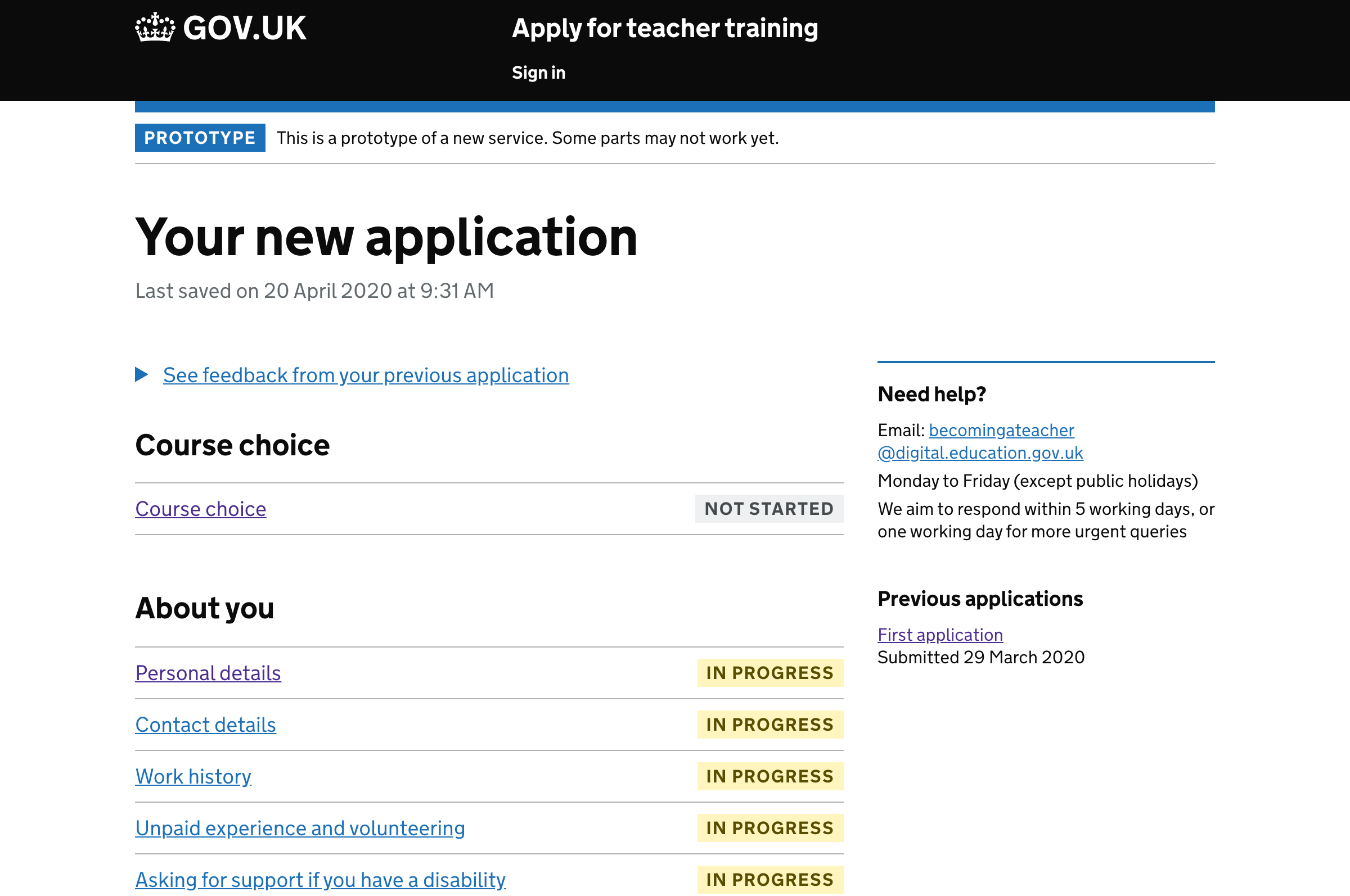
12 out of 13 participants understood the difference between these states.
1 participant (P5) didn’t realise they needed to mark the other tasks as complete until they got to the review page.
Make ‘check and submit application’ a button
The ‘check and submit application’ task is not really a task. It doesn’t make sense being labelled as ‘not started’ or ‘in progress’ and it can never be marked as completed either. And some users missed it when it was a link without a status tag.
A button has been tried before but because everything was marked as complete, some users thought there was nothing left to do.
This time we’ll keep the section heading above to make it more obvious that something else needs to be done.
This iteration changes the content to read ‘Check and submit’ instead of ‘Review and submit’ which follows the check answers pattern.
If we turn the final task into a button and keep the heading
Then candidates will know how to proceed without it being confused for a regular task
We’ll know this works when users click the button.
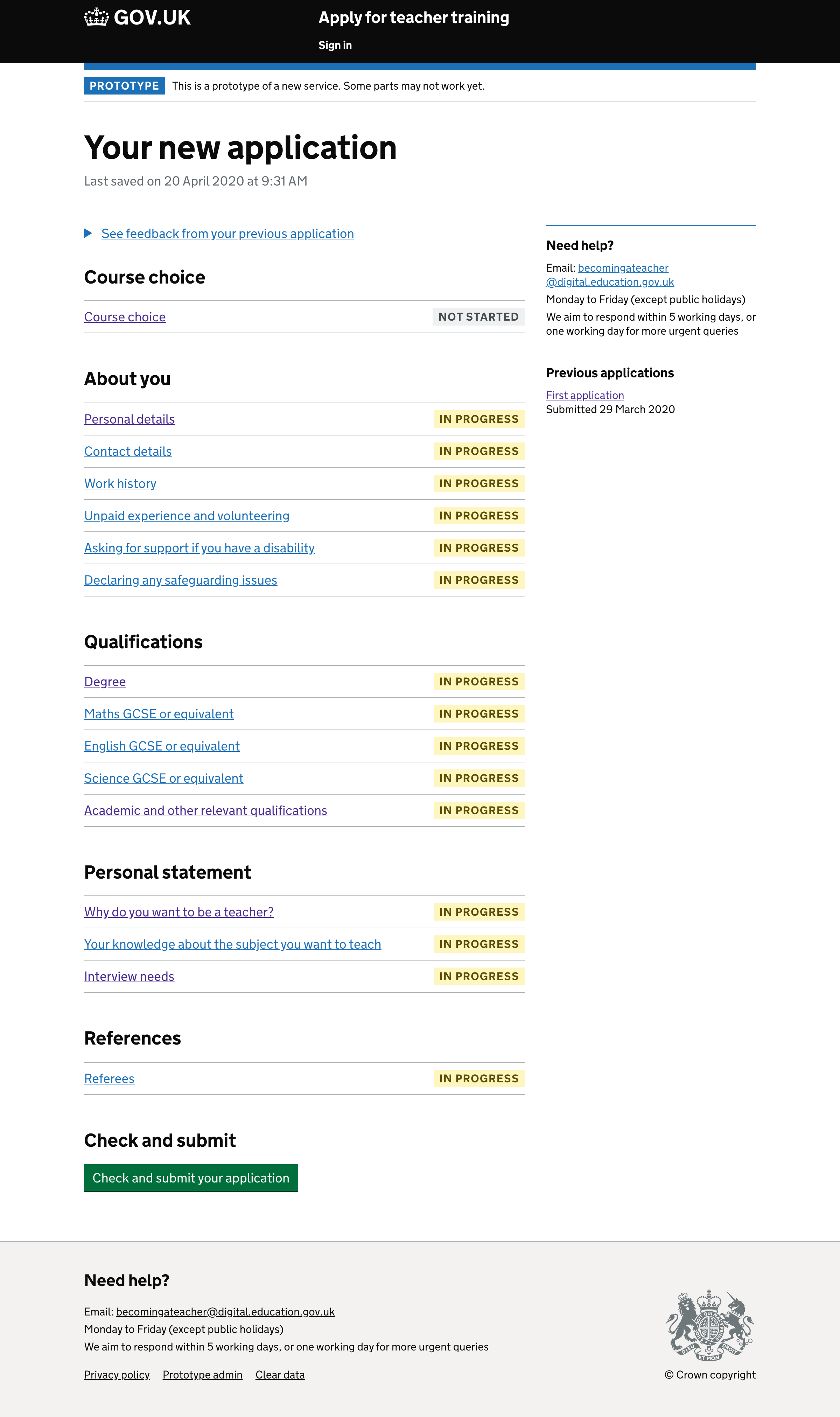
5 out of 5 participants found the button and used it without a problem.