We made three changes which we wanted to test with users.
- Displaying permissions differently in summary lists.
- Removing the choice between ‘view only’ and ‘additional user permissions’.
- Removing the content on the organisation permissions page which says that both organisations can view applications.
The first of these changes is completely new.
We’ve tried things similar to the other two changes in earlier iterations of the permissions feature. We wanted to try them again because:
- we’ve simplified many other parts of the flow, such as adding a user to only one organisation a time
- the prototype now has realistic data for users, organisations and relationships so it might be easier for a research participant to understand
We ran a single ‘pilot’ research session while still finalising other changes, and found that the participant had trouble with some of the things we were considering changing. So we decided to go ahead with these changes for the main research sessions.
What we changed and why
User permissions summary lists
Previously we represented user permissions in summary lists with:
- ‘Additional permissions’ on the left side
- the additional permissions which the user has on the right side, sometimes with additional information about the influence of organisation permissions
We moved the permissions to the left column of summary lists. This lets us give a clear ‘yes’ or ‘no’ for each on the right side, rather than omitting permissions which the user or organisation does not have.
It also means we don’t need to use bold for the permission name, which was inconsistent since normally bold is used only to replay questions in the left column.
Setting up user permissions
We’ve removed the page which asked whether the user should get ‘view only’ or ‘additional’ permissions.
Instead we take the user straight to the page where they can add specific permissions, which is now called ‘User permissions’ instead of ‘Additional user permissions’.
At the top of the page we say that all users get view permissions. We repeat that message when user permissions are displayed in a summary list.
The radio buttons had been added following research which showed that participants did not understand that all users would get view permissions. However, we have been concerned that users could be confused by:
- the concept of ‘additional user permissions’
- the answer to the question about ‘view’ or ‘additional’ appearing in the summary list
Both of these came up in the pilot research session.
Removing the question simplifies the journey for setting up permissions and means we can display user permissions more clearly once set. We want to see whether participants in research either:
- assume that all users will get view permissions
- understand from the line of content we’ve added that all users will get view permissions
Set up organisational permissions
We’ve removed the ‘who can view applications’ heading and bullets. We wanted to explore the possibility that, now that we’ve improved other parts of the journey, users correctly assume that organisations can view applications to their own courses.
If so, we can simplify the page. It will no longer need to serve two different purposes, both explaining something about view permissions and asking questions about additional permissions.
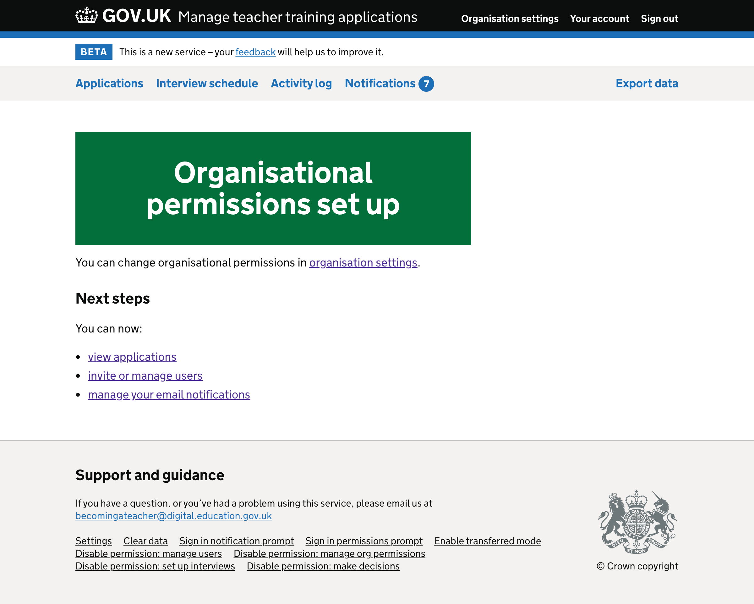
Screenshots: set up organisation permissions#
Start page#

Relationship page#

Check answers#

Success#
Screenshots: manage organisation permissions#
Organisation permissions#

Edit organisation permissions#

Success#

Screenshots: invite user#
Personal details#

Permissions#

Check answers#

Success#

Screenshots: manage user permissions#
User details#

Edit permissions#

Check answers#

Success#
